Free collection · Figma file · AI-ready
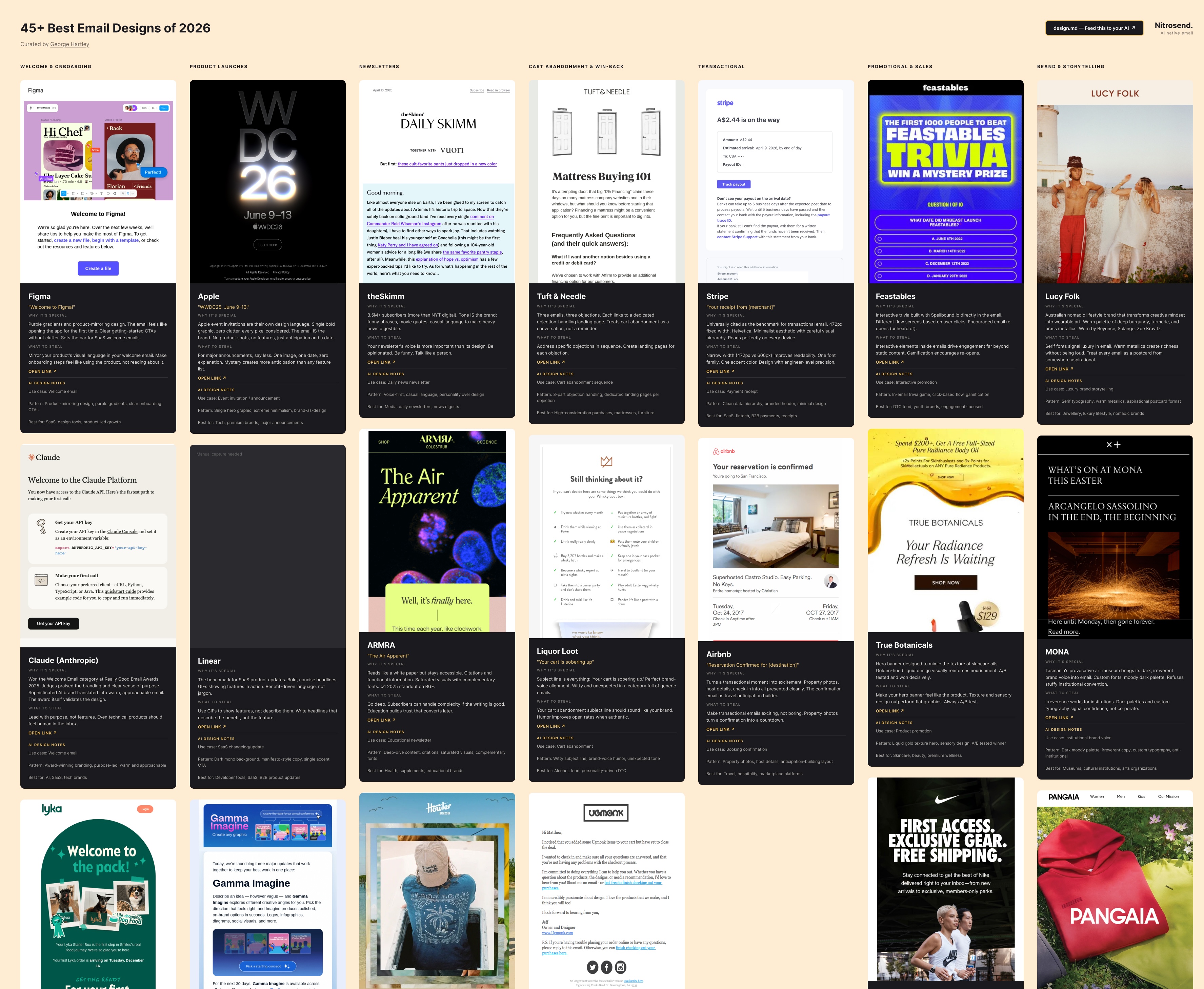
47 emails that changed how I think about email design.
I started this email design collection to train our own Nitrosend AI (NitroWheel) to design better emails when prompted by Claude and Codex. I'm open-sourcing it because I wish I'd had this to start with.
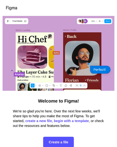
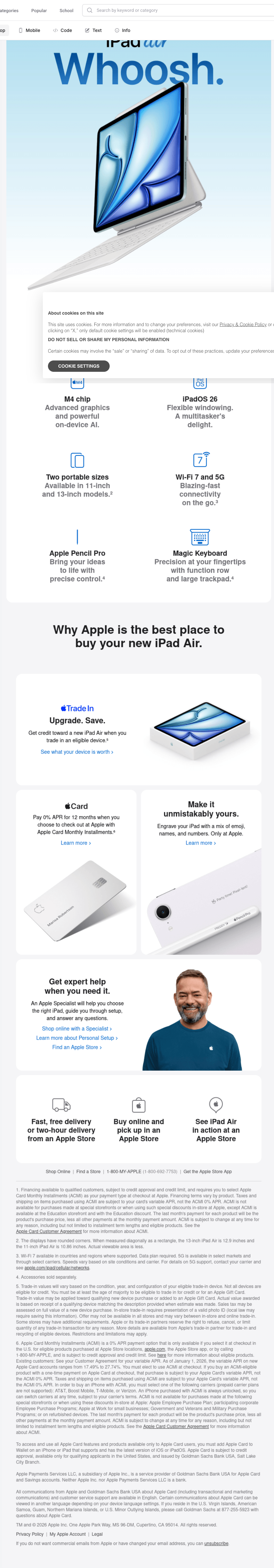
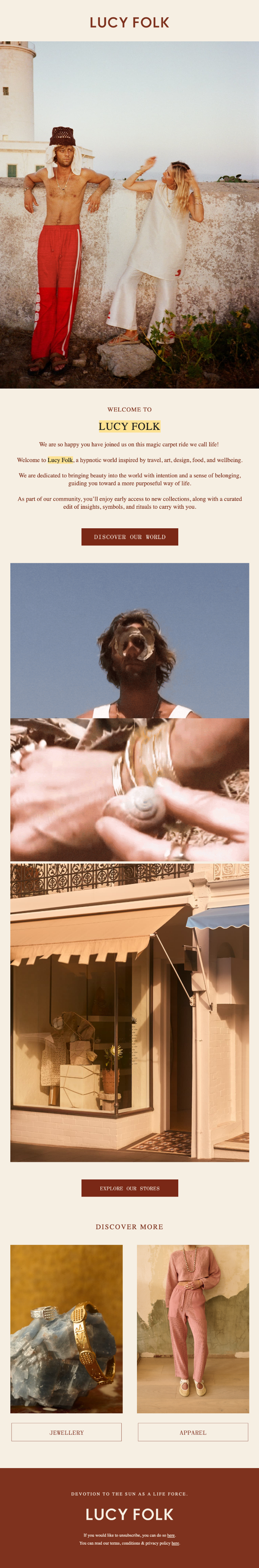
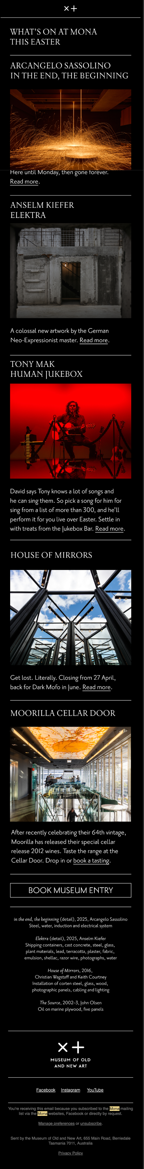
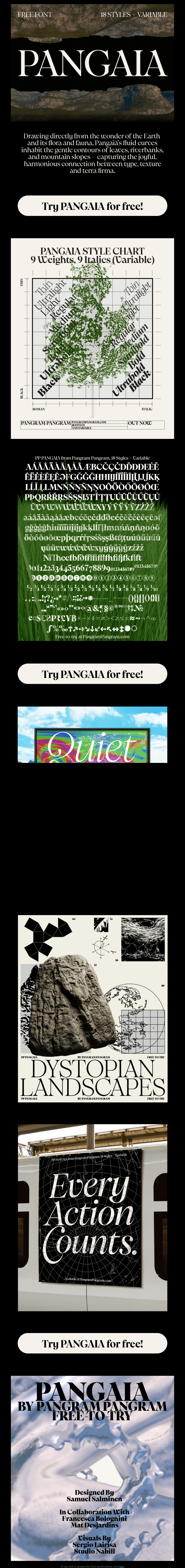
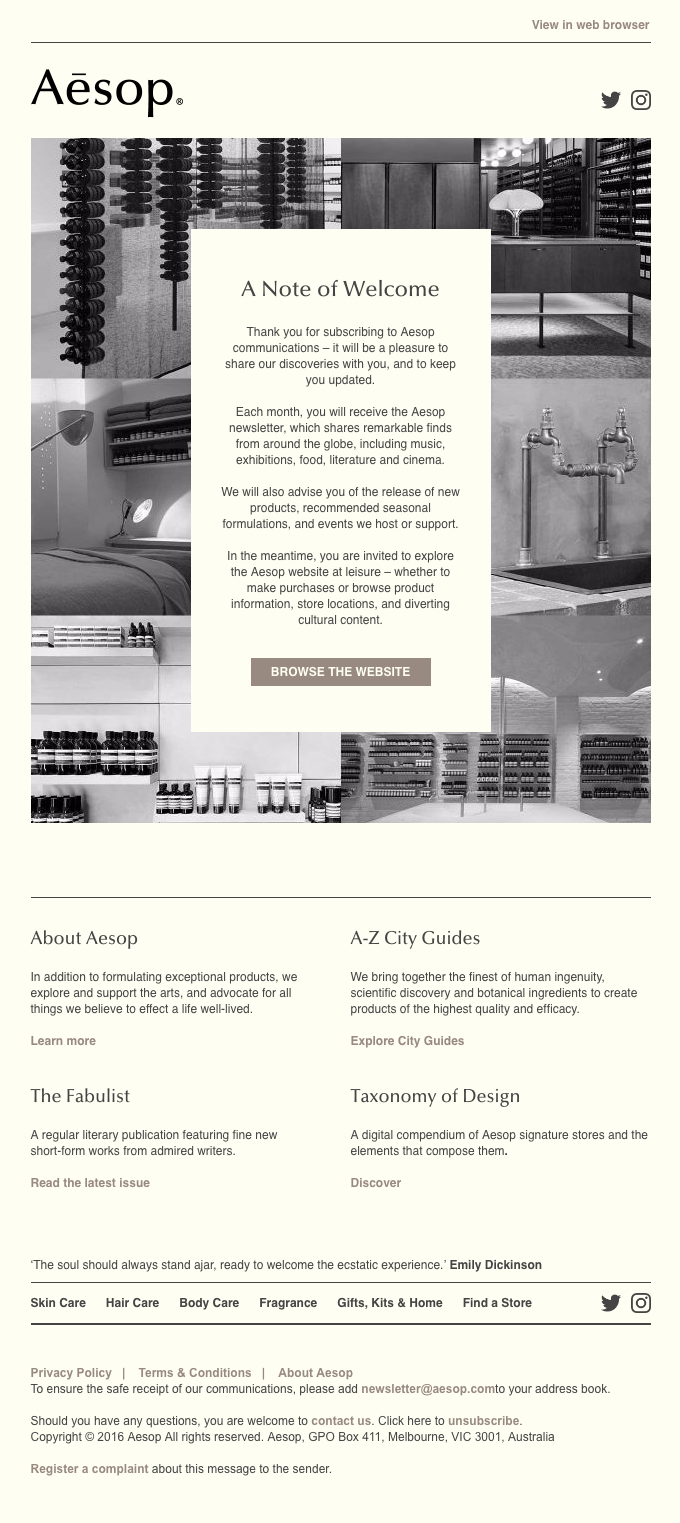
I've sent 6 billion emails. Here's a collection from dozens of brands like Apple, Stripe, Figma, Patagonia, Lucy Folk, MONA, Pangaia, Aesop, and more. Hand-picked for the designs that made me stop and rethink everything. Not a listicle. A design education.
Figma file with all 47 screenshots, structured notes, and a companion AI-readable DESIGN.MD file.

Why this exists
Email design is a blind spot. For humans and for AI.
Designers obsess over websites and apps, then treat email as an afterthought. White background, blue button, stock photo. The result is a sea of campaigns that all look the same, and nobody stops scrolling for any of them.
AI makes this worse. It generates from the average, which means every AI-drafted email inherits the same safe, forgettable patterns. The fix isn't better prompts. It's better references. Show your AI what exceptional looks like and the output changes completely.
This collection is 47 real campaigns from brands that treat email as a first-class design surface. Unexpected layouts. Subject lines that earn the open. Copy that sounds human. Every one includes notes on why it works and what to take from it.
What's inside
47 emails across 7 categories. Each with a full screenshot, design notes, and what makes it worth studying.
Welcome & Onboarding
7
Product Launches
6
Newsletters
6
Cart & Win-Back
6
Transactional
2
Promotional & Sales
9
Brand & Storytelling
11
A few from the collection

Apple

Stripe

Lucy Folk

MONA

Pangaia

Aesop
Why I made this
I'm George Hartley. I spent a decade building email tools. My last company, SmartrMail, had 12,000 customers and sent 6 billion emails before it was acquired in 2022. I've seen more email than most people will in a lifetime. Most of it is forgettable.
Now I'm building nitrosend, a full-stack email platform designed for AI. The goal is simple: you should be able to prompt Claude or Codex and get a beautifully designed email back. Not a template. Not slop. Something with real taste.
The problem is that AI generates from averages, and the average email is mediocre. The only fix is to show it what great looks like. So I started collecting. 47 emails later, it became something worth open-sourcing.
This collection is also part of the Email Marketing Bible, a 65,000-word guide built from 908 sources and 44 industry experts. If you want to go deeper on strategy, segmentation, deliverability, and the rest of it, start there.
I hope this is useful. I hope it raises the bar for what email can look like. And if it helps you send something that makes one person stop scrolling, it was worth it.
Figma file with all 47 screenshots, structured notes, and a companion AI-readable DESIGN.MD file.
