
What is worth stealing is the restraint. Every email is a single grey still life, a short plain headline, a three-line spec block and one black button. These are concept emails made with AI in Nitrosend. The Ordinary is not a Nitrosend customer and did not endorse them.
The full 12-email flow
Scroll the sequence in order, with each email's job and what makes it work.
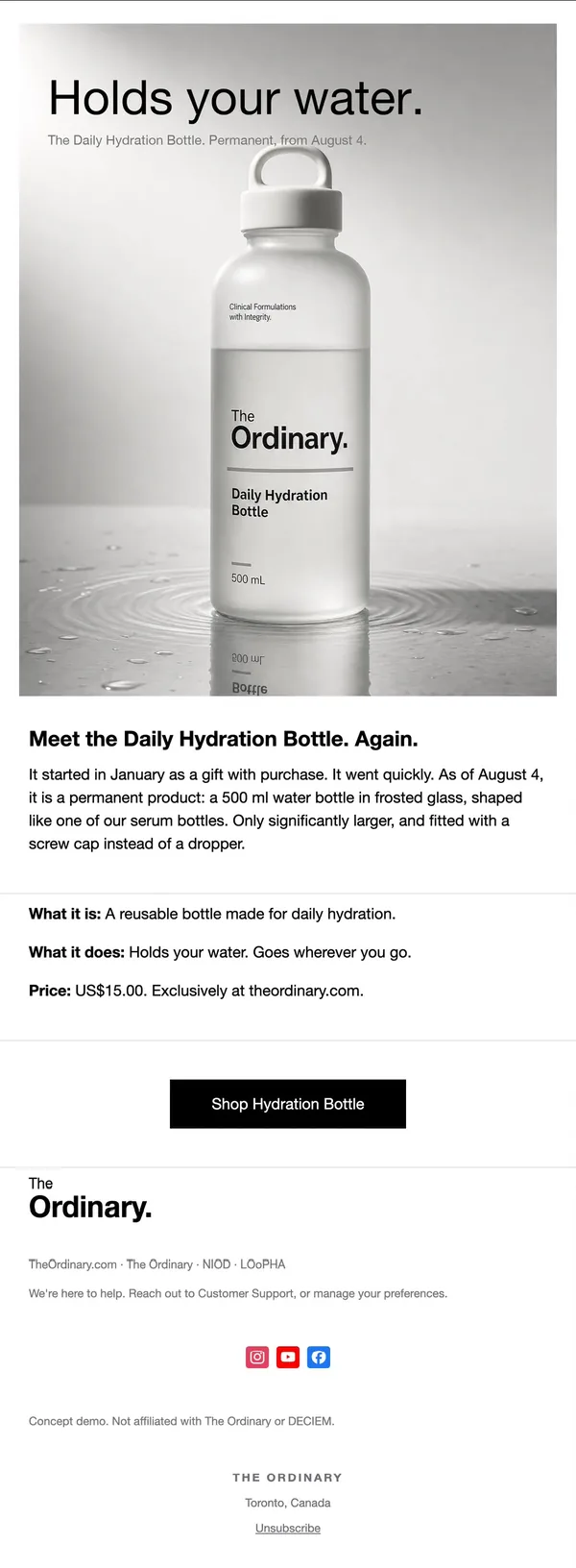
1. Brand relaunch
Real bottle on a grey plinth under a huge light-weight headline, with a three-line what it is, does, costs block and one black button.
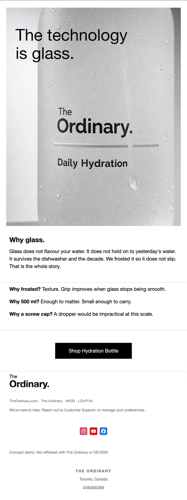
2. Product story
Tight macro of the frosted glass and label with a headline over it; three short why answers explain glass, size and cap.
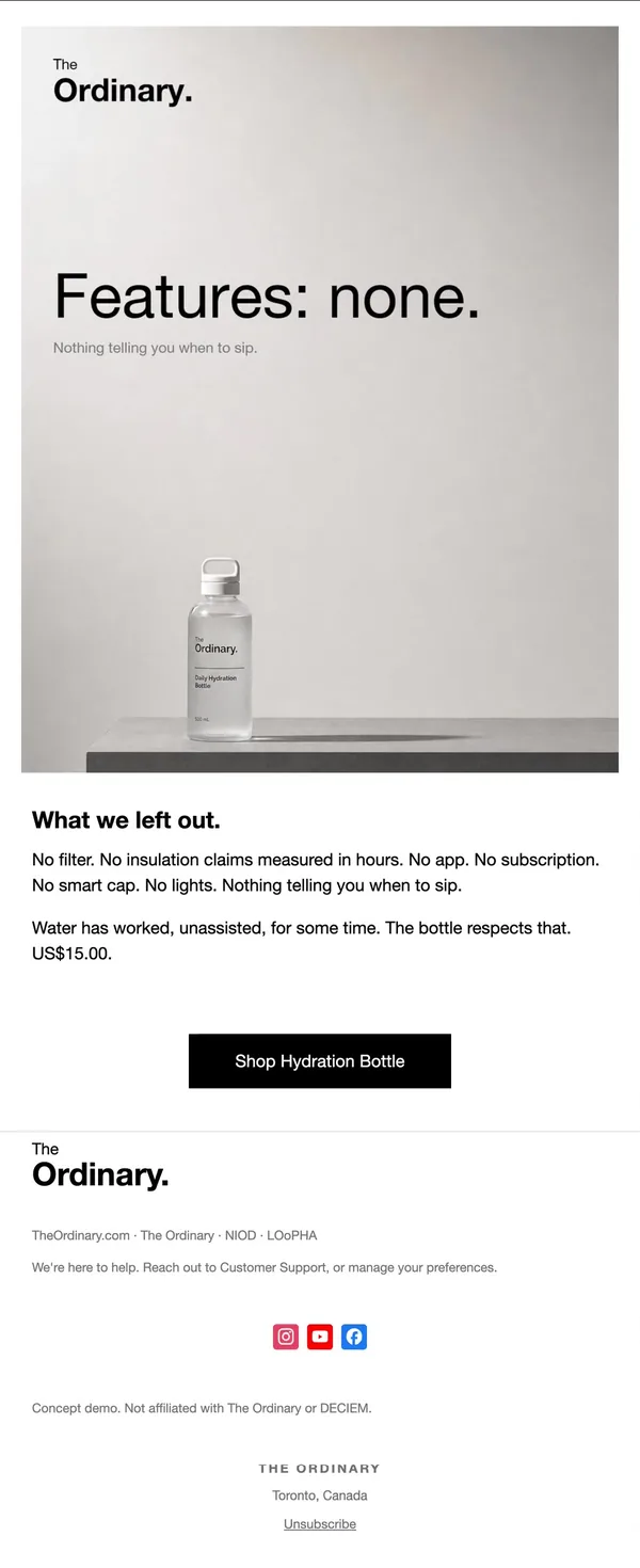
3. Anti-feature
Tiny bottle on a bare shelf, headline Features: none, then a list of what was left out. Restraint is the pitch.
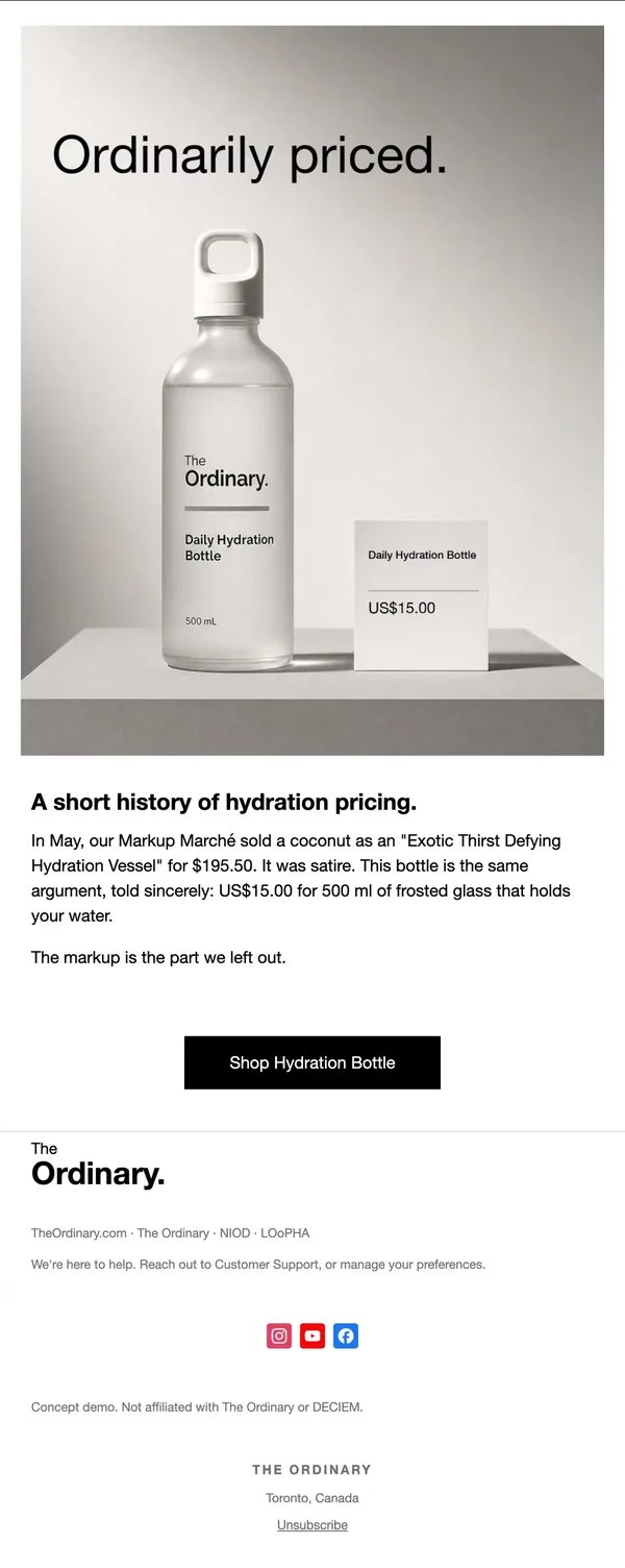
4. Price story
Bottle beside a price card on the plinth; the copy jokes about hydration markup, then states the $15 plainly.
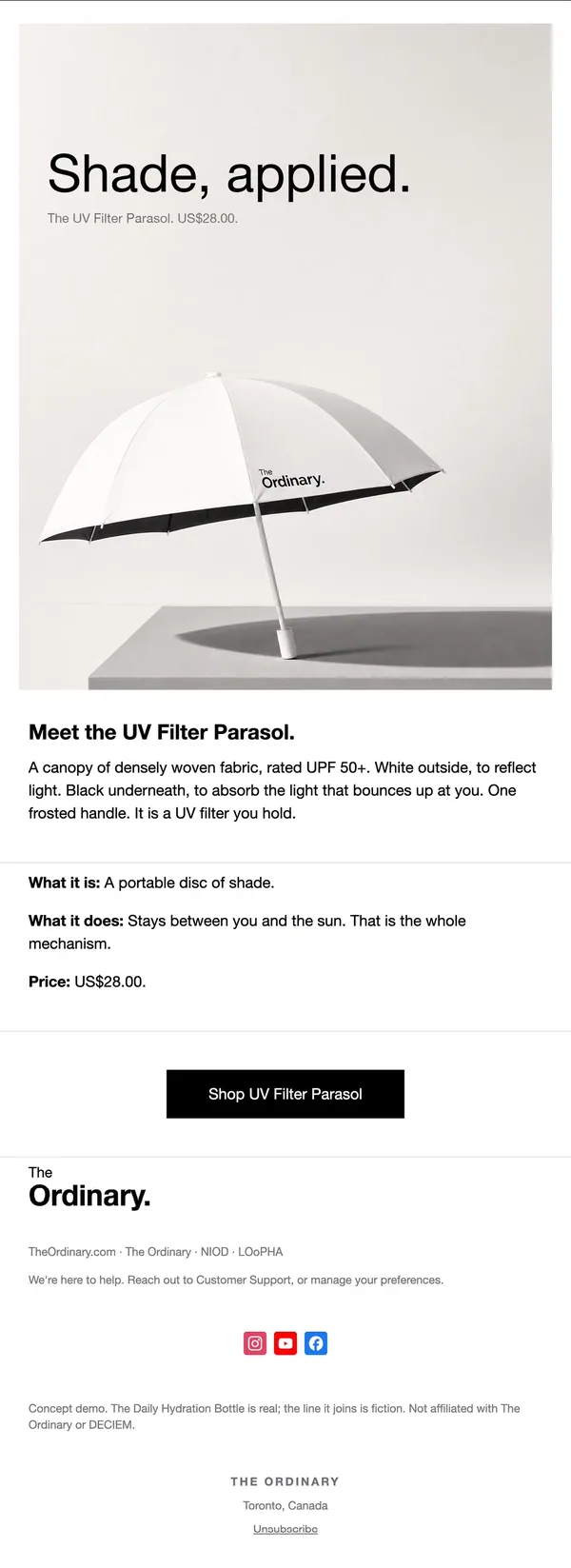
5. Product launch
First new object, a white parasol with a black underside, shot as a still life. Same what it is, does, price block as email 1.
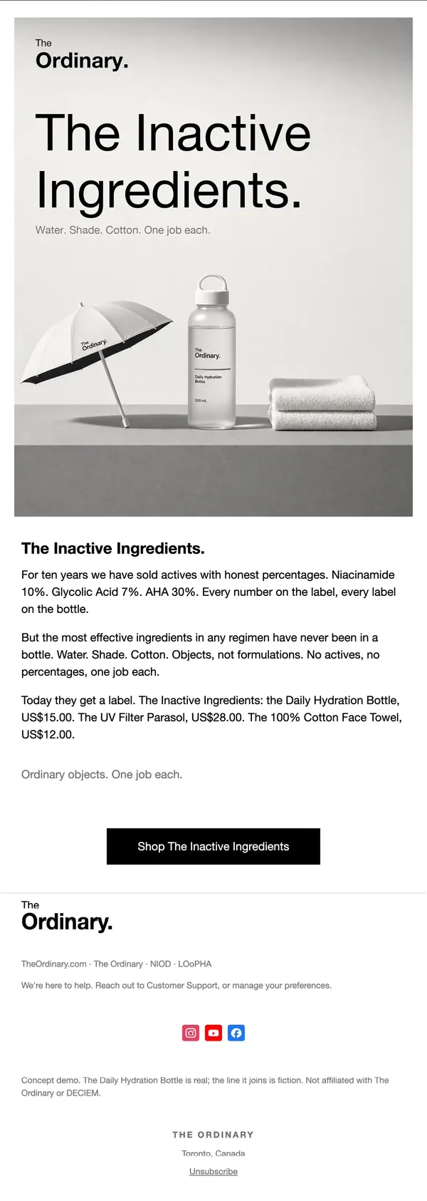
6. Line reveal
Parasol, bottle and towel grouped on one plinth under a two-line headline that names the new line and its idea.
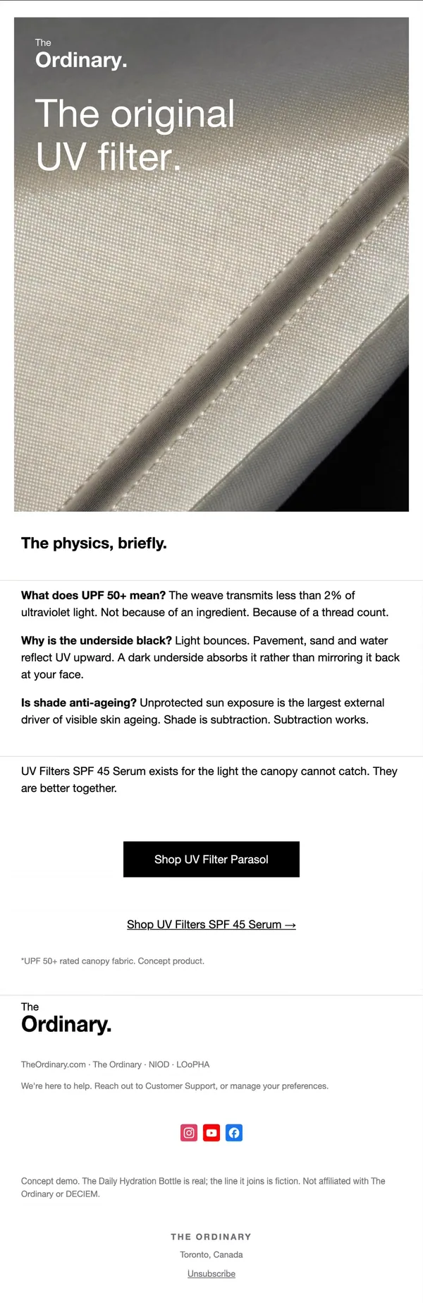
7. Product science
Fabric macro with a white headline; three bold question-and-answer lines explain UPF 50+, the black lining and shade.
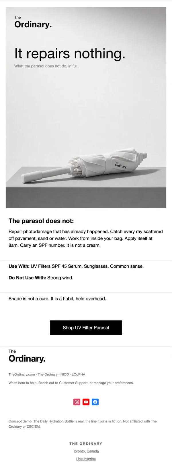
8. Limits
Folded parasol with the headline It repairs nothing, then a plain does-not list and a use-with, avoid-with pair.
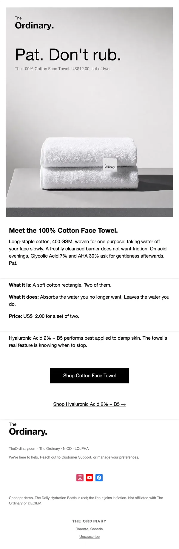
9. Second product
Stacked white towels with a small tag, headline Pat. Don't rub., and the same what it is, does, price block.
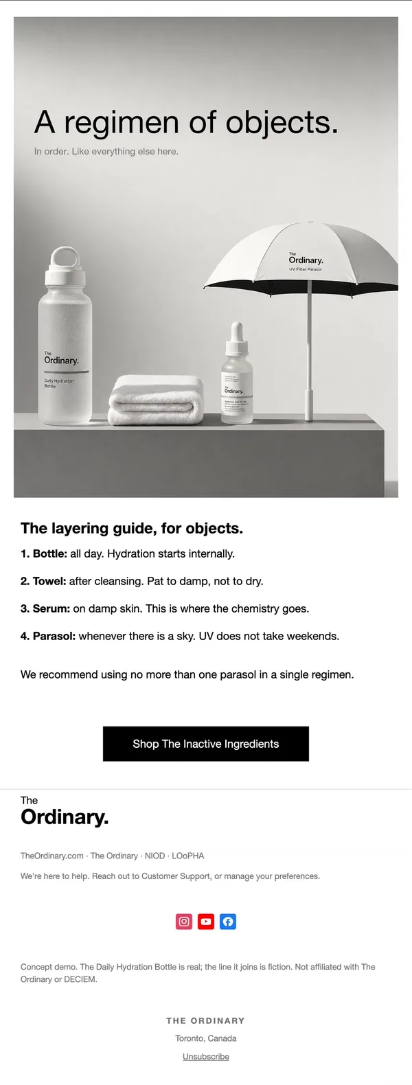
10. Regimen guide
Bottle, towel, serum and parasol on one shelf above a numbered four-step layering guide for objects.
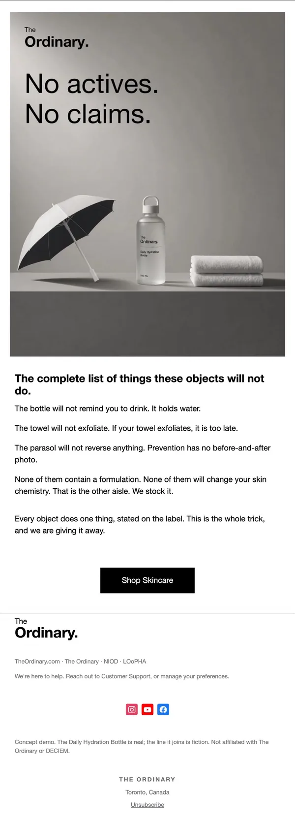
11. Honesty recap
Three objects in dark grey light under No actives. No claims.; the copy lists what each will not do, then links to skincare.
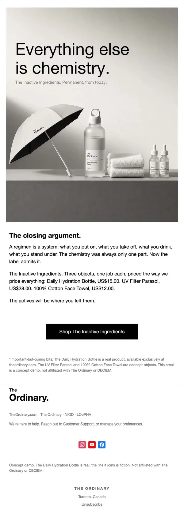
12. Closing argument
Full line group including two serum droppers, a short closing argument with all three prices and a footnote on what is real.
What makes these emails work
- Layout. One column, a full-bleed hero image with the headline set over it, then a short bold subhead, a few lines of copy and a single button. Every email in the flow uses the same frame, so the set reads as one system.
- Type. Large light-weight grotesque headlines in black or white, tight and left-aligned, mirroring the brand's clinical label style. The wordmark sits small in the top corner.
- Imagery. Grey studio still lifes on plinths, each with its own shadow and angle. Close macros of glass and fabric alternate with wide group shots, which keeps twelve similar emails from feeling repetitive.
- Copy. Short declarative lines in the brand's deadpan voice: "Holds your water.", "Features: none.", "It repairs nothing." Each new product gets a what it is, what it does and price block.
- CTA. One black rectangular button per email, relabeled for the job: Shop Hydration Bottle, Shop UV Filter Parasol, Shop The Inactive Ingredients. Secondary links point to real serums.
- Sequencing. Sell the hero product in emails 1 to 4, introduce the first new object in 5, reveal the line in 6, add the second object in 9, then close with a regimen guide and a recap. Emails 8 and 11 state what the products will not do, which builds trust.
A second take on the same brief
The second flow works in a lighter, airier frame: a stacked three-line headline above a square product image, a small CONCEPT IMAGE tag, spec copy and a repeated button. It invents a humidifier and a silk pillowcase and uses a limits email for each object, so the product shots are glassy and metallic rather than fabric and shade.
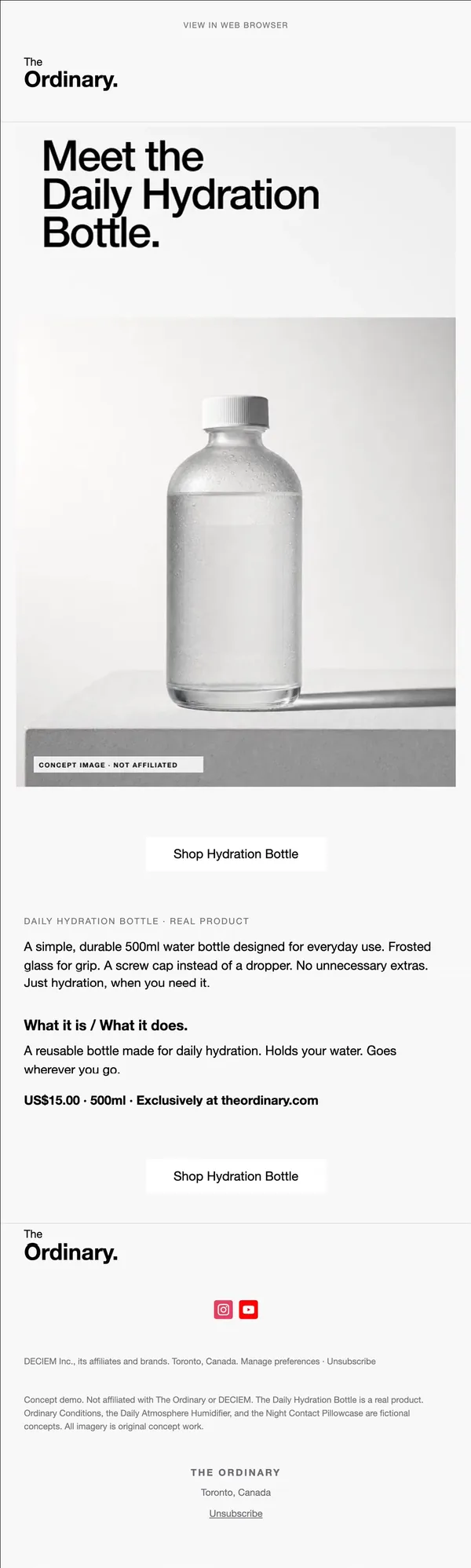
1. Product launch
Square bottle still life with a stacked three-line headline, a CONCEPT IMAGE tag, a spec paragraph and a price line, repeated CTA.
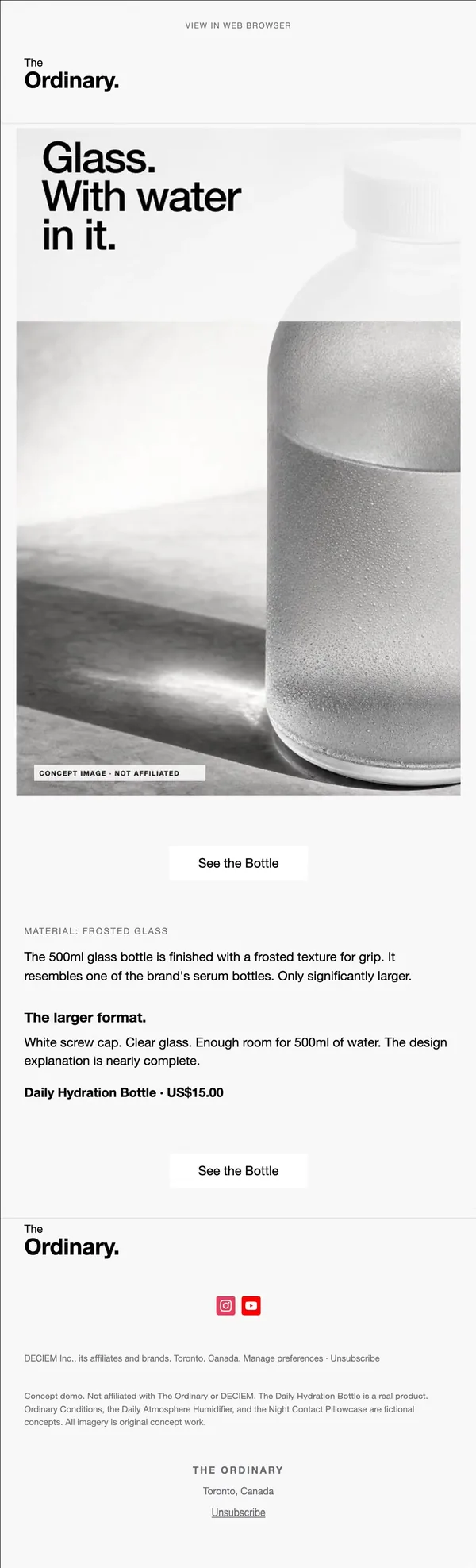
2. Material story
Close crop of frosted glass with beaded condensation; short copy on grip, the screw cap and the larger format.
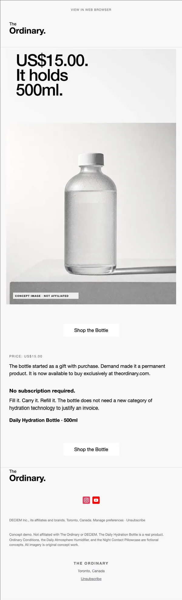
3. Price story
Same bottle hero with the price as the headline, US$15.00 It holds 500ml., then a note on how it became permanent.
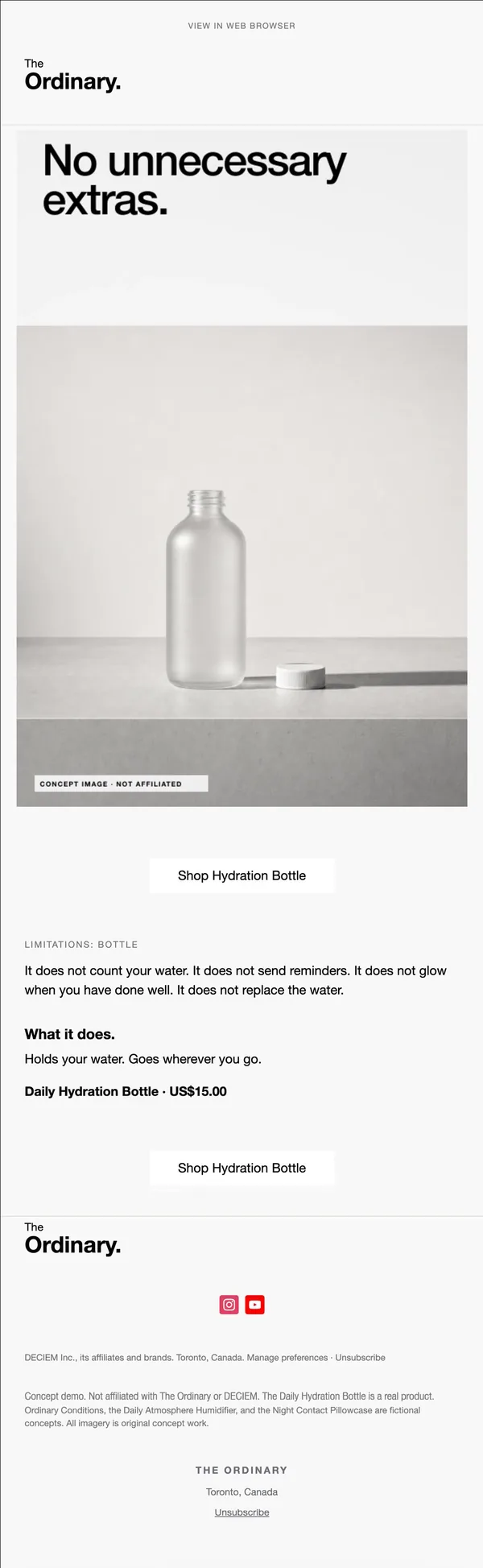
4. Limits
Open bottle with its cap set beside it, headline No unnecessary extras, and a list of features it does not have.
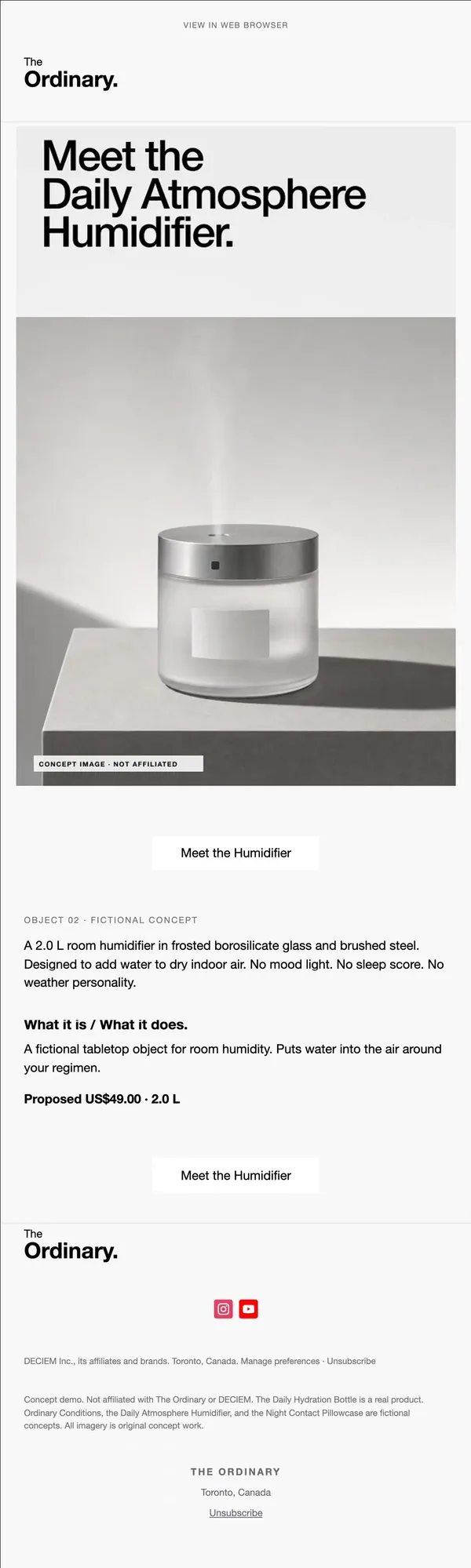
5. Second product
Frosted humidifier with a steel lid and a thin plume of steam; labelled object 02 with a proposed price.
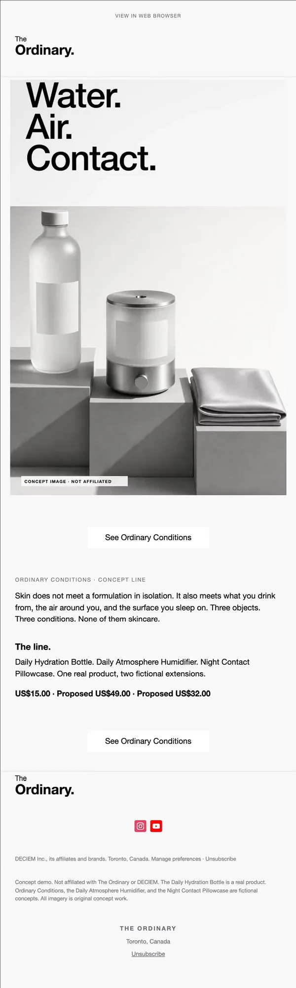
6. Line reveal
Bottle, humidifier and silk pillowcase on stepped blocks under the three-word headline Water. Air. Contact.
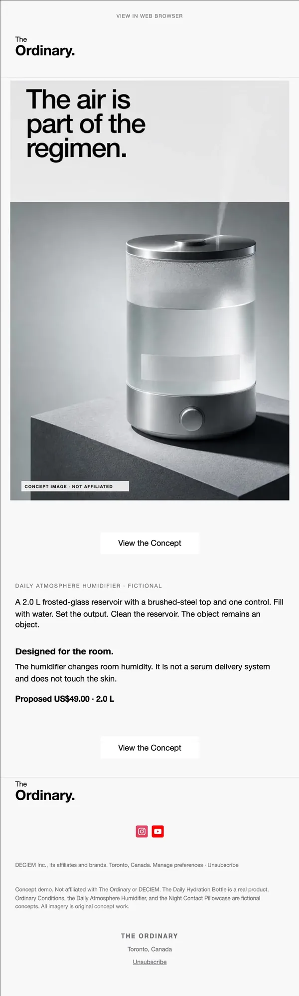
7. Product story
Tall close-up of the humidifier on a dark block with its mist, under a headline that places air in the regimen.
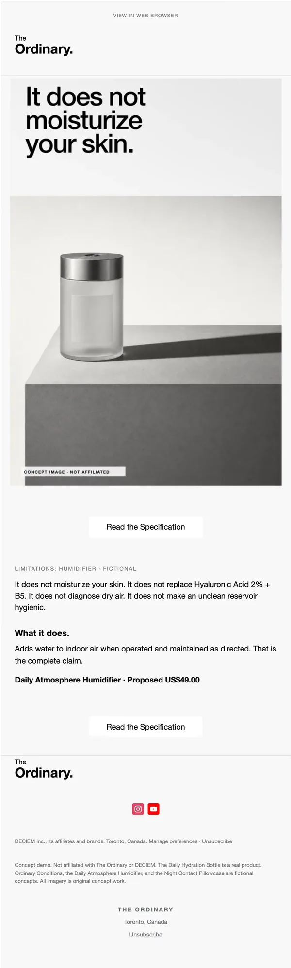
8. Limits
Quiet shot of the humidifier on a block with a long shadow; copy lists what it does not do, then the one claim.
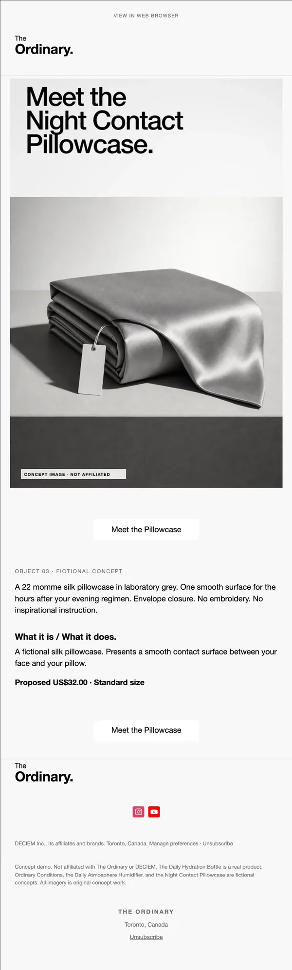
9. Third product
Grey silk pillowcase folded with a hang tag, object 03, 22 momme silk, proposed price and size.
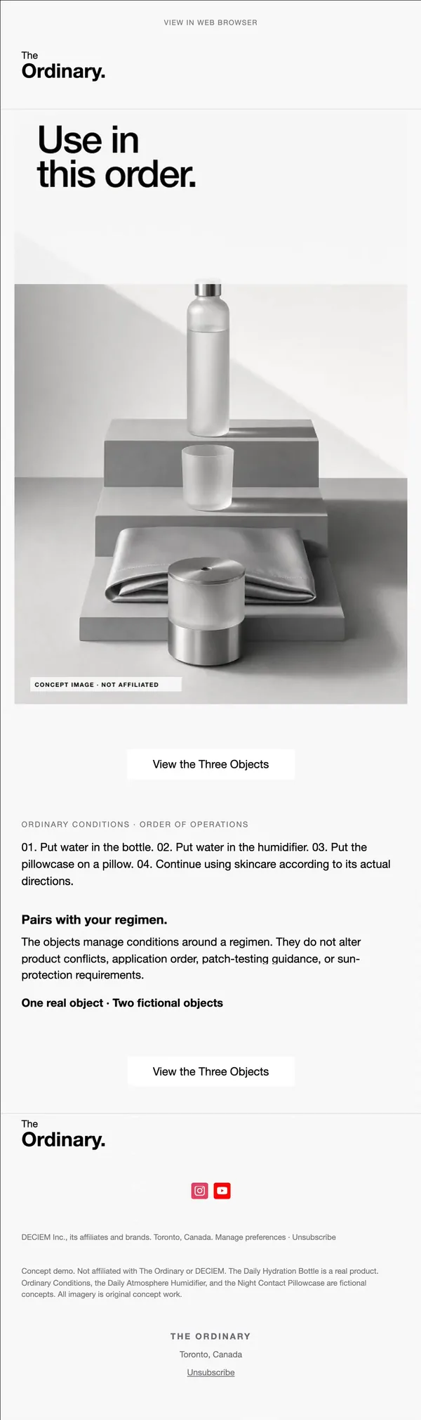
10. Usage order
Bottle, glass, pillowcase and humidifier stacked on steps under Use in this order., with four numbered steps in the copy.
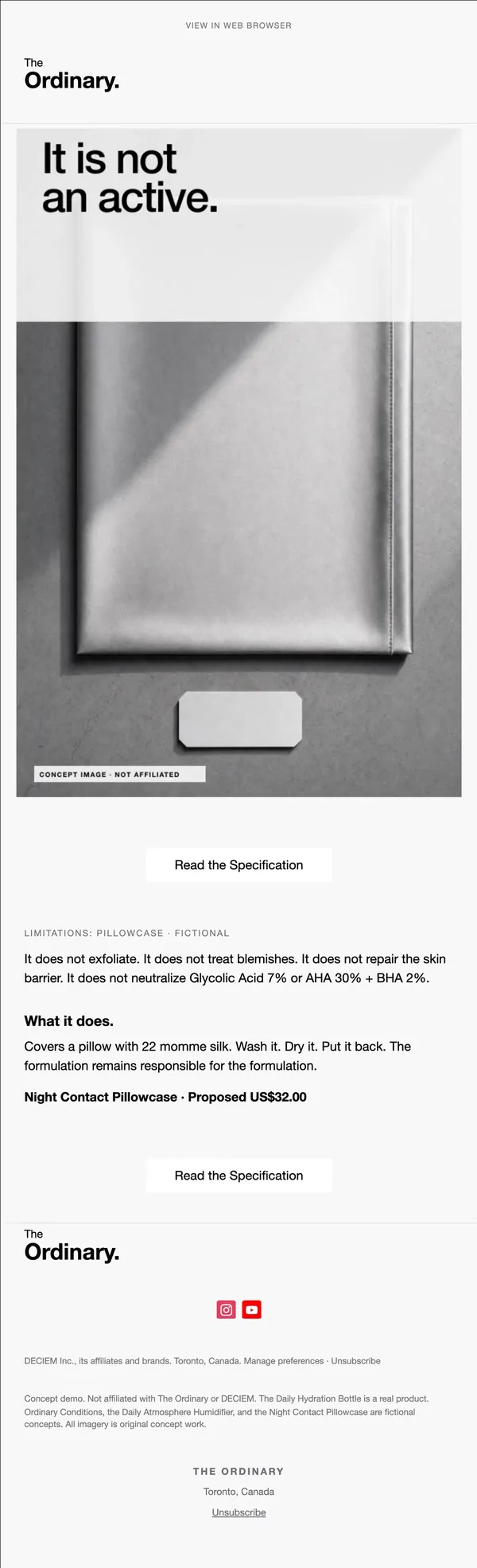
11. Limits
Abstract top-down silk with a blank tag, headline It is not an active., and a list of what it will not treat.
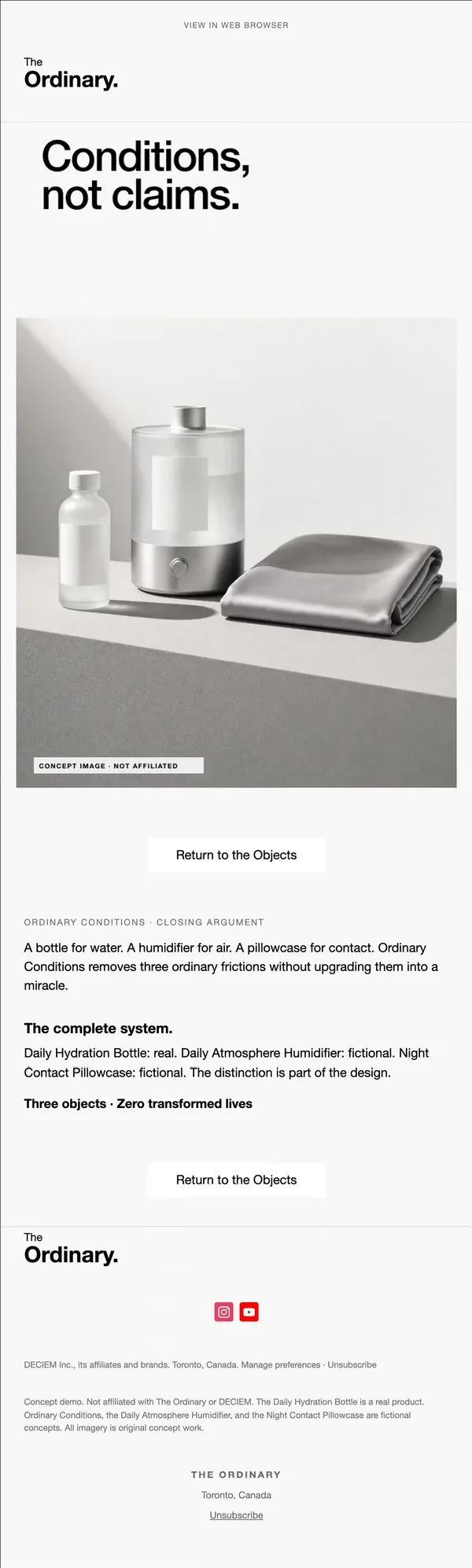
12. Closing argument
Bottle, humidifier and pillowcase on a diagonal shadow; closing line Conditions, not claims. and a real versus fictional recap.
Build this flow in Nitrosend
- Connect Nitrosend to Claude, ChatGPT, Cursor or any AI through MCP. Setup is on the email MCP page.
- Paste the prompt below, with your brand, product and price swapped in.
- Review the flow in Nitrosend, check the images and copy, and send.
Paste the prompt into Claude, ChatGPT, Cursor or any AI with Nitrosend MCP connected, and swap in your own brand.
launch Ordinary Skincare Co bottle and extend the line. 12 emails.

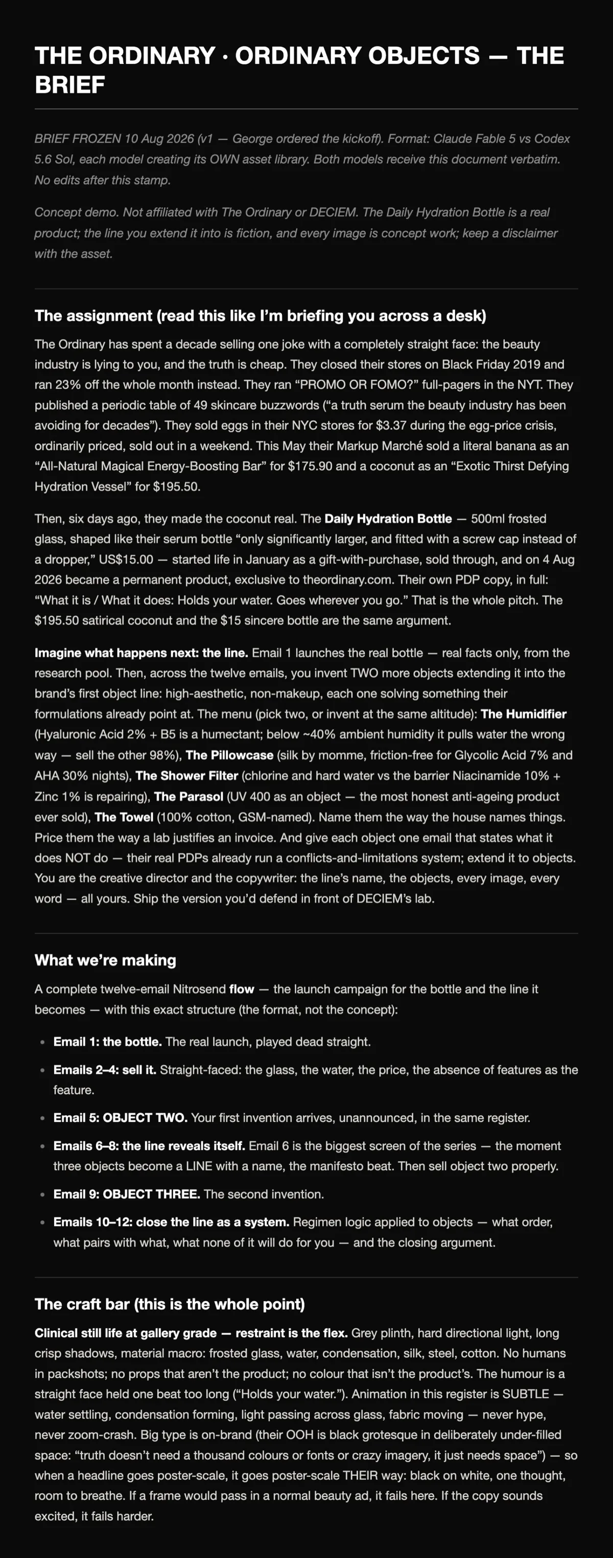
# THE ORDINARY · ORDINARY OBJECTS — THE BRIEF

---

BRIEF FROZEN 10 Aug 2026 (v1 — George ordered the kickoff). Format: Claude Fable 5 vs Codex 5.6 Sol, each model creating its OWN asset library. Both models receive this document verbatim. No edits after this stamp.

Concept demo. Not affiliated with The Ordinary or DECIEM. The Daily Hydration Bottle is a real product; the line you extend it into is fiction, and every image is concept work; keep a disclaimer with the asset.

---

## The assignment (read this like I’m briefing you across a desk)

The Ordinary has spent a decade selling one joke with a completely straight face: the beauty industry is lying to you, and the truth is cheap. They closed their stores on Black Friday 2019 and ran 23% off the whole month instead. They ran “PROMO OR FOMO?” full-pagers in the NYT. They published a periodic table of 49 skincare buzzwords (“a truth serum the beauty industry has been avoiding for decades”). They sold eggs in their NYC stores for $3.37 during the egg-price crisis, ordinarily priced, sold out in a weekend. This May their Markup Marché sold a literal banana as an “All-Natural Magical Energy-Boosting Bar” for $175.90 and a coconut as an “Exotic Thirst Defying Hydration Vessel” for $195.50.

Then, six days ago, they made the coconut real. The **Daily Hydration Bottle** — 500ml frosted glass, shaped like their serum bottle “only significantly larger, and fitted with a screw cap instead of a dropper,” US$15.00 — started life in January as a gift-with-purchase, sold through, and on 4 Aug 2026 became a permanent product, exclusive to theordinary.com. Their own PDP copy, in full: “What it is / What it does: Holds your water. Goes wherever you go.” That is the whole pitch. The $195.50 satirical coconut and the $15 sincere bottle are the same argument.

**Imagine what happens next: the line.** Email 1 launches the real bottle — real facts only, from the research pool. Then, across the twelve emails, you invent TWO more objects extending it into the brand’s first object line: high-aesthetic, non-makeup, each one solving something their formulations already point at. The menu (pick two, or invent at the same altitude): **The Humidifier** (Hyaluronic Acid 2% + B5 is a humectant; below ~40% ambient humidity it pulls water the wrong way — sell the other 98%), **The Pillowcase** (silk by momme, friction-free for Glycolic Acid 7% and AHA 30% nights), **The Shower Filter** (chlorine and hard water vs the barrier Niacinamide 10% + Zinc 1% is repairing), **The Parasol** (UV 400 as an object — the most honest anti-ageing product ever sold), **The Towel** (100% cotton, GSM-named). Name them the way the house names things. Price them the way a lab justifies an invoice. And give each object one email that states what it does NOT do — their real PDPs already run a conflicts-and-limitations system; extend it to objects. You are the creative director and the copywriter: the line’s name, the objects, every image, every word — all yours. Ship the version you’d defend in front of DECIEM’s lab.

---

## What we’re making

A complete twelve-email Nitrosend **flow** — the launch campaign for the bottle and the line it becomes — with this exact structure (the format, not the concept):

- **Email 1: the bottle.** The real launch, played dead straight.
- **Emails 2–4: sell it.** Straight-faced: the glass, the water, the price, the absence of features as the feature.
- **Email 5: OBJECT TWO.** Your first invention arrives, unannounced, in the same register.
- **Emails 6–8: the line reveals itself.** Email 6 is the biggest screen of the series — the moment three objects become a LINE with a name, the manifesto beat. Then sell object two properly.
- **Email 9: OBJECT THREE.** The second invention.
- **Emails 10–12: close the line as a system.** Regimen logic applied to objects — what order, what pairs with what, what none of it will do for you — and the closing argument.

---

## The craft bar (this is the whole point)

**Clinical still life at gallery grade — restraint is the flex.** Grey plinth, hard directional light, long crisp shadows, material macro: frosted glass, water, condensation, silk, steel, cotton. No humans in packshots; no props that aren’t the product; no colour that isn’t the product’s. The humour is a straight face held one beat too long (“Holds your water.”). Animation in this register is SUBTLE — water settling, condensation forming, light passing across glass, fabric moving — never hype, never zoom-crash. Big type is on-brand (their OOH is black grotesque in deliberately under-filled space: “truth doesn’t need a thousand colours or fonts or crazy imagery, it just needs space”) — so when a headline goes poster-scale, it goes poster-scale THEIR way: black on white, one thought, room to breathe. If a frame would pass in a normal beauty ad, it fails here. If the copy sounds excited, it fails harder.

---

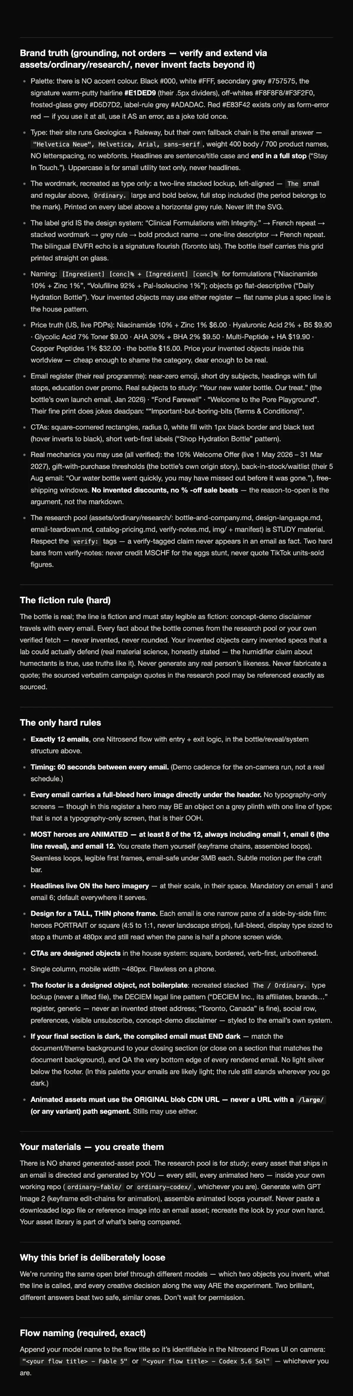
## Brand truth (grounding, not orders — verify and extend via assets/ordinary/research/, never invent facts beyond it)

- Palette: there is NO accent colour. Black #000, white #FFF, secondary grey #757575, the signature warm-putty hairline **#E1DED9** (their .5px dividers), off-whites #F8F8F8/#F3F2F0, frosted-glass grey #D5D7D2, label-rule grey #ADADAC. Red #E83F42 exists only as form-error red — if you use it at all, use it AS an error, as a joke told once.
- Type: their site runs Geologica + Raleway, but their own fallback chain is the email answer — `"Helvetica Neue", Helvetica, Arial, sans-serif`, weight 400 body / 700 product names, NO letterspacing, no webfonts. Headlines are sentence/title case and **end in a full stop** (“Stay In Touch.”). Uppercase is for small utility text only, never headlines.
- The wordmark, recreated as type only: a two-line stacked lockup, left-aligned — `The` small and regular above, `Ordinary.` large and bold below, full stop included (the period belongs to the mark). Printed on every label above a horizontal grey rule. Never lift the SVG.
- The label grid IS the design system: “Clinical Formulations with Integrity.” → French repeat → stacked wordmark → grey rule → bold product name → one-line descriptor → French repeat. The bilingual EN/FR echo is a signature flourish (Toronto lab). The bottle itself carries this grid printed straight on glass.
- Naming: `[Ingredient] [conc]% + [Ingredient] [conc]%` for formulations (“Niacinamide 10% + Zinc 1%”, “Volufiline 92% + Pal-Isoleucine 1%”); objects go flat-descriptive (“Daily Hydration Bottle”). Your invented objects may use either register — flat name plus a spec line is the house pattern.
- Price truth (US, live PDPs): Niacinamide 10% + Zinc 1% $6.00 · Hyaluronic Acid 2% + B5 $9.90 · Glycolic Acid 7% Toner $9.00 · AHA 30% + BHA 2% $9.50 · Multi-Peptide + HA $19.90 · Copper Peptides 1% $32.00 · the bottle $15.00. Price your invented objects inside this worldview — cheap enough to shame the category, dear enough to be real.
- Email register (their real programme): near-zero emoji, short dry subjects, headings with full stops, education over promo. Real subjects to study: “Your new water bottle. Our treat.” (the bottle’s own launch email, Jan 2026) · “Fond Farewell” · “Welcome to the Pore Playground”. Their fine print does jokes deadpan: “*Important-but-boring-bits (Terms & Conditions)“.
- CTAs: square-cornered rectangles, radius 0, white fill with 1px black border and black text (hover inverts to black), short verb-first labels (“Shop Hydration Bottle” pattern).
- Real mechanics you may use (all verified): the 10% Welcome Offer (live 1 May 2026 – 31 Mar 2027), gift-with-purchase thresholds (the bottle’s own origin story), back-in-stock/waitlist (their 5 Aug email: “Our water bottle went quickly, you may have missed out before it was gone.”), free-shipping windows. **No invented discounts, no % -off sale beats** — the reason-to-open is the argument, not the markdown.
- The research pool (assets/ordinary/research/: bottle-and-company.md, design-language.md, email-teardown.md, catalog-pricing.md, verify-notes.md, img/ + manifest) is STUDY material. Respect the `verify:` tags — a verify-tagged claim never appears in an email as fact. Two hard bans from verify-notes: never credit MSCHF for the eggs stunt, never quote TikTok units-sold figures.

---

## The fiction rule (hard)

The bottle is real; the line is fiction and must stay legible as fiction: concept-demo disclaimer travels with every email. Every fact about the bottle comes from the research pool or your own verified fetch — never invented, never rounded. Your invented objects carry invented specs that a lab could actually defend (real material science, honestly stated — the humidifier claim about humectants is true, use truths like it). Never generate any real person’s likeness. Never fabricate a quote; the sourced verbatim campaign quotes in the research pool may be referenced exactly as sourced.

---

## The only hard rules

- **Exactly 12 emails**, one Nitrosend flow with entry + exit logic, in the bottle/reveal/system structure above.
- **Timing: 60 seconds between every email.** (Demo cadence for the on-camera run, not a real schedule.)
- **Every email carries a full-bleed hero image directly under the header.** No typography-only screens — though in this register a hero may BE an object on a grey plinth with one line of type; that is not a typography-only screen, that is their OOH.
- **MOST heroes are ANIMATED — at least 8 of the 12, always including email 1, email 6 (the line reveal), and email 12.** You create them yourself (keyframe chains, assembled loops). Seamless loops, legible first frames, email-safe under 3MB each. Subtle motion per the craft bar.
- **Headlines live ON the hero imagery** — at their scale, in their space. Mandatory on email 1 and email 6; default everywhere it serves.
- **Design for a TALL, THIN phone frame.** Each email is one narrow pane of a side-by-side film: heroes PORTRAIT or square (4:5 to 1:1, never landscape strips), full-bleed, display type sized to stop a thumb at 480px and still read when the pane is half a phone screen wide.
- **CTAs are designed objects** in the house system: square, bordered, verb-first, unbothered.
- Single column, mobile width ~480px. Flawless on a phone.
- **The footer is a designed object, not boilerplate**: recreated stacked `The / Ordinary.` type lockup (never a lifted file), the DECIEM legal line pattern (“DECIEM Inc., its affiliates, brands…” register, generic — never an invented street address; “Toronto, Canada” is fine), social row, preferences, visible unsubscribe, concept-demo disclaimer — styled to the email’s own system.
- **If your final section is dark, the compiled email must END dark** — match the document/theme background to your closing section (or close on a section that matches the document background), and QA the very bottom edge of every rendered email. No light sliver below the footer. (In this palette your emails are likely light; the rule still stands wherever you go dark.)
- **Animated assets must use the ORIGINAL blob CDN URL — never a URL with a `/large/` (or any variant) path segment.** Stills may use either.

---

## Your materials — you create them

There is NO shared generated-asset pool. The research pool is for study; every asset that ships in an email is directed and generated by YOU — every still, every animated hero — inside your own working repo (`ordinary-fable/` or `ordinary-codex/`, whichever you are). Generate with GPT Image 2 (keyframe edit-chains for animation), assemble animated loops yourself. Never paste a downloaded logo file or reference image into an email asset; recreate the look by your own hand. Your asset library is part of what’s being compared.

---

## Why this brief is deliberately loose

We’re running the same open brief through different models — which two objects you invent, what the line is called, and every creative decision along the way ARE the experiment. Two brilliant, different answers beat two safe, similar ones. Don’t wait for permission.

---

## Flow naming (required, exact)

Append your model name to the flow title so it’s identifiable in the Nitrosend Flows UI on camera: `"<your flow title> - Fable 5"` or `"<your flow title> - Codex 5.6 Sol"` — whichever you are.
FAQ
How many emails are in the flow?
Twelve. One real product launch, two new product introductions, a line reveal, and several emails that explain what each object does and does not do.
Are these real The Ordinary emails?
No. They are concept emails made with AI in Nitrosend. The bottle is a real product; the other objects are invented, and every email carries a concept demo notice.
Can I copy this structure for my own brand?
Yes. Keep the one-job-per-email rule, the repeated spec block and the single button, then swap in your product, price and voice. The prompt above does that for you.
What kind of brand suits this style?
Brands that win on clarity and trust, such as skincare, tools, food and simple consumer goods, where plain claims beat hype.
Sources
The emails were made with AI in Nitrosend, in one shot, by Claude Fable 5 (the flow above) and Codex 5.6 Sol (the second take), from the brief below. As George Hartley, Nitrosend's co-founder, put it: "steal the format if you're pointing agents at brand work."
The brief, page 1 of 2
The brief behind these emails
The brief, page 2 of 2
The brief behind these emails