
![Calm discount offer email: [NAME] , your discount is inside.](/email-examples/img/19ab54e6085445c9-t.webp)
What minimalist email design is
Minimalist email design keeps only what the message needs: one column, few elements, plenty of white space and usually a single thing to look at.
We collected 2,476 of them from 1,016 brands, sent between 2016 and 2026, out of two real inboxes that are part of the Nitrosend email library. This page shows 166 of them from 144 brands, 145 sent in 2023 or later. We left off repeats of one brand's template, emails our tagging called minimal that are visibly designed (photo-led, poster type, dense product grids), sign-in alerts, codes and live account links, emails that showed someone's personal details or private health and money matters, broken or clipped renders and a few others, one of them our own send. The tables below still count all of them.
Minimal is not the same as plain. Only 3% of these emails use a plain-text layout; the rest are designed HTML that holds back. For emails that read like a typed note, see the plain text email examples.
166 minimal emails you can open
The first screen is recent marketing sends (launches, welcomes, offers and surveys), starting with Anthropic, Cursor, Calm, Wispr Flow and Perplexity. Of the 166 shown, 13 are promotions, 22 surveys, 11 welcomes and 12 product launches, and 158 use a single-column layout. Open any email for its subject line, what it does and the prompt that rebuilds it.
Anthropic
Claude, meet Android
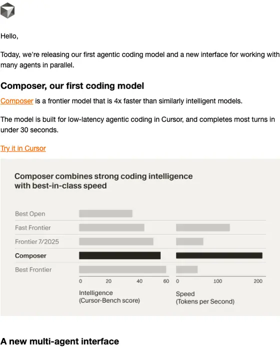
Cursor Team
Introducing Cursor 2.0 and Composer
Calm
[NAME] , your discount is inside.
Wispr Flow
Welcome to Wispr Flow 💜
Perplexity
Comet is now available to everyone
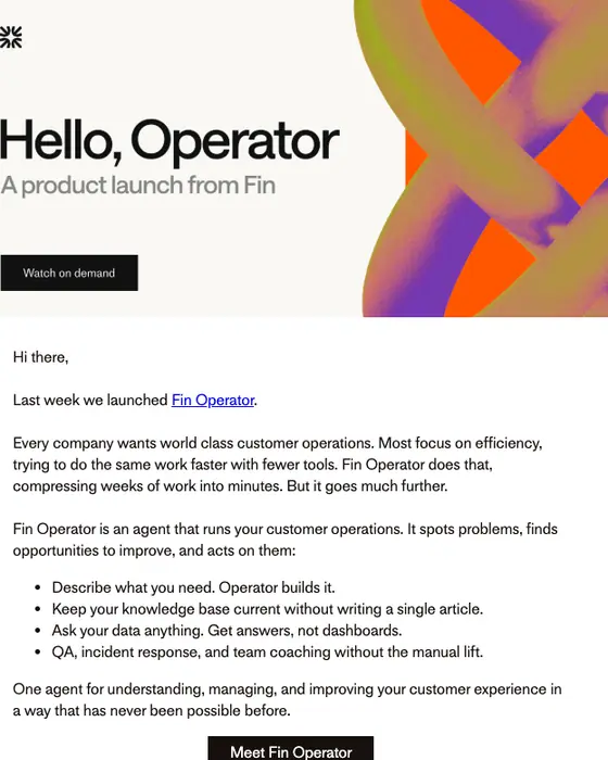
Fin
Hello, Operator
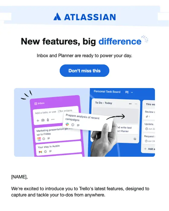
Trello
Trello just got better ✨
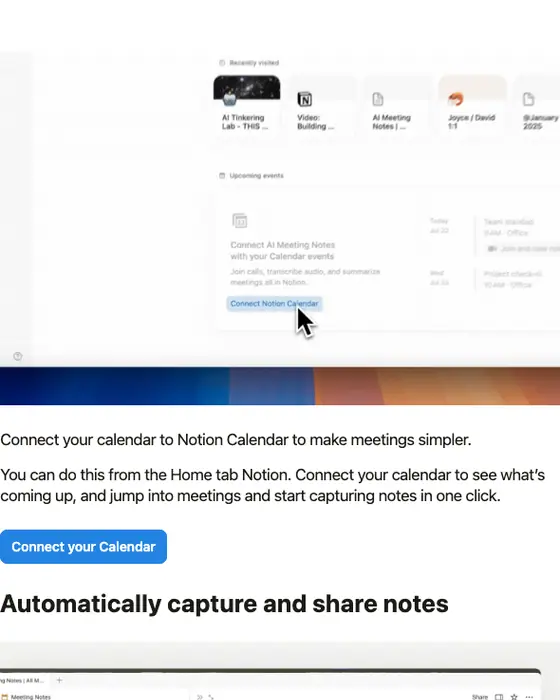
Notion
Connect your calendar with AI Meeting Notes
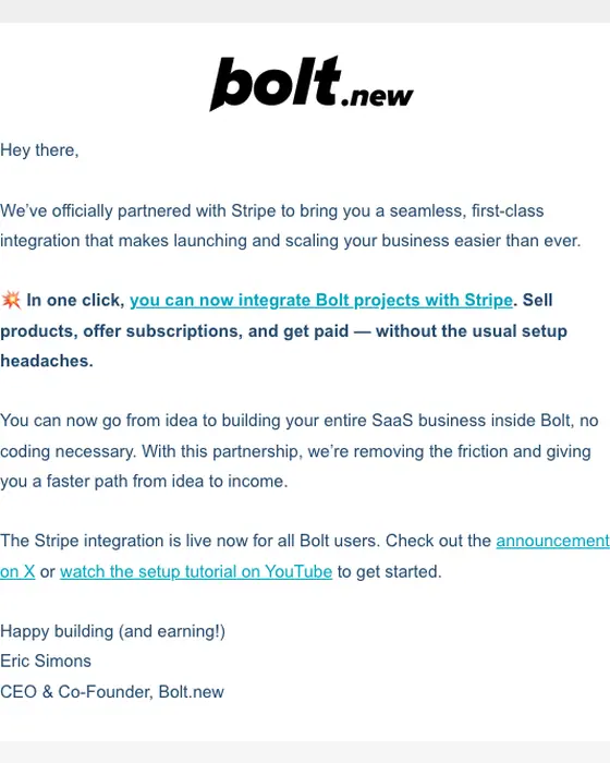
Bolt.new
Bolt + Stripe is live 💥
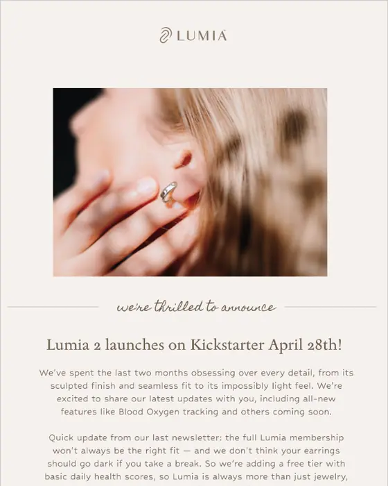
Lumia Health
Lumia 2 Pre-Orders Open April 28th 🎉
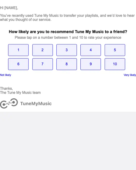
Tune My Music
Quick question for you
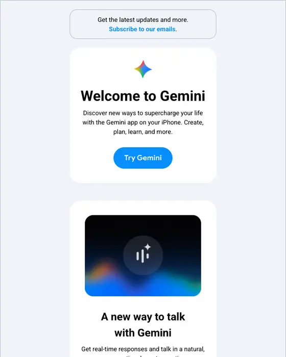
Google Gemini
Hey [NAME], welcome to Gemini
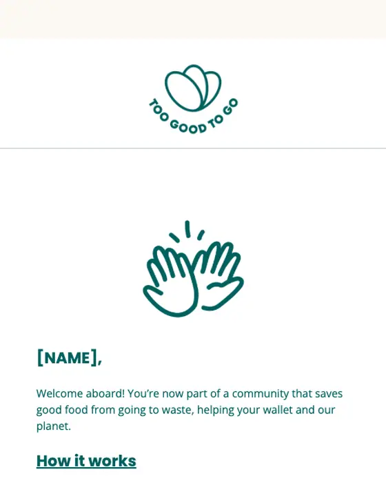
Too Good To Go
Welcome to Too Good To Go!
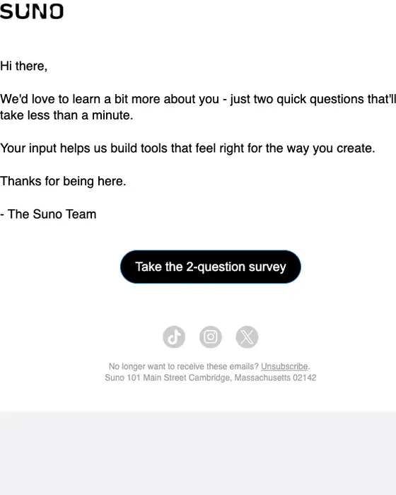
Suno
Quick question for you
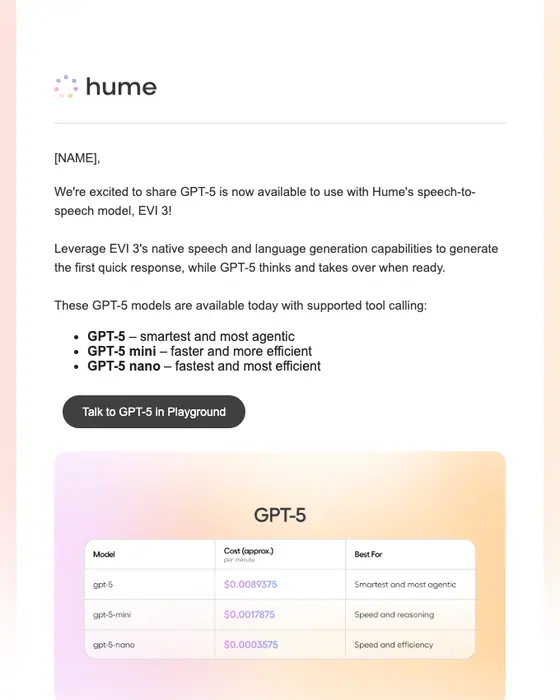
Hume
Talk to GPT-5 now via EVI 3
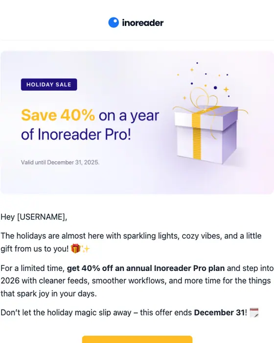
Inoreader
Holiday sale: Save 40% on a year of Pro! 🎄
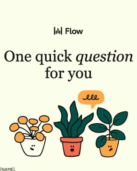
Wispr Flow
One quick question for you
Turo
Give your pup the ride of their life
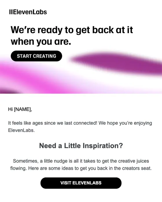
ElevenLabs
Need a little inspo?
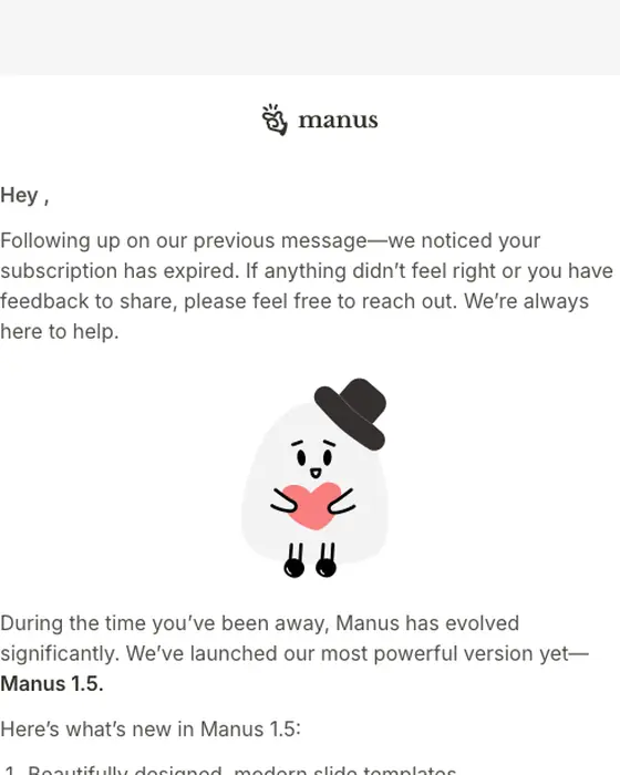
Manus
Return to Manus and Try the Upgraded 1.5 for Free (7 Days)
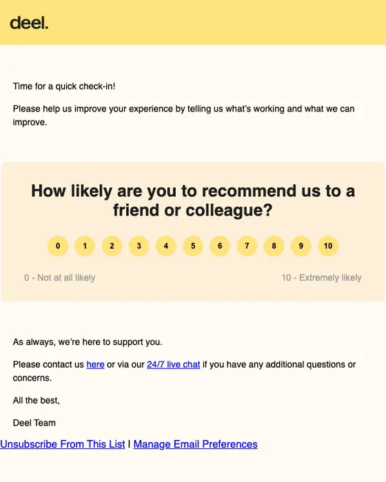
Deel
How are we doing?
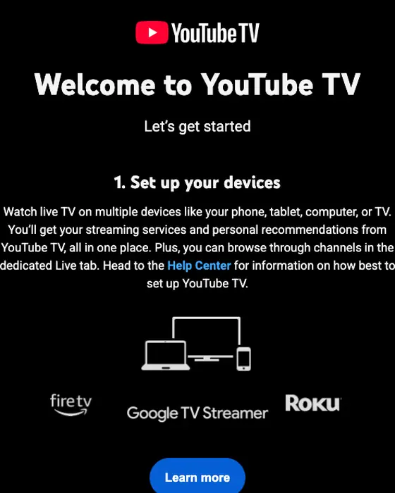
YouTube TV
Welcome to YouTube TV, [NAME]
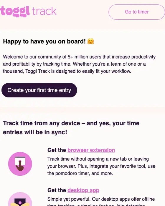
Toggl Track
Welcome to Toggl Track!
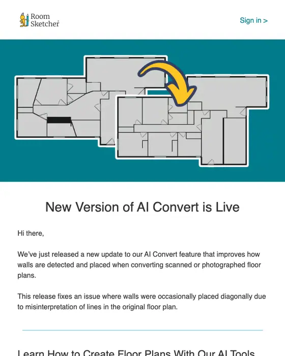
RoomSketcher
New AI Convert Update
How minimal emails differ from the rest
Minimal emails against every other email in the library
2,476 minimal emails and 10,235 others, same two inboxes| What we counted | Minimal | Every other email |
|---|---|---|
| Single-column layout | 93% | 58% |
| Plain-text layout | 3% | 39% |
| Micro or short | 78% | 47% |
| Long | 3% | 20% |
| Exactly one call to action | 38% | 28% |
| Five or more calls to action | 16% | 25% |
| Median calls to action | 2 | 2 |
| Mostly images (tagged image heavy) | 13% | 4% |
| Mostly text (tagged text heavy) | 45% | 64% |
| Greets the reader by first name | 31% | 43% |
| Sent to a business audience | 10% | 21% |
| Promotions, sales and discount offers | 30% | 28% |
| Limited color palette (tagged monochrome) | 53% | 64% |
The clearest difference is shape. 93% of minimal emails use one column, against 58% of everything else, and 78% are micro or short, against 47%. Only 3% run long. They ask for less, but not by a rule: 38% have exactly one call to action (against 28%) and 16% have five or more (against 25%), while the median is two for both. Minimal does not mean no pictures either. Our tagging marks 13% of them as mostly images, against 4% of the rest. Nor does it mean a restricted palette: 53% are tagged monochrome (1,317 of 2,476), against 64% of everything else, so minimal emails use color more often, not less. They greet the reader by first name less often (31% against 43%) and are aimed at a business audience half as often (10% against 21%).
For how designers put these choices together, see our best email designs of 2026.
Where the white space comes from
White space is the one part of minimalist email design that can arrive without anyone choosing it. The MJML email framework gives every section a default padding of 20px above and below, and every text block 10px above and below, so five stacked text sections open with 200px of section padding alone, before the sender has decided anything. Nitrosend ran into this building its own digest emails and tightened the spacing for them: gaps that nobody chose read as empty rather than as restraint.
What is in the minimal collection
What the minimal emails are
2,476 emails, top 8 types| Type | Emails | Share |
|---|---|---|
| Promotional | 484 | 20% |
| Shipping | 207 | 8% |
| Product launch | 163 | 7% |
| Newsletter | 148 | 6% |
| Survey | 144 | 6% |
| Discount offer | 133 | 5% |
| Sale | 129 | 5% |
| Welcome | 122 | 5% |
When in the customer's life they arrive
2,476 emails, top 5 stages| Stage | Emails | Share |
|---|---|---|
| Keeping an existing customer | 1,038 | 42% |
| After a purchase or booking | 593 | 24% |
| Winning a new one | 277 | 11% |
| Activation | 211 | 9% |
| Onboarding | 177 | 7% |
One brand moves the type table. Depop sent 220 of the 2,476 emails (9%), almost all of them order notices: 123 of the 207 shipping emails are Depop's. Without Depop, shipping drops out of the top eight. None of Depop's are in the grid: every one rendered for this page named a private seller. Most minimal emails go to people who are already customers: 42% are about keeping one, and 24% arrive after a purchase or booking.
Next to this one
The same library by structure: single column email layouts. By style: plain text, utilitarian, editorial, corporate, playful and bold graphic. By the types that most often go out minimal: welcome emails, survey emails and product launch emails.
Questions people ask
Minimalist email design strips an email back to the message: one column, few elements, white space and one main thing to look at. In our library 93% of the 2,476 minimal emails use a single column, against 58% of other emails, and 78% are micro or short.
Fewer than most, though not always one. Of the 2,476 minimal emails we collected, 38% have exactly one call to action, against 28% of other emails, and 16% have five or more, against 25%. The median is two for both, so the difference is in how few carry a long list of links.
Put everything in one column, lead with the point, keep it short and keep the number of actions down. The minimal emails here are 93% single column and 78% micro or short, and 38% have exactly one call to action against 28% of other emails. Simple is not plain text, though: only 3% use a plain-text layout.
Often, yes. Our tagging marks 13% of minimal emails as mostly images, against 4% of other emails, and 45% as mostly text, against 64%. So minimal emails lean on pictures more than other emails do, and the restraint shows in the number of elements and the single column, not in leaving images out.
Less often than you would expect. Advice on minimalist design usually says to restrict the palette, but in our library 53% of the 2,476 minimal emails (1,317) are tagged monochrome, against 64% of other emails. Minimal emails cut elements and columns, not color.
777 were rendered for this page and we cut 611: 327 tagged minimal that are visibly designed, 116 repeats of one brand's template, 91 that showed personal or private details, 24 sign-in alerts, codes and live links, 48 broken or clipped renders and 5 others. The tables count all 2,476.