
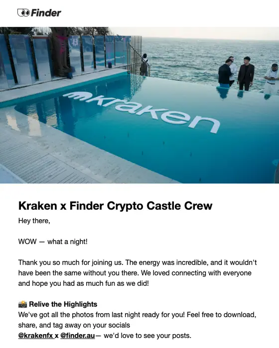
What a fintech email is
A fintech email is a message a payments, investing, crypto, lending or budgeting app sends to the people who use it. Most are receipts and account mail, sign-in and security messages, and the offers and newsletters that make up fintech email marketing.
We collected 339 from 66 fintech brands in two ordinary inboxes, sent between 2016 and 2026, and show 57 of them here from 28 brands. One sender shapes the totals: PayPal sent 158 of the 339, including 135 of the 144 receipts. So every number on this page is given twice, once for all 339 and once for the 181 emails from the other 65 brands. 234 of the 339 came from Australian senders, so the set leans Australian.
Browse all 57 fintech emails
Filter by the kind of email, or search a brand or subject line. Open any email to see it full length, with its subject line, notes on what it is doing, and a prompt that rebuilds it.
The grid is not a sample of the collection. It holds 3 PayPal emails where the collection holds 158, and 17 of the 57 shown are promotional. 46 of the 57 were sent in 2025 or 2026.
Stake
Five U.S. stocks Stake investors are loving 🔥
Polymarket
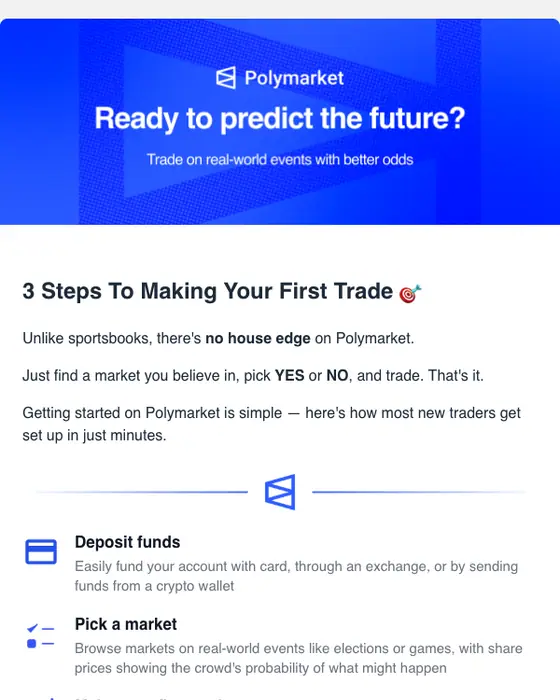
Your first Polymarket trade in 3 steps 🎯
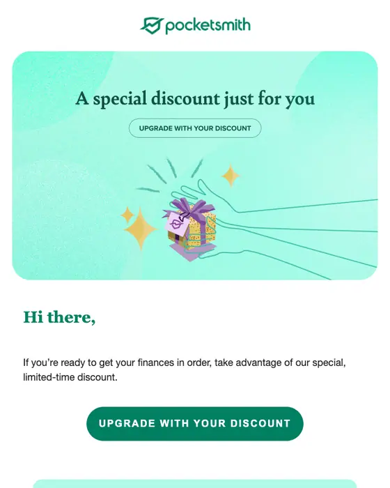
PocketSmith
A special discount for you
Coinbase
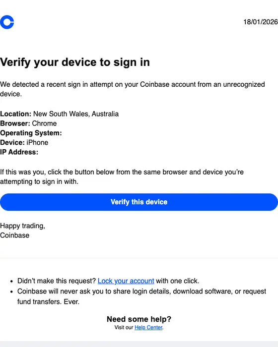
Verify your device to sign in
PocketSmith
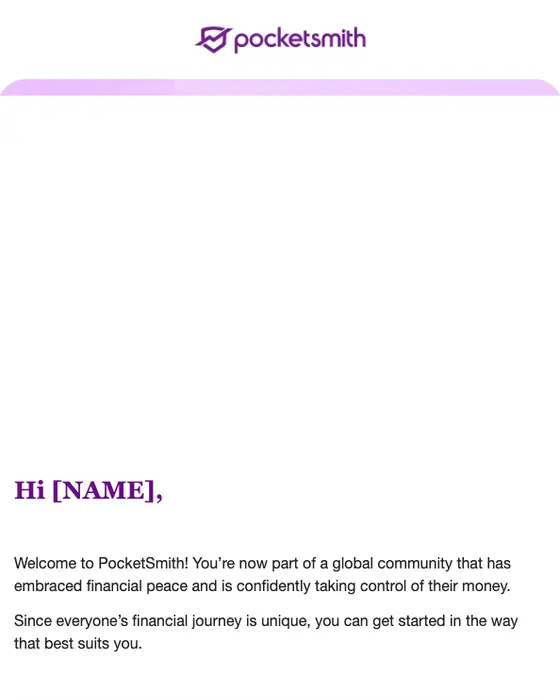
Welcome to PocketSmith - let's get started, your way
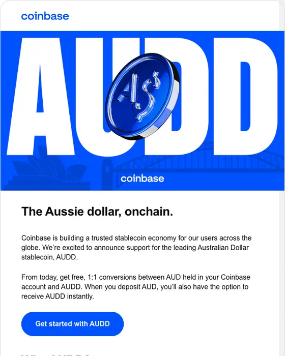
Coinbase
AUDD is live in Australia on Coinbase.
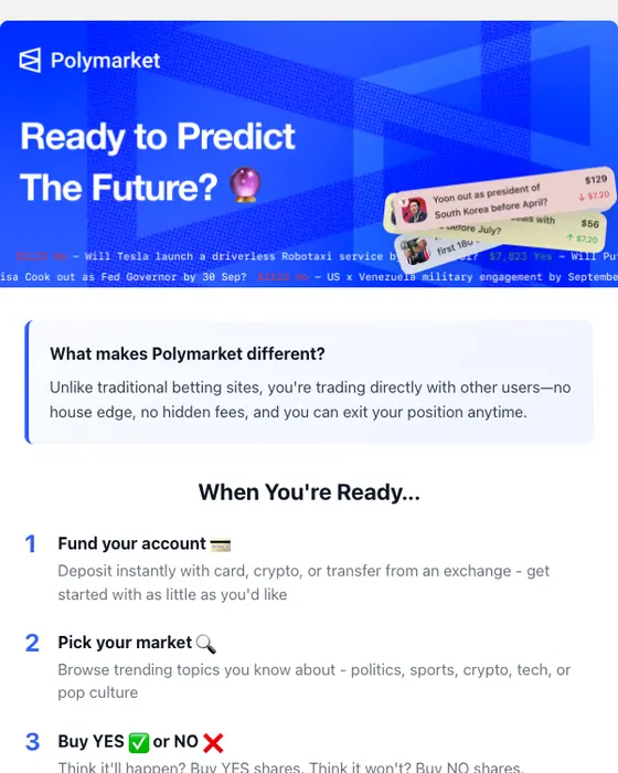
Polymarket
Your edge to making a winning trade on polymarket...
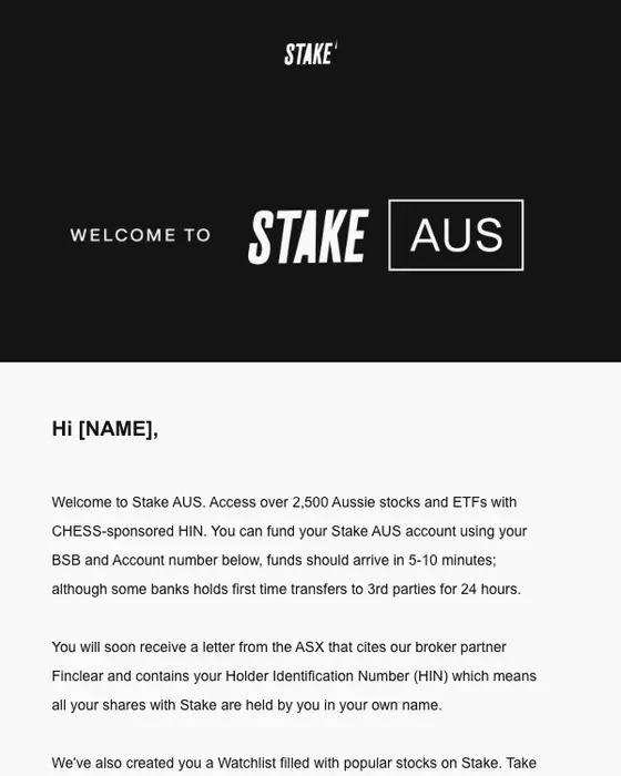
Stake
Welcome to Stake AUS

Superhero
Who really owns Australian property? 🏠
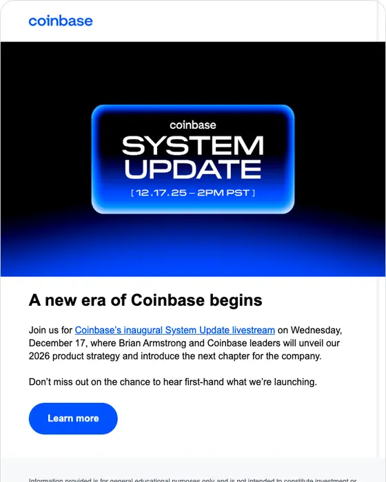
Coinbase
Join Coinbase's inaugural System Update livestream | December 17
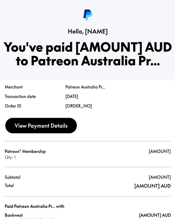
PayPal
Receipt for Your Payment to Patreon Australia Pr...
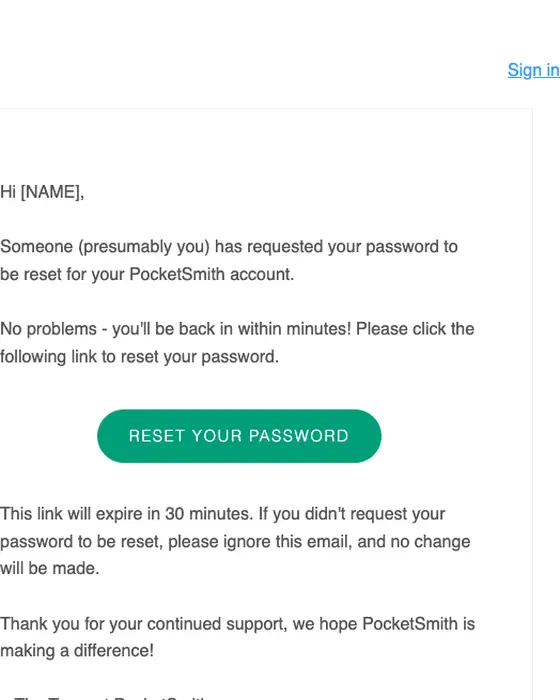
PocketSmith
PocketSmith | Password Reset Instructions
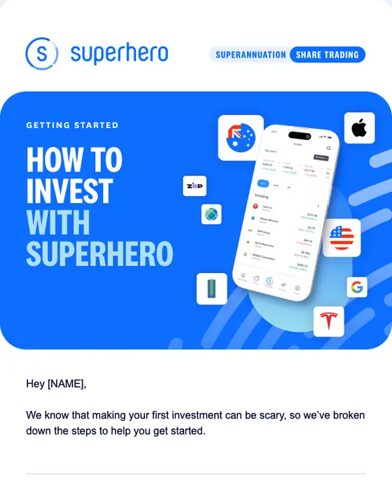
Superhero
How to invest with Superhero
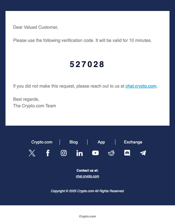
Crypto.com
Crypto.com Verification Code
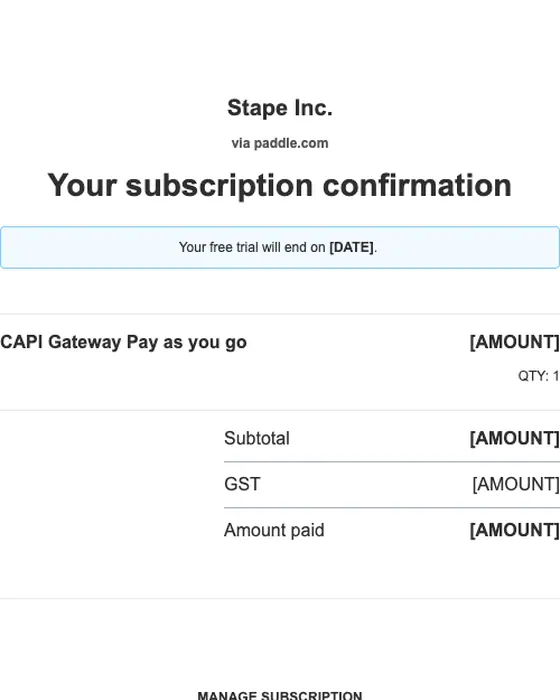
Paddle
Your subscription to Stape Inc.
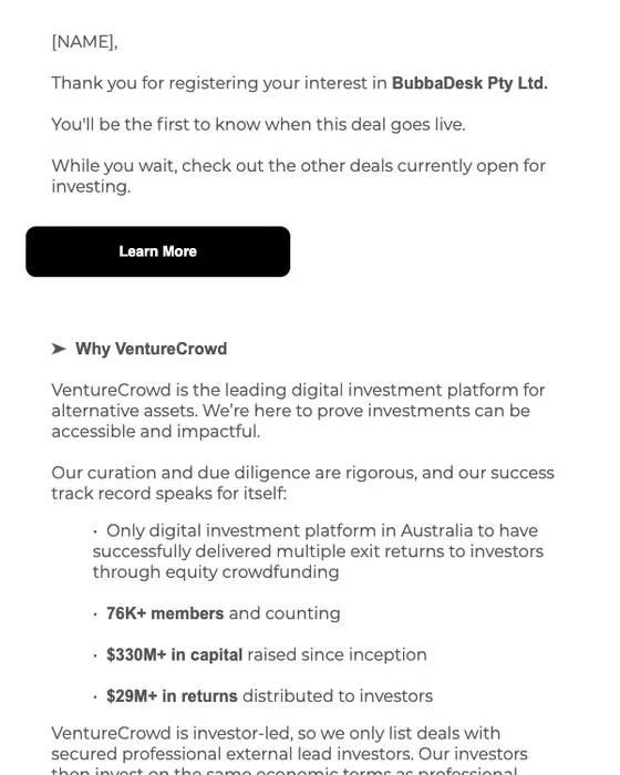
VentureCrowd
Thanks For Registering Your Interest in BubbaDesk Pty Ltd
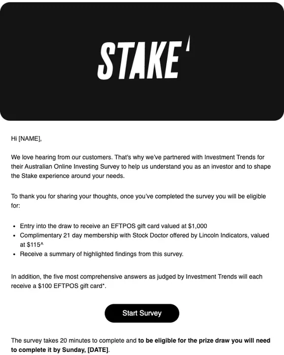
Stake
Investment Trends 2025 Survey | Chance to win a $1000 Gift Card
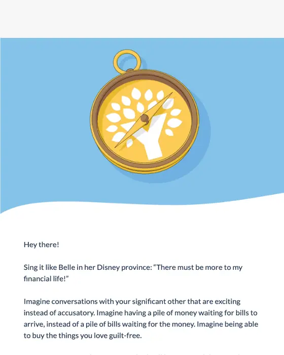
YNAB
Show your money who’s boss
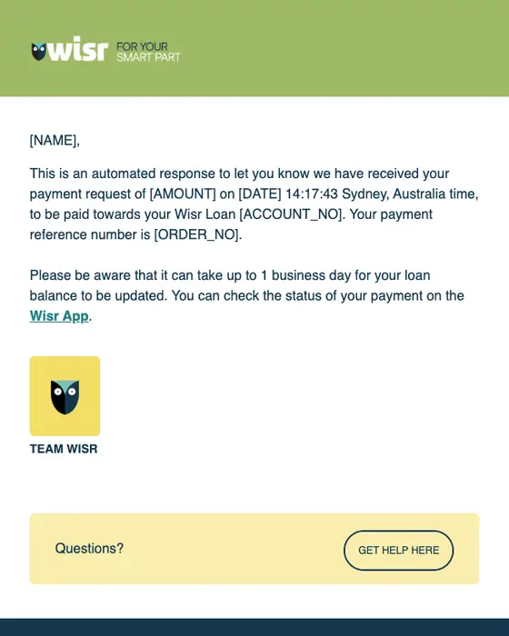
Wisr
[NAME], your one-time payment request has been received.
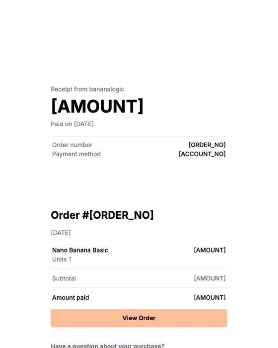
Creem
Payment receipt
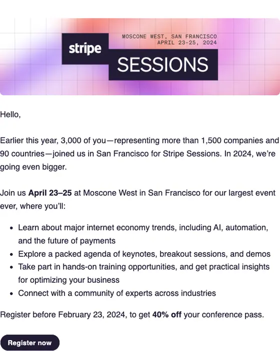
Stripe
Stripe Sessions is back for 2024
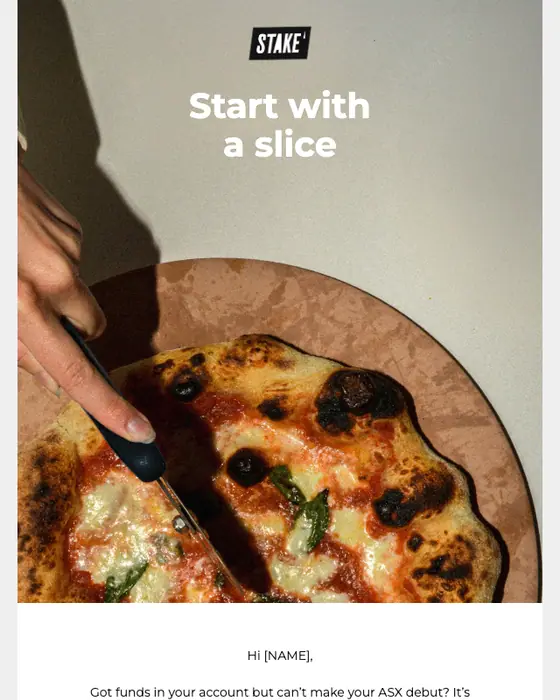
Stake
Get invested from only US$10 💰

Stake
The Ambition Project is live
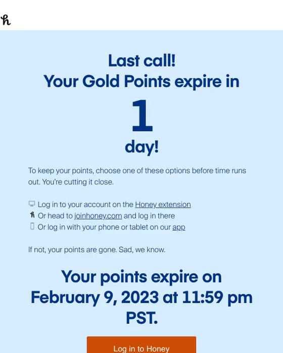
Honey
Last chance! Your Gold points expire tomorrow.
Fintech email marketing against everything else in the same inboxes
Fintech emails, with and without PayPal, against every other email
339 fintech, 181 without PayPal, 12,372 other emails| What we measured | All fintech | Fintech without PayPal | Everything else |
|---|---|---|---|
| Receipts | 42% | 5% | 3% |
| Receipts, payment confirmations and invoices | 49% | 12% | 4% |
| One-time codes, password resets, email verification and security alerts | 8% | 13% | 3% |
| Promotions, sales and discount offers | 14% | 25% | 29% |
| Newsletters | 6% | 10% | 12% |
| Sent to consumers, not businesses | 91% | 85% | 79% |
| Plain subject line that says what it is | 62% | 30% | 32% |
| Uses the reader's first name | 68% | 41% | 39% |
| Plain-text layout | 37% | 27% | 32% |
| Mostly text, few images | 72% | 57% | 60% |
| Large image at the top | 3% | 6% | 12% |
| Exactly one link or button to act on | 20% | 35% | 30% |
Counted whole, fintech looks like a receipts business: 42% of the 339 are receipts, against 3% of everything else the same inboxes received. That is PayPal. Set its 158 emails aside and receipts fall to 5%, the plain subject line falls from 62% to 30%, and the first-name greeting falls from 68% to 41%, each within a few points of ordinary email.
Three differences hold up without PayPal. Sign-in and security mail is 13% of fintech email against 3% elsewhere. Receipts, payment confirmations and invoices are 12% against 4%. And fintech brands use fewer big pictures, with 6% opening on a large image against 12%. Fintech email marketing itself is close to the norm: 25% of the 181 are promotions, sales or discount offers, against 29% of everything else.
So the mail a fintech customer gets from the brand most often is the mail they open because they need it: the receipt, the payment confirmation, the sign-in alert. Those sends are often left on a default template, which makes them the place where a fintech brand has the most room to stand out. The Coinbase security alert in the grid is one built with care: it names the device and place of the sign-in and gives one clear button.
What is in the collected set
The most common fintech email types
all 339 collected| Type | Emails | Share of the 339 | Emails without PayPal |
|---|---|---|---|
| Receipt | 144 | 42% | 9 |
| Promotional | 44 | 13% | 43 |
| Account notice | 27 | 8% | 19 |
| Newsletter | 19 | 6% | 19 |
| Invoice | 12 | 4% | 8 |
| Welcome | 11 | 3% | 10 |
| Payment confirmation | 9 | 3% | 5 |
| Email verification | 8 | 2% | 7 |
| Expiry notice | 8 | 2% | 8 |
| One-time code | 7 | 2% | 6 |
| Password reset | 7 | 2% | 6 |
The brands that sent the most
66 brands in all| Brand | Emails | Share of the 339 |
|---|---|---|
| PayPal | 158 | 47% |
| Credit Karma | 11 | 3% |
| Stake | 9 | 3% |
| Superhero | 9 | 3% |
| Coinbase | 9 | 3% |
After PayPal, no brand sent more than 11 of the 339. The 57 shown here lean the other way from the collection: 17 promotional emails, 6 welcomes, 4 newsletters, 4 event invitations, 4 expiry notices, 3 account notices and 3 one-time codes. 6 of the 57 use a plain-text layout, and 33 came from Australian senders.
Next to this one
The same library, cut by the job the email does: receipt emails, payment confirmation emails, security alert emails, one-time code emails and account notices. Banks, insurers and brokers are on finance email examples, and software companies on SaaS email examples.
Questions about fintech emails
Receipts, on the raw count: 144 of the 339 fintech emails we collected, or 42%. But 135 of those came from PayPal. Across the other 65 brands the most common type is promotional, 43 of 181 emails, followed by account notices and newsletters at 19 each, then welcomes at 10.
Much like other email marketing, with fewer pictures. Promotions, sales and discount offers are 25% of the 181 fintech emails outside PayPal, against 29% of everything else in the same inboxes. 6% open on a large image, against 12%. 91% of all 339 were sent to consumers, not businesses. 17 promotional emails are on this page.
Coinbase's 2026 security alert, subject "Verify your device to sign in". It names the location, browser and device of the sign-in attempt, gives one button, "Verify this device", and adds a link to lock the account if the request was not yours. Sign-in and security emails are 13% of the 181 fintech emails outside PayPal, against 3% of everything else.
Some do. 19 of the 339 are newsletters, from 13 brands, which is 10% of fintech email outside PayPal against 12% elsewhere. 4 are on this page. Stake's from 2025, "Five U.S. stocks Stake investors are loving", lists five tickers, each with a short description and one link. Newsletters from every industry are on newsletter email examples.
By type, 192 of the 339 (57%) are receipts, payment confirmations, invoices, one-time codes, password resets, email verifications or security alerts. 74 (22%) are promotions, newsletters, product launches or event invitations. The rest are mostly account notices and welcomes (38 of the other 73), which can fall either way depending on what they say. How to tell them apart is in transactional email versus marketing email.
83 of the 339 are published in the library so far. 149 of the 256 unpublished ones are PayPal emails, nearly all of them receipts. On this page we took off 14 that showed personal details, 7 repeats of an email the same brand already has here, 4 that did not render cleanly and 1 weak promotion. That leaves 57 from 28 brands.