
What a subscription email is
A subscription email is a message about something you signed up to on a recurring basis, such as a paid plan, a membership or a mailing list. It tells you the subscription started, was charged, will renew, changed or ended, and usually how to manage or cancel it.
We collected 45 from 30 brands in two ordinary inboxes, 39 of them sent in 2023 or later, and show 13 here from 11 brands. The percentages describe all 45. This page is one slice of the Nitrosend email library.
Browse all 13 subscription emails
Filter by industry, or search a brand or subject line. Open any email to see it full length, with its subject line, notes on what it is doing, and a prompt that rebuilds it.
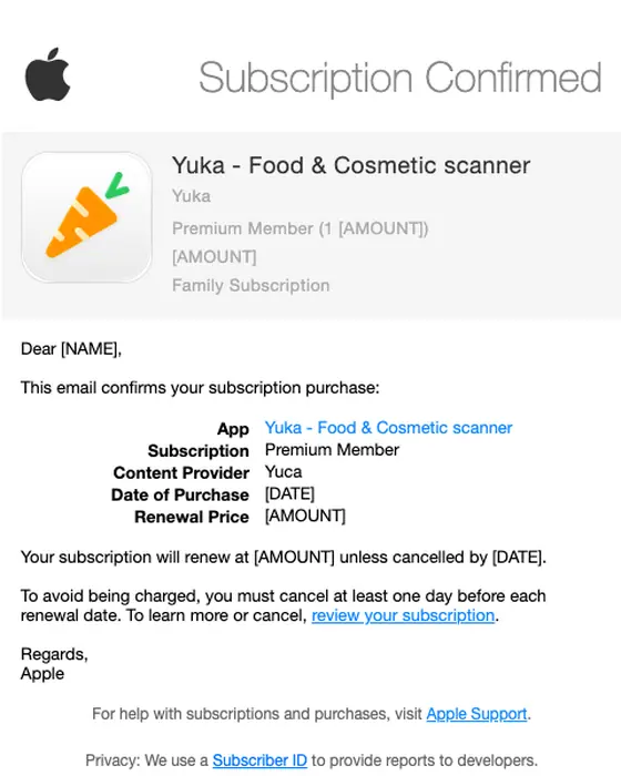
Apple
Your Subscription is Confirmed
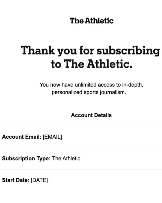
NYTimes.com
Your Athletic subscription is confirmed.
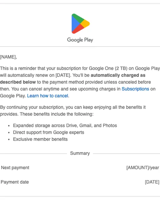
Google Play
Your subscription for Google One will renew on Nov 8, 2025
Apple
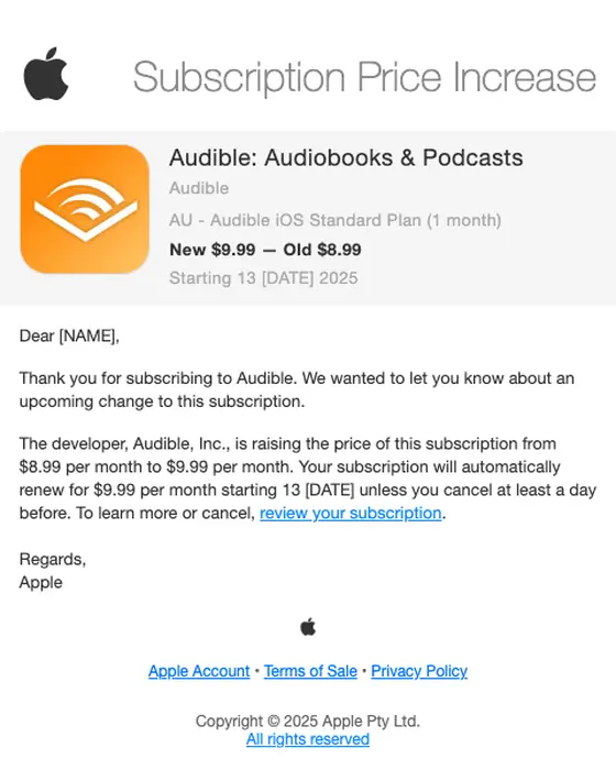
Your Subscription Price Increase
Paddle
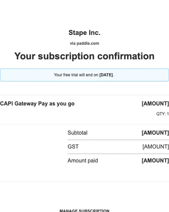
Your subscription to Stape Inc.
Slack
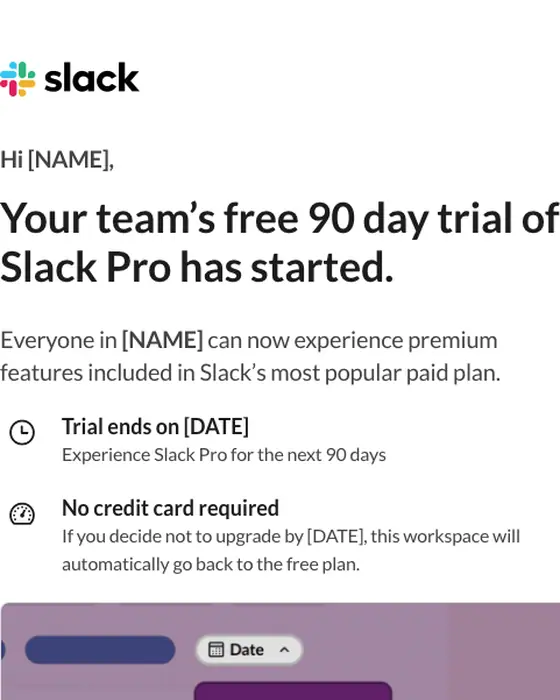
[NAME] has started a free trial of Slack Pro
Kobo
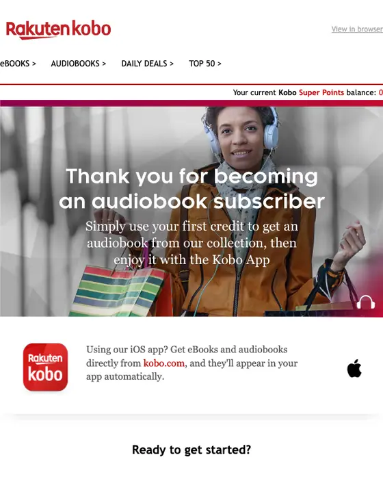
Get started with your Kobo Audiobook subscription
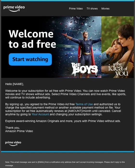
Prime Video
Welcome to ad free with Prime Video
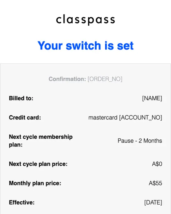
ClassPass
Your ClassPass Membership Change Is Confirmed
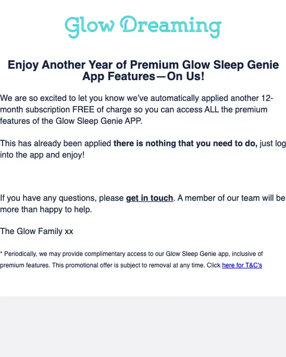
Glow Dreaming
Additional Free annual subscription to Glow Dreaming’s Sleep Genie Premium subscription
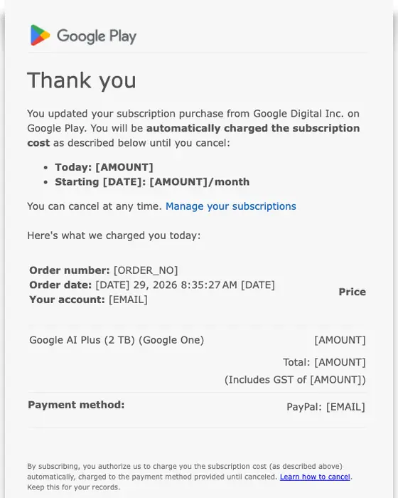
Google Play
You updated your subscription to Google LLC
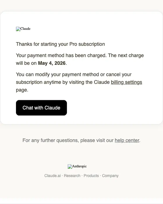
Anthropic
Welcome to the Pro plan
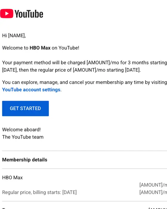
YouTube
Welcome to HBO Max
How subscription emails differ from the rest of the inbox
Subscription emails against welcome emails, receipts and everything else
45 subscription, 468 welcome, 465 receipt and 12,666 other emails from the same two inboxes| What we measured | Subscription | Welcome | Receipt | Every other email |
|---|---|---|---|---|
| Plain subject line that says what it is | 87% | 13% | 97% | 32% |
| Only text links, no button | 80% | 44% | 74% | 55% |
| Short or very short | 78% | 54% | 63% | 53% |
| Plain-text layout | 56% | 30% | 51% | 32% |
| Monochrome color | 80% | 51% | 93% | 62% |
| Greets by first name | 60% | 50% | 66% | 40% |
| Hero image | 2% | 15% | 0% | 12% |
| Median links and buttons to click | 2 | 2 | 3 | 2 |
Subscription emails sit closer to receipts than to welcome emails. 87% have a subject line that says what the email is, against 97% of receipts and 13% of welcome emails, and 2% carry a hero image against 15% of welcome emails. They are the shortest of the four: 78% are short or very short, against 54% of welcome emails and 53% of everything else. 80% use text links only, with no button. “Every other email” is all 12,666 non-subscription emails from the same inboxes, welcome emails and receipts included.
What the 45 do
The job each of the 45 subscription emails does
all 45 collected| The email | Emails | Share |
|---|---|---|
| Confirms a new plan, a plan change or a charge | 16 | 36% |
| Welcomes a new subscriber and shows where to start | 11 | 24% |
| Account notice: a price or plan change, or leaving a mailing list | 9 | 20% |
| Renewal: renewing soon, renewed or extended | 6 | 13% |
| Free trial started | 3 | 7% |
Six of the nine account notices are about leaving a mailing list: five confirm an unsubscribe, and one tells a reader it thinks has lost interest that it is unsubscribing them. The other three announce a price or plan change; Apple’s for Audible and ClassPass’s are in the grid. For the other way out of a paid plan, see cancellation emails. The 45 come from 12 named industries and one email filed as other: SaaS (17), media and publishing (12) and education (4) are the largest, and no other industry has more than 2. 22 came from US senders and 15 from Australian ones. In the grid, 6 were sent in 2025, 4 in 2026 and 3 in 2024.
What the shown emails have in common
Most of them tell you how to leave. 10 of the 13 say how to cancel or manage the plan, often in the first lines: Anthropic says you can “modify your payment method or cancel your subscription anytime”, and Paddle closes with a Manage subscription block holding the renewal date, a link to update the payment method and a link to cancel. 7 of the 13 give the date of the next charge or renewal.
The price is stated, not implied. Apple’s notice for Audible puts the old and new price side by side, $8.99 and $9.99 a month, and says the plan renews at the new price unless you cancel at least a day before. Slack’s trial email says no credit card is required and that the workspace goes back to the free plan by itself if nobody upgrades.
Next to this one
The same inboxes, cut by the email’s job: payment confirmation, expiration notice and account notice emails.
Questions people ask
A subscription email is a message about something you signed up to on a recurring basis: a paid plan, a membership or a mailing list. It confirms that the subscription started, was charged, will renew, changed or ended. Of the 45 we collected, 16 (36%) confirm a new plan, a plan change or a charge.
Two renewal emails are on this page. Google Play reminds you that a Google One plan will renew, with the payment date and a link to learn how to cancel. Glow Dreaming says another free year has been applied. Apple's Audible price notice also states the renewal price: $9.99 a month unless canceled. 6 of the 45 we collected are renewal emails.
Copy what the plain ones do. Of the 13 shown here, 10 say how to cancel or manage the plan and 7 give the date of the next charge or renewal. Across all 45, 87% use a subject line that says what the email is, and 80% use text links rather than a button.
Start with a signup form and an email that asks each new subscriber to confirm the address, like the newsletter signup confirmation emails. Plan the way out as well: 6 of the 45 subscription emails we collected are about leaving a mailing list, and five of them simply confirm the unsubscribe.
We show one send per template, checked by eye. Of the 45, 6 came off this page: two repeats of a template already shown, three that showed a person's details and one with a broken image. 2 were removed from the library earlier, and 24 have not been rendered to the library yet. The percentages on this page describe all 45.