
![Slack expiration notice email: [NAME]'s free trial of Slack Pro ends in 7 days](/email-examples/img/190f3207aed45366-t.webp)

What expiration notice emails are
An expiration notice email tells a customer that something they already have is about to run out or has just run out: a free trial, a subscription or membership, reward points or a coupon, or an unused account and its data. Trial expiration emails, renewal reminder emails and deactivation warnings all belong here.
We collected 157 of them from 117 brands out of two ordinary inboxes, and every number on this page is about those 157. 66 have a published image and 26 of those are shown, one per brand. Of the 40 left out, 19 were sales deadlines rather than expiry (a class closing enrollment, a discount ending, a crowdfunding campaign closing), 8 were a second send of a brand already shown, 9 came off for showing the reader's details, rendering with missing images or being cut off, and 4 were weaker or off-topic for this page. The 157 are everything the two inboxes held under the library's expiration notice tag, so they include some of those sales deadlines; the 26 shown are the ones that are clearly expiry. They are one slice of the Nitrosend email library.
Expiration notice emails you can look at
Filter by what is expiring, industry, layout or call to action. Open any one to read the subject line, what it does, and the prompt that rebuilds it.
Slack
[NAME]'s free trial of Slack Pro ends in 7 days
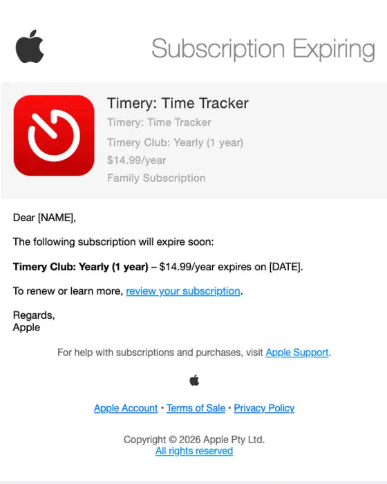
Apple
Your Subscription is Expiring
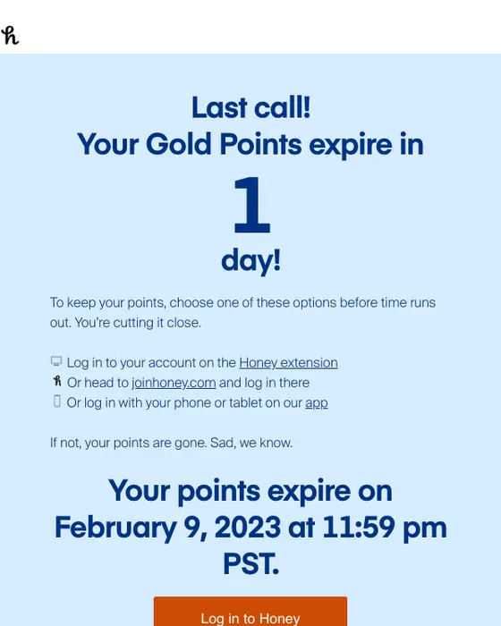
Honey
Last chance! Your Gold points expire tomorrow.
Photobucket
Warning: Your account has been deactivated. Do you want to keep your photos?
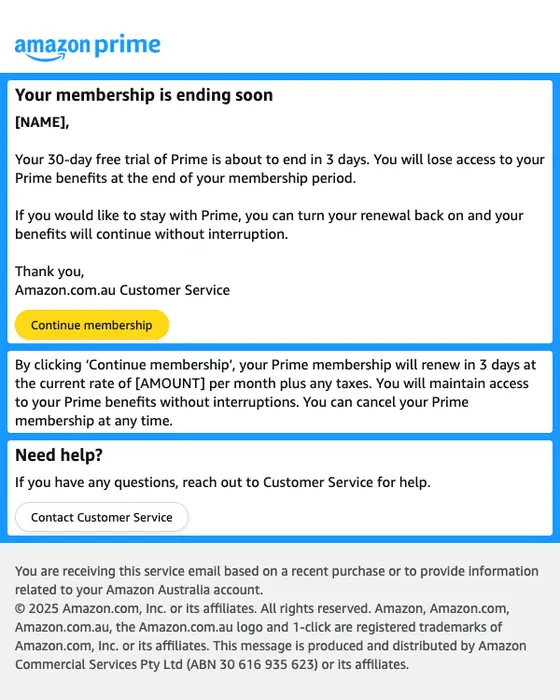
Amazon Prime
Your 30-day free trial of Prime is expiring in 3 days
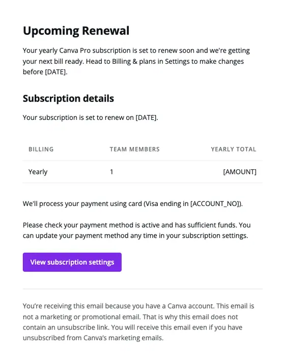
Canva
It’s renewal time!
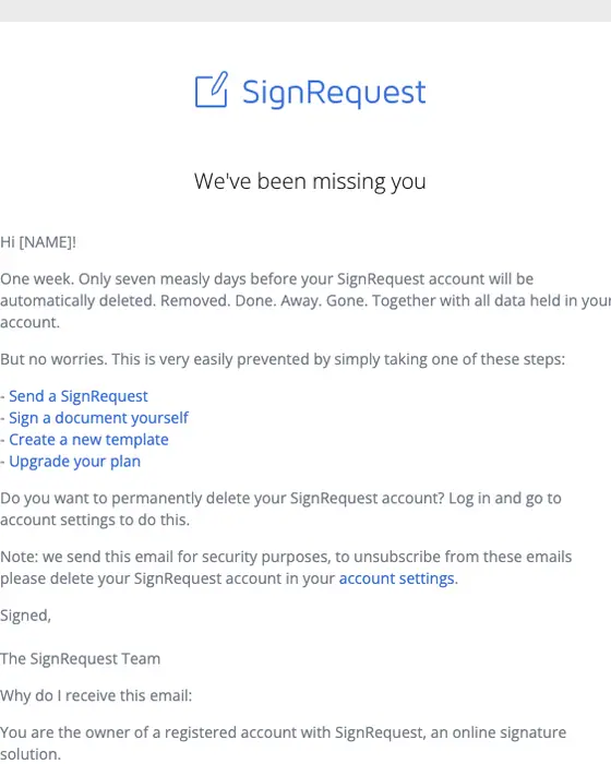
SignRequest
One week to save your account
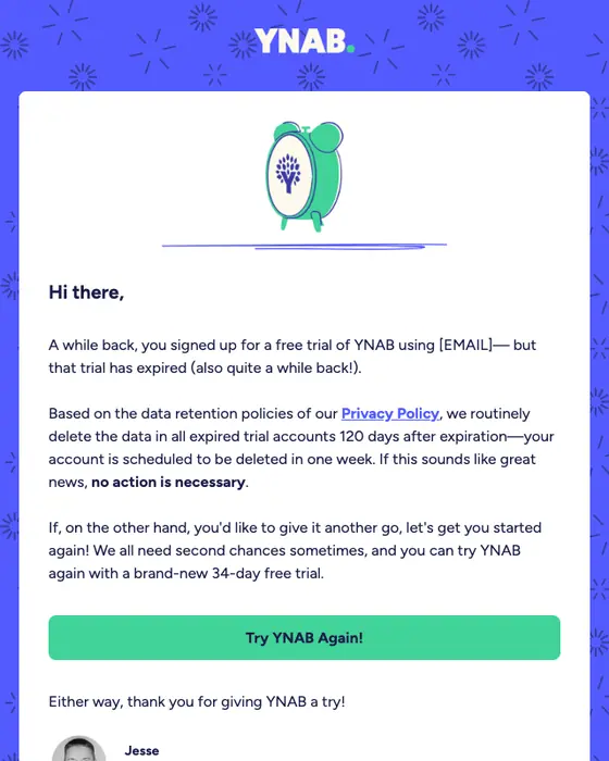
YNAB
Your YNAB Trial Account
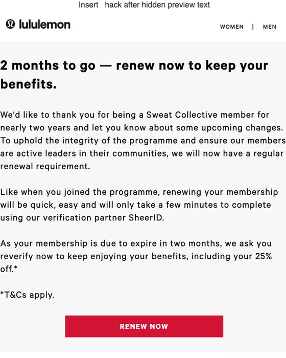
lululemon
Your Sweat Collective membership expires soon.
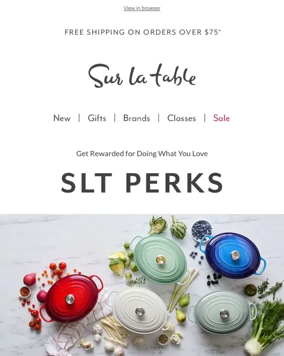
SLT Perks
[NAME], only 3 days left to use your SLT Perks!
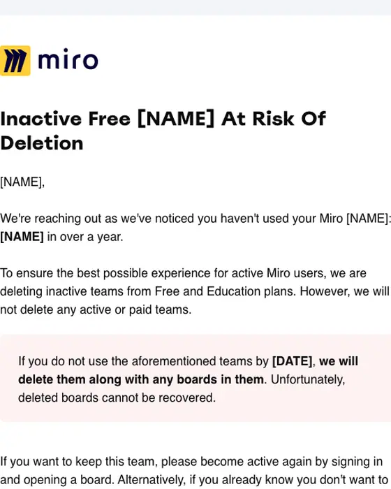
Miro
Important: Inactive Team(s) on Miro Will Be Deleted
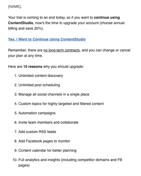
ContentStudio
Your free trial is ending today - Action required!
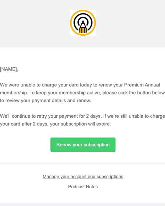
Podcast Notes
Your Podcast Notes subscription renewal is late!
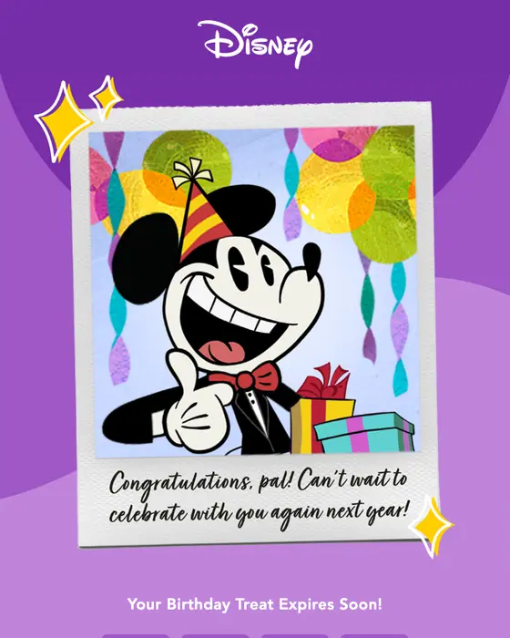
My Disney
Your birthday gift expires soon!
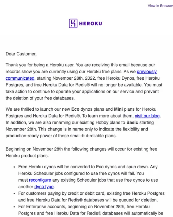
Heroku
Reminder Upgrade now: Heroku free product plans end November 28th
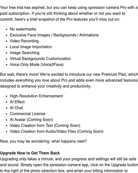
xpression camera
Your xpression camera free trial has expired/ upgrade to continue
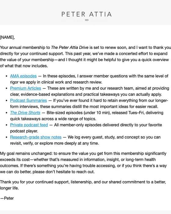
Peter Attia
Your subscription is renewing soon
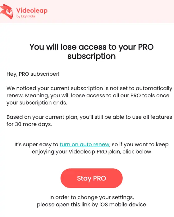
Videoleap
You disabled auto renew on your PRO subscription
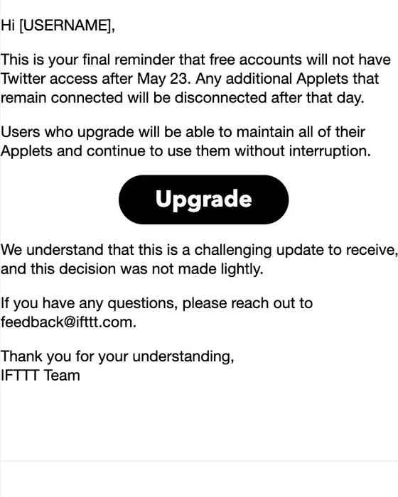
IFTTT
Final reminder: Your Twitter Applets will be disconnected
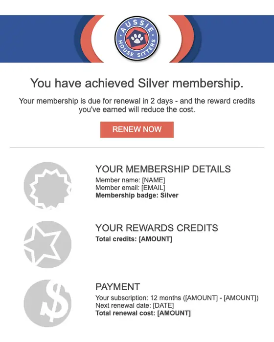
Aussie House Sitters
Aussie House Sitters: Membership renewal in 2 days - Claim your rewards discount
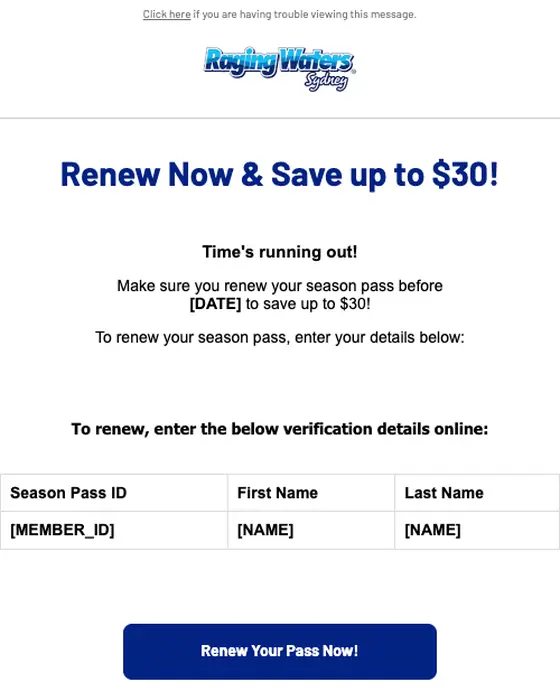
Raging Waters Sydney
Renew your season pass now!
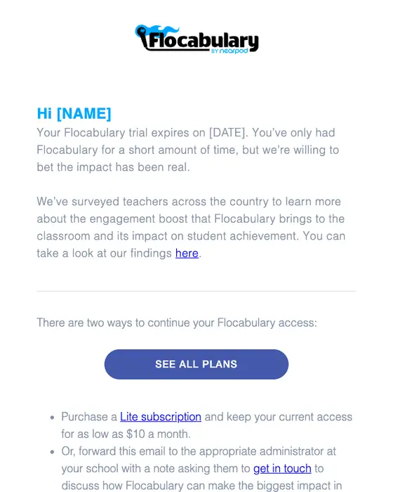
Flocabulary
Lesson Plans
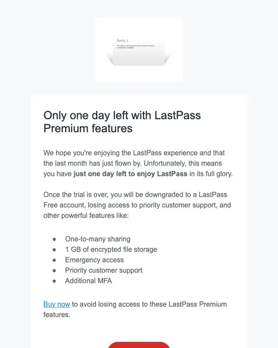
LastPass
It’s the last day of your LastPass Premium trial
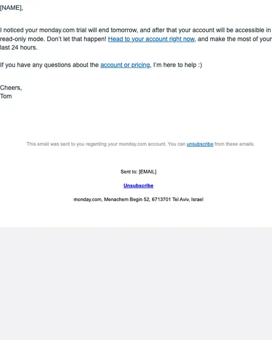
monday.com
the end is coming
What 157 collected expiration notices do
What the collected emails do
157 emails from 117 brands| Pattern | Share | Count |
|---|---|---|
| Urgent tone | 53% | 83 of 157 |
| Neutral tone | 22% | 34 of 157 |
| Plain, transactional subject line | 44% | 69 of 157 |
| Urgency subject line | 30% | 47 of 157 |
| Short or micro length | 73% | 115 of 157 |
| Exactly one link or button | 39% | 61 of 157 |
| Greets the reader by first name | 50% | 78 of 157 |
| Plain-text layout | 42% | 66 of 157 |
| Monochrome color | 71% | 112 of 157 |
| Hero image | 6% | 9 of 157 |
| Sent to consumers | 78% | 123 of 157 |
| Tagged as win-back in the library | 14% | 22 of 157 |
Just over half, 53%, are urgent in tone, and 30% put the urgency in the subject line. Some of the best-known senders are the calm ones: Apple, Amazon Prime and Canva are neutral in tone and keep to the plan, the timing and one main button or link. The median email has 2 links or buttons and 73% are short or micro. Plain text is common (42% use a plain-text layout, as Peter Attia, ContentStudio, IFTTT and monday.com do here), and a hero image is rare.
Real notices and the scam version
Search for an expiration notice email (checked October 1, 2026) and Google's AI answer treats it as a phishing scam, warning about false urgency, Verify Now buttons and senders off the official domain. The real ones share some of that shape: 53% of the 157 we collected are urgent in tone, and 12 ask the reader to log in or sign in. None of the 157 has a main button that says verify. 25% of the main buttons say renew, upgrade or log in (39 of 157); the rest are labels like learn more, update payment method or a plain link to the account.
What the main button asks you to do
Primary call to action, 157 emails| Label contains | Emails | Share |
|---|---|---|
| Renew | 15 emails | 10% |
| Upgrade | 12 emails | 8% |
| Log in or sign in | 12 emails | 8% |
| Verify | 0 emails | 0% |
Getting a real notice delivered and recognized is a transactional email problem, and transactional email best practices covers the sending side.
Who sends them
Software brands send almost half of this set. The top eight industries:
By industry
Top 8 of 157 emails| Industry | Emails | Share of the set |
|---|---|---|
| SaaS | 76 emails | 48% of the set |
| Education | 11 emails | 7% of the set |
| Media and publishing | 11 emails | 7% of the set |
| Fintech | 8 emails | 5% of the set |
| Ecommerce | 6 emails | 4% of the set |
| Health and fitness | 6 emails | 4% of the set |
| Professional services | 6 emails | 4% of the set |
| Retail and fashion | 6 emails | 4% of the set |
Next to this one
The emails either side of an expiration notice: subscription, account notice, cancellation and re-engagement.
Questions people ask
What is expiring, the date it happens and what changes after it, then one way to keep it. Apple states the plan, the price and the date in one line, with one link. The median email in the 157 we collected has 2 links or buttons, and the clearest ones also say what happens if the reader does nothing.
In these emails it depends on the product. Slack and LastPass drop the account to a free plan, monday.com makes it read-only, and YNAB, Miro and SignRequest delete the data after a set period. SaaS brands send 48% of the 157 we collected, so most notices describe a software account.
Most do: 53% of the 157 we collected are urgent in tone, against 22% neutral. The neutral ones are not weaker. Apple, Amazon Prime and Canva state the plan, the price and the timing and leave the decision to the reader, each with one main link or button.
Some are, but most come from the service itself: these 157 came from two ordinary inboxes. About a quarter of their main buttons say renew, upgrade or log in, and none says verify. If you are unsure, open the service directly rather than following the link, which is what Google's own answer advises.