
What booking confirmation emails are
A booking confirmation email is the message a hotel, airline, restaurant or other business sends as soon as a reservation is made, to confirm what was booked, for when and where.
We collected 306 of them from 109 brands out of two ordinary inboxes, sent between 2016 and 2026, and every figure about booking confirmations on this page is about those 306. 51 have a published image and 21 are shown here, from 20 brands (why the other 30 are left out is under the examples). They are one slice of the Nitrosend email library.
Booking confirmation emails you can look at
Filter by what was booked, length, style or tone. Open any one to read the subject line, what it does, and the prompt that rebuilds it. If you are writing a booking confirmation message of your own, the subject lines here are wording that real senders used.
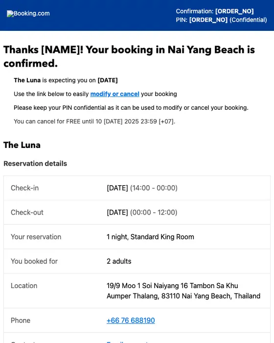
Booking.com
🛄 Thanks! Your booking is confirmed at The Luna
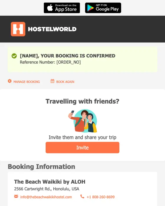
Hostelworld
Confirmed booking from hostelworld.com - The Beach Waikiki by ALOH, Honolulu
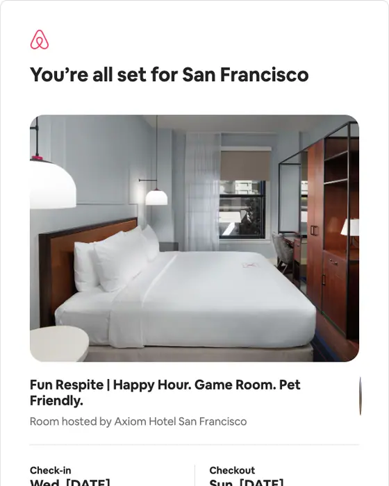
Airbnb
Confirmed: Your reservation for [DATE] – 14
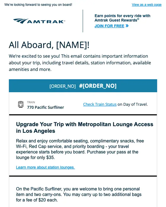
Amtrak
Get ready for your trip to San Diego
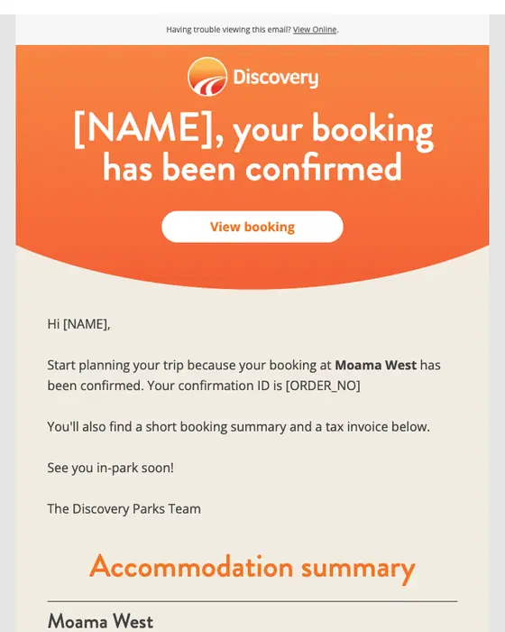
Discovery Parks & Resorts
[NAME], your booking at Moama West has been confirmed
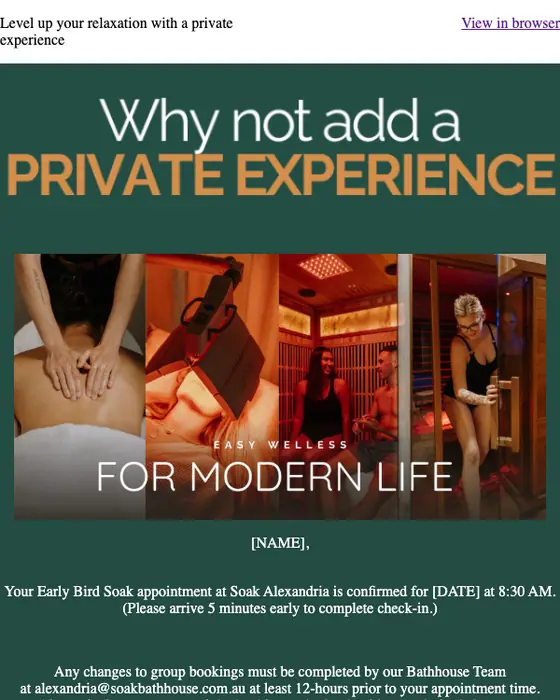
Soak Bathhouse
Group Appointment Confirmation - Soak Alexandria
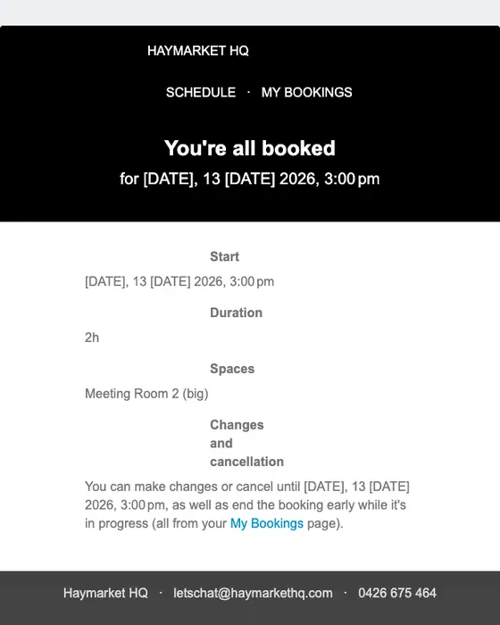
Haymarket HQ
Your booking for Tuesday, 13 January 2026, 3:00 pm (Meeting Room 2 (big))
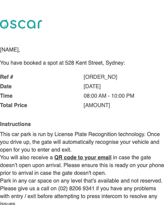
Share with Oscar
Your booking receipt [Ref#[ORDER_NO]]
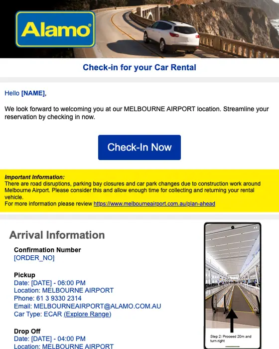
Alamo Rent A Car
Alamo Rent A Car Reservation Confirmation [ORDER_NO] at MELBOURNE AIRPORT (MEL)
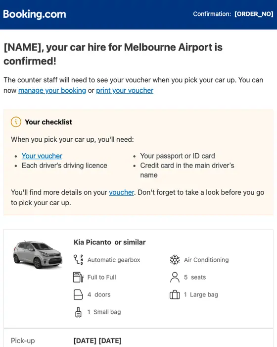
Booking.com
Thanks! Your car rental with Alamo at Melbourne Airport is confirmed
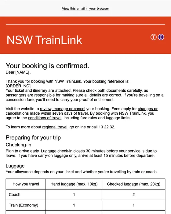
NSW TrainLink
NSW TrainLink - Purchase Confirmed for Booking [ORDER_NO]
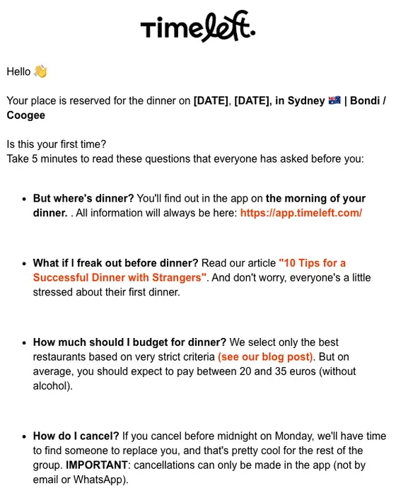
Timeleft
🎉 Your Timeleft Dinner on [DATE] is confirmed!
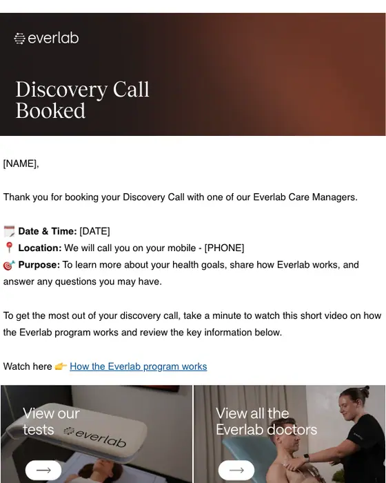
Everlab
Your Discovery Call with Everlab – Booking Confirmed
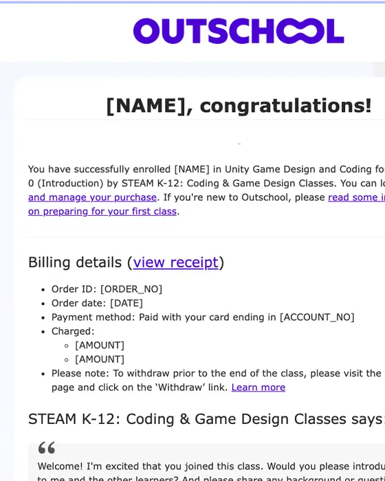
Outschool
Welcome to Unity Game Design and Coding for Kids - Level 0 (Introduction)
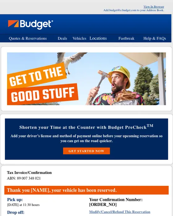
Budget
Budget Rent A Car: Reservation Confirmation: [NAME], your Budget reservation #[ORDER_NO] at CNS is confirmed
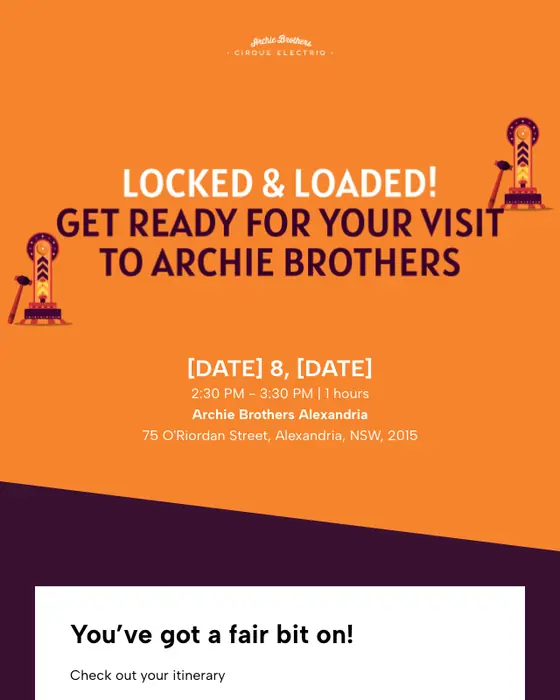
Archie Brothers
Your Archie Brothers Alexandria booking confirmation
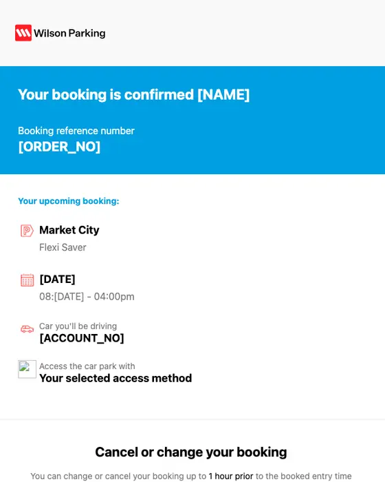
Wilson Parking
Booking Confirmation
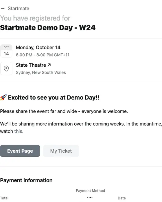
Startmate
Registration confirmed for Startmate Demo Day - W24
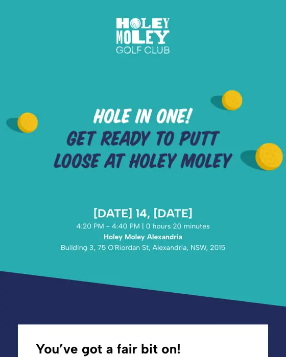
Holey Moley
Your Holey Moley Alexandria booking confirmation
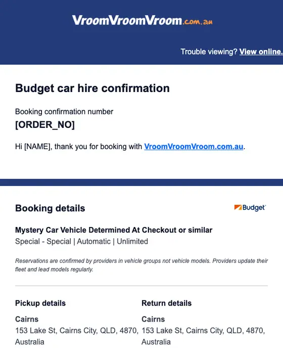
VroomVroomVroom.com.au
Thanks! Your rental vehicle booking [ORDER_NO] with Budget is now confirmed.
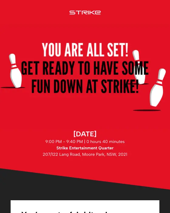
Strike Booking
Your Strike Entertainment Quarter booking confirmation
Of the 30 with a published image that are left out, 11 repeated a template already shown here, from the same brand or the same event platform, 11 showed personal details or rendered incompletely, 7 were not confirmed bookings (event RSVPs, a reminder, two payment requests, an inquiry receipt and a request to confirm) and 1 was a forwarded copy.
What is shown: hotel, travel and venue confirmations
By what was booked
21 emails from 20 brands| What was booked | Emails | Brands |
|---|---|---|
| Hotels and stays | 4 emails | Booking.com, Hostelworld, Airbnb, Discovery Parks & Resorts |
| Car rental | 4 emails | Alamo Rent A Car, Booking.com, Budget, VroomVroomVroom.com.au |
| Trains and parking | 4 emails | Amtrak, Share with Oscar, NSW TrainLink, Wilson Parking |
| Dining and things to do | 5 emails | Soak Bathhouse, Timeleft, Archie Brothers, Holey Moley, Strike Booking |
| Services, classes and events | 4 emails | Haymarket HQ, Everlab, Outschool, Startmate |
The four hotel and stay confirmations come from Booking.com, Hostelworld, Airbnb and Discovery Parks & Resorts. All four give the check-in and check-out dates, the room booked and what was paid or is still owed. Booking.com, Hostelworld and Airbnb also state the cancellation terms and carry a link to change the booking. Discovery Parks puts the tax receipt in the same email. Booking.com appears twice because its hotel and car rental confirmations are different emails. The wider sets these come from are travel emails and hospitality emails.
What 306 collected booking confirmations do
Booking confirmations against order confirmations and every other email
306 booking confirmations, 471 order confirmations and 12,405 other emails, the order confirmations included| What we measured | Booking confirmation | Order confirmation | Every other email |
|---|---|---|---|
| Tells the reader what to do next (instructional tone) | 52% | 24% | 37% |
| Long | 28% | 11% | 16% |
| Median links or buttons | 3 | 2 | 2 |
| Exactly one link or button | 15% | 20% | 30% |
| Plain, transactional subject line | 94% | 96% | 31% |
| Greets the reader by first name | 60% | 70% | 40% |
| Plain-text layout | 45% | 24% | 31% |
| Data table | 7% | 30% | 3% |
| Hero image | 1% | 1% | 12% |
A booking confirmation tells the reader more of what to do than an order confirmation from the same inboxes. 52% are instructional in tone against 24%, 28% are long against 11%, and the median one has 3 links or buttons against 2. The order confirmation is the one with a data table (30% against 7%). Both keep the subject line plain (94% and 96%) and almost never open with a hero image.
Taken together, these numbers describe a default template: 94% keep the subject line plain and 2 of the 306 open with a hero image. A booking confirmation is an email the reader is waiting for, and most senders here give it no more design than a receipt.
One sender pulls the short end of these numbers. Haymarket HQ sent 58 of the 306, short confirmations of meeting room, event space and day pass bookings, and they account for 49 of the 74 micro-length emails and 56 of the 139 with a plain-text layout. Airbnb sent another 42.
For the sending side, the closest how-to pages are the order confirmation email template and transactional email best practices.
Who sends them
Travel and hospitality brands sent 197 of the 306 (64%). 57 of the hospitality emails are Haymarket HQ bookings, and without them the two groups are 140 of the 306 (46%). The top nine industries:
By industry
Top 9 of 306 emails| Industry | Emails | Share of the set |
|---|---|---|
| Hospitality | 105 emails | 34% of the set |
| Travel | 92 emails | 30% of the set |
| Health and fitness | 16 emails | 5% of the set |
| Entertainment | 13 emails | 4% of the set |
| Events | 13 emails | 4% of the set |
| Marketplace | 13 emails | 4% of the set |
| Education | 11 emails | 4% of the set |
| Automotive | 8 emails | 3% of the set |
| Healthcare | 8 emails | 3% of the set |
Next to this one
The emails either side of a booking confirmation: reservation, appointment, cancellation and event invite.
Questions people ask
Say that the booking is confirmed, then what was booked, the date and the place. In the 306 booking confirmations we collected, 94% use a plain, transactional subject line, such as Wilson Parking's two-word Booking Confirmation, and 52% are instructional in tone, telling the reader what to do next.
The four hotel and stay confirmations shown here, from Booking.com, Hostelworld, Airbnb and Discovery Parks, all give the check-in and check-out dates, the room booked and what was paid or is still owed. Three of the four also state the cancellation terms and link to change the booking.
This page shows 21 real ones from 20 brands, sent between 2024 and 2026. Hostelworld's subject line reads Confirmed booking from hostelworld.com, followed by the hostel's name and city. Its email gives the reference number, the dates, the price for each night and the free-cancellation deadline.
Yes. Hotels, holiday parks and booking sites such as Booking.com, Hostelworld and Airbnb all appear in the two inboxes we collected from. Setting aside one sender's meeting room bookings, travel and hospitality brands sent 140 of the 306 booking confirmations, and Airbnb alone sent 42. The four stay confirmations shown here all state the check-in and check-out dates.