
![THE ICONIC shipping email: Good news [NAME], your order is on its way!](/email-examples/img/19b156bc913211df-t.webp)
What an ecommerce shipping confirmation email is
An ecommerce shipping confirmation email is the transactional email an online store sends when an order leaves the warehouse. It says the parcel is on its way and links to tracking. In the 359 we collected, 77% make tracking the main button or link, but only 27% say when the parcel should arrive and 32% name the carrier.
We collected 359 from 169 brands out of two ordinary inboxes, sent 2018 to 2026, and show 10 here. 82% come from Australian senders and 32% from Amazon (103 from Amazon.com.au, 13 from Amazon.com), so the table below also gives the numbers without Amazon. Four of the ten shown, from Running Warehouse, Pillow Talk, Koala and BlockBlueLight, are online-store shipping emails the library files under another industry, so they are not in the percentages.
Browse 10 ecommerce shipping emails
Tap a chip to see the stores whose main link is a button or a text link. Open any email to see it full length, with its subject line, notes on what it does and a prompt that rebuilds it for your store.
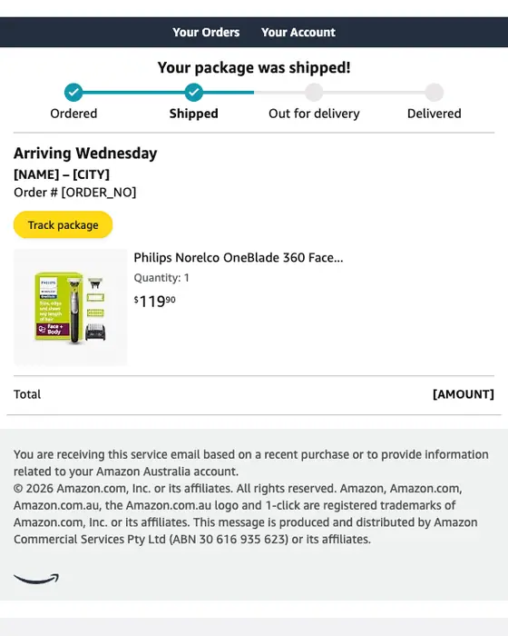
Amazon.com.au
Shipped: ‘Philips Norelco OneBlade...’
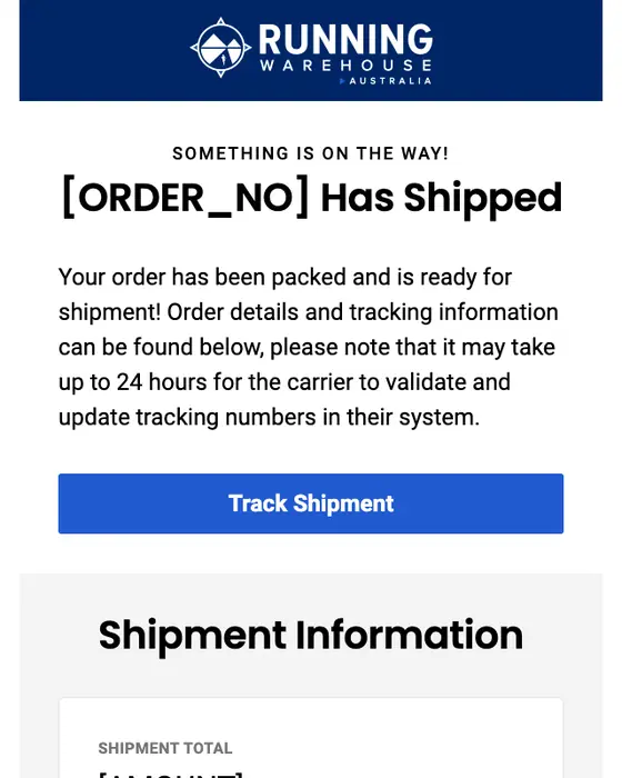
Running Warehouse Australia
Your Running Warehouse Australia order has shipped.
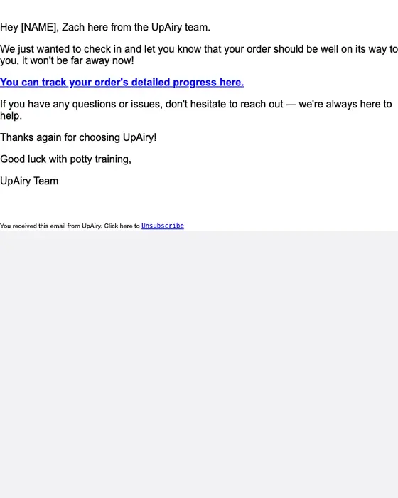
UpAiry
Hey, your order’s shouldn't be far away!
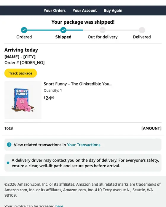
Amazon.com
Shipped: "Snort Funny – The..."
THE ICONIC
Good news [NAME], your order is on its way!
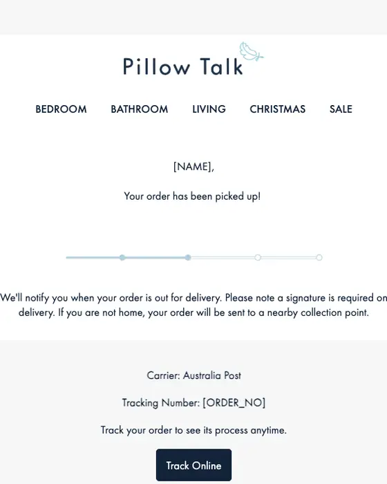
Pillow Talk
Your Pillow Talk order is on its way to you
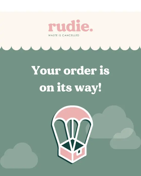
Rudie
Your Period Bestie is on Its Way!💚
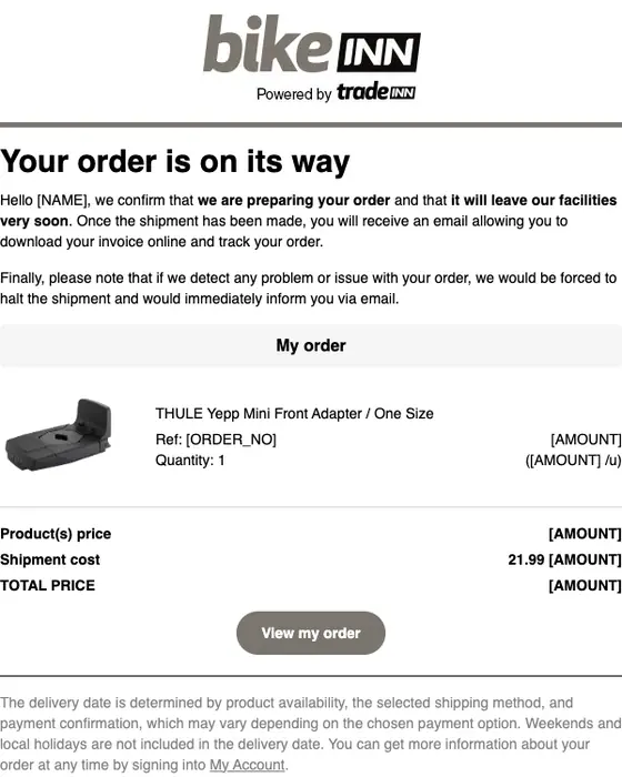
Bikeinn
Your Bikeinn order [REF] is being prepared
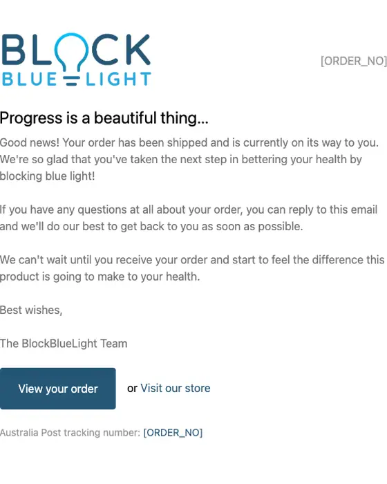
BlockBlueLight AU
A shipment from order [REF] is on the way
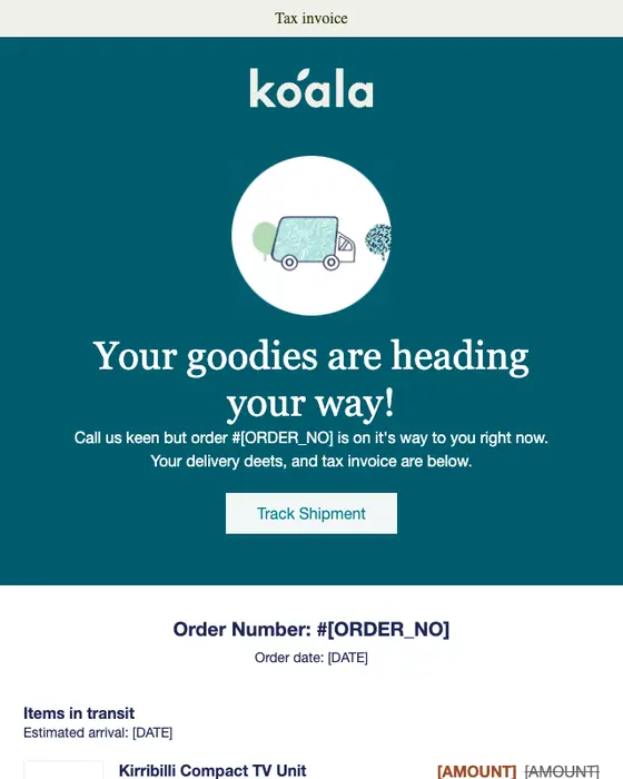
Koala
Your order [ORDER_NO] is on the way
Only 16 of the 359 are published as images so far, so the grid is short. We left off emails showing the recipient's ZIP code, a tracking number or a receipt barcode, one with a clipped image, repeats of a template already shown and two that were not shipping notices. Amazon appears twice, once from each of its stores.
What ecommerce shipping emails contain, with and without Amazon
Ecommerce shipping emails and order confirmations, same two inboxes
359 shipping emails, 243 of them not from Amazon, 211 order confirmations| What we measured | All shipping | Shipping, without Amazon | Order confirmation |
|---|---|---|---|
| Main button or link says track | 77% | 67% | 5% |
| Names a delivery date or window | 27% | 15% | 11% |
| Names the carrier | 32% | 47% | 23% |
| Repeats the order details | 98% | 97% | 97% |
| Greets the reader by first name | 57% | 54% | 69% |
| Asks for one thing only | 47% | 27% | 15% |
| Lays the items out in a table | 6% | 9% | 32% |
| Plain-text design | 20% | 28% | 17% |
| Short or very short | 75% | 71% | 42% |
| Main link is a text link, not a button | 70% | 66% | 77% |
Amazon and everyone else split the job differently. Amazon gives the delivery day in 60 of its 116 shipping emails and names a carrier in 1. The other 243 do the reverse: 47% name the carrier and 15% give a date. Amazon also keeps to one ask more often, which is why that row drops from 47% to 27% without it. The order confirmation sent at checkout is about what was bought, so it rarely links to tracking (5%) and lays the items out in a table in 32%, against 6% of shipping emails.
The date and carrier rows match words in each email and its image alt text, so a date or carrier shown only as a logo is missed. The tracking row reads the recorded label of the main button or link.
The full set of shipping emails, from online stores, marketplaces and couriers, is in shipping confirmation email examples, and the checkout emails from online stores are in ecommerce order confirmation examples.
Next to this one
The same library, cut by the other emails an online store sends around an order: tracking updates, delivery emails and every email from online stores.
Questions about ecommerce shipping emails
Running Warehouse Australia's 2026 email shows the usual parts: it says the order has shipped, gives one Track Shipment button, then the shipping method and tracking details. Of the 359 online-store shipping emails we collected, 77% make tracking the main button or link, 98% repeat the order details and 75% are short or very short.
Put the tracking link first, then the delivery date and the carrier, which is where most stores fall short. 77% of the 359 we collected make tracking the main link, but only 27% name a delivery date or window and 32% name the carrier. Keep the order details: 98% repeat them.
Order confirmations from online stores have their own collection: 211 from the same two inboxes, sent at checkout rather than dispatch. 69% greet the customer by first name and 32% lay the items out in a table, against 57% and 6% of the 359 shipping emails.
Only 16 of the 359 have been published as images so far. We took off emails showing a ZIP code, a tracking number or a receipt barcode, one clipped render, repeats of a template and two that were not shipping notices, then added four online-store shipping emails filed under other industries. The percentages describe all 359.
Send one like it
Simple pricing. Unlimited contacts.
Every plan includes full stack emailing: Flows, Newsletter Campaigns and Transactional Email, plus our NitroWheel LLM and all agent integrations (Claude, ChatGPT, Codex, Cursor and others). Pay for what you send, not who you store.
- Emails 8,000then 500/mo
- Email types Transactional & Marketing
- AI actions 20/mo
- Contacts Free & Unlimited
- Brands 3 · Custom domain 1
- Seats 1
- Recipients / rolling 24h 100–5,000
- Email validation Prepaid only
- Emails 20,000/month
- NitroWheel LLM Included
- Brands 5 · Domains 3
- AI actions 1,000/mo
- Contacts Free & Unlimited
- BYO sending and AI keys Yes
- Seats 3
- Recipients / rolling 24h 1,000–100,000
- Email validation Prepaid only
- Emails 125,000/month
- AI actions 5,000/mo
- Brands 10 · Domains 10
- Seats 10
- Frontier AI Included
- Dedicated IP Available
- Recipients / rolling 24h 1,000–625,000
- Email validation Prepaid only
- AI actions Unlimited
- Unlimited brands & domains Included
- SSO / SAML Included
- 99.9% SLA Included
- Recipients / rolling 24h Contracted
- Email validation Prepaid only
Daily allowances depend on your plan and sender standing. Strong list, domain and delivery evidence can raise standing, including on day one. Trusted receives the full plan allowance; available email credits, safety checks and delivery pacing still apply.
Free forever. No credit card required. See full comparison →