
![Playgroup NSW webinar email: [NAME], join us for our next FREE Press Play webinar!](/email-examples/img/19d2459c0cacc008-t.webp)

![Lawpath webinar email: [Starting soon] Lawpath x GoDaddy EOFY Webinar](/email-examples/img/188db793dc0d0737-t.webp)
What a webinar email is
A webinar email is a marketing email about an online session: the invitation to register, the reminder before it starts, and the replay or recording after it.
We collected 211 of them from 125 brands out of two ordinary inboxes, sent between 2016 and 2026, and none is a mockup. This page shows 27 from 26 brands (19 invitations, 5 reminders and 3 replays or recordings), because only some have been rendered as images so far and we left out the ones that repeat a brand's template, show a broken image or carry personal details.
Webinar invitation, reminder and replay examples
Tap a kind to narrow the grid: the invitation, the reminder before the session, or the replay after it. Open any email to see it full length, with its subject line, notes on what it is doing, and a prompt that rebuilds it.
How webinar emails differ from event invitations, same two inboxes
Webinar emails, event invitations and all email, same two inboxes
211 webinar emails, 514 event invitations, 12,711 emails| What we measured | Webinar | Event invitation | All email |
|---|---|---|---|
| Sent to a business audience | 86% | 47% | 19% |
| Instructional in tone | 83% | 50% | 37% |
| Asks for one thing only | 43% | 31% | 30% |
| Greets the reader by first name | 50% | 38% | 40% |
| Has a hero image | 3% | 12% | 12% |
| Subject opens with a tag in brackets, like [Webinar] | 28% | 4% | 2.5% |
Webinar emails are business email. 86% go to a business audience, against 47% of event invitations and 19% of everything we collected, and 68% come from SaaS companies. 83% are instructional in tone. They carry fewer pictures than event invitations: 3% have a hero image, against 12%. They also ask for less, with 43% making one request only, against 31% of event invitations and 30% of all email.
Event invitations have their own collection in event invite email examples.
What is in the collected set
By what the email does
all 211 webinar emails collected| What the email does | Emails | Share of the set |
|---|---|---|
| Invitation to register | 159 emails | 75% of the set |
| Reminder or last call before the session | 41 emails | 19% of the set |
| Replay after a live session | 6 emails | 3% of the set |
| On-demand recording | 5 emails | 2% of the set |
| Registration confirmation | 0 emails | 0% of the set |
We sorted the 211 by what the subject line and the button say, and read the body where those two did not settle it. Three in four are the invitation. Nearly one in five is a reminder, and only 11 carry a recording. None is a registration confirmation, so the confirmation step is the one stage of a webinar sequence this collection cannot show.
By industry
all 211 webinar emails collected| Industry | Emails | Share of the set |
|---|---|---|
| SaaS | 143 emails | 68% of the set |
| Professional services | 39 emails | 18% of the set |
| Education | 15 emails | 7% of the set |
| Nonprofit | 4 emails | 2% of the set |
| Other (8 industries) | 10 emails | 5% of the set |
SaaS companies send most of them, and the 143 SaaS webinar emails have their own cut in SaaS webinar email examples.
Next to this one
The same library, cut by what sits around a webinar: event invitations, emails from events companies, product launch emails, B2B emails and plain-text emails.
Questions about webinar emails
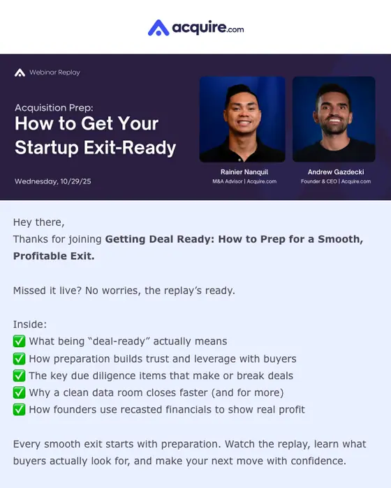
The recording, and a reason to watch it. Only 11 of the 211 webinar emails we collected carry a replay or an on-demand recording, and 6 of those follow a live session. Acquire.com's, shown here, thanks the reader for joining, says "Missed it live? No worries, the replay's ready", lists five things the session covered, and ends on one Watch Now button.
Tied to a time. 41 of the 211 (19%) are reminders or last calls, sent in the days and hours before it starts. Zoom's, shown here, went out the day before as "[Live Tomorrow] Zoom Meetings 101": the session title, "Tomorrow, March 7th" with the start time, two short paragraphs on what it covers, and one button, "Get on the Guest List".
Saying what the session is. 71% of the 211 subject lines describe the session plainly and 66% contain the word webinar. 28% open with a tag in brackets, like [Webinar] or [Live Tomorrow], against 2.5% of all 12,711 emails we collected. 10% lean on urgency instead.
Only 46 of the 211 have been rendered as images so far, and 19 of those are not on this page. Nine repeated a template the same brand already has here (Zoom, Acquire.com and HubSpot among them). The other ten had a broken image, carried personal details such as a staff member's full-name signature or a street address, ran as a wall of text, or had a subject line we could not show verbatim. The percentages on this page still describe all 211.
Send one like it
Simple pricing. Unlimited contacts.
Every plan includes full stack emailing: Flows, Newsletter Campaigns and Transactional Email, plus our NitroWheel LLM and all agent integrations (Claude, ChatGPT, Codex, Cursor and others). Pay for what you send, not who you store.
- Emails 8,000then 500/mo
- Email types Transactional & Marketing
- AI actions 20/mo
- Contacts Free & Unlimited
- Brands 3 · Custom domain 1
- Seats 1
- Recipients / rolling 24h 100–5,000
- Email validation Prepaid only
- Emails 20,000/month
- NitroWheel LLM Included
- Brands 5 · Domains 3
- AI actions 1,000/mo
- Contacts Free & Unlimited
- BYO sending and AI keys Yes
- Seats 3
- Recipients / rolling 24h 1,000–100,000
- Email validation Prepaid only
- Emails 125,000/month
- AI actions 5,000/mo
- Brands 10 · Domains 10
- Seats 10
- Frontier AI Included
- Dedicated IP Available
- Recipients / rolling 24h 1,000–625,000
- Email validation Prepaid only
- AI actions Unlimited
- Unlimited brands & domains Included
- SSO / SAML Included
- 99.9% SLA Included
- Recipients / rolling 24h Contracted
- Email validation Prepaid only
Daily allowances depend on your plan and sender standing. Strong list, domain and delivery evidence can raise standing, including on day one. Trusted receives the full plan allowance; available email credits, safety checks and delivery pacing still apply.
Free forever. No credit card required. See full comparison →