Redbubble
Subject line
Buy 3 t-shirts, save 15%.
What it is doing
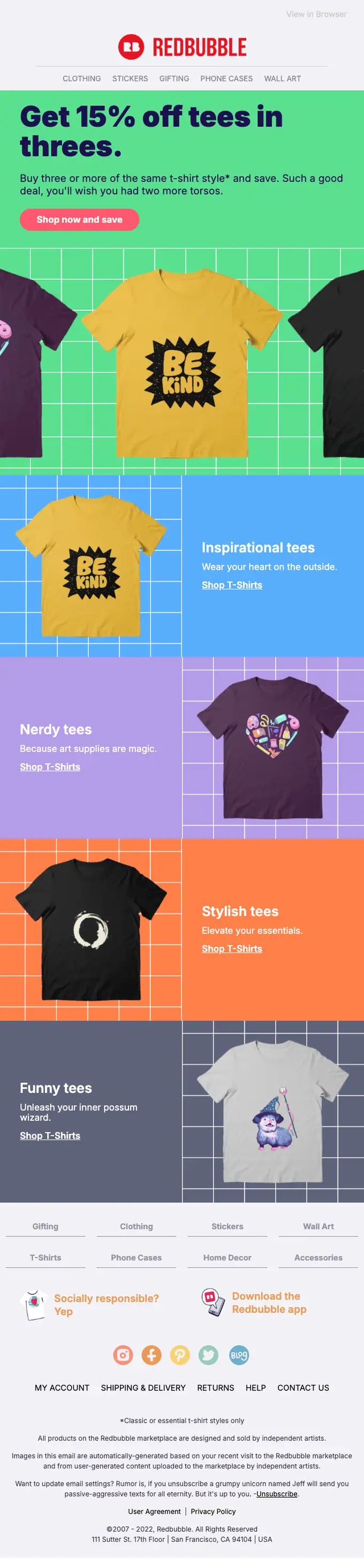
This email uses a modular grid layout with a strong visual hierarchy. Each product category (Inspirational, Nerdy, Stylish, Funny tees) is presented with a distinct image and a clear call to action, making it easy to scan. The design effectively uses white space to highlight content blocks and features a consistent brand aesthetic.
Worth stealing
The email uses a humorous, slightly self-deprecating tone in its copy, particularly in the unsubscribe section, to engage the reader.
Attributes
promotionalmarketplacebold graphicmodular gridretentionplayfulmediumUS
In the library