
What an order reminder email is
An order reminder email is a message about an order or booking the customer already has, sent before the next step is due: collect it, pay for it, turn up for it, or buy it again.
We collected 64 from 17 brands in two ordinary inboxes, sent between 2022 and 2026, and show 6 of them here, from 5 brands. The percentages describe all 64. 41 of the 64 are one food co-op's recurring bread and veg order reminder, so the tables below also show the other 16 brands on their own.
Browse 6 order reminder emails
Pickup, ticket, payment and restock reminders. Search a brand or subject line, or open any email to see it full length, with its subject line, notes on what it is doing, and a prompt that rebuilds it.
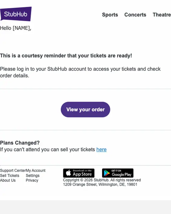
StubHub
Reminder. Your tickets are ready - order# [ORDER_NO]
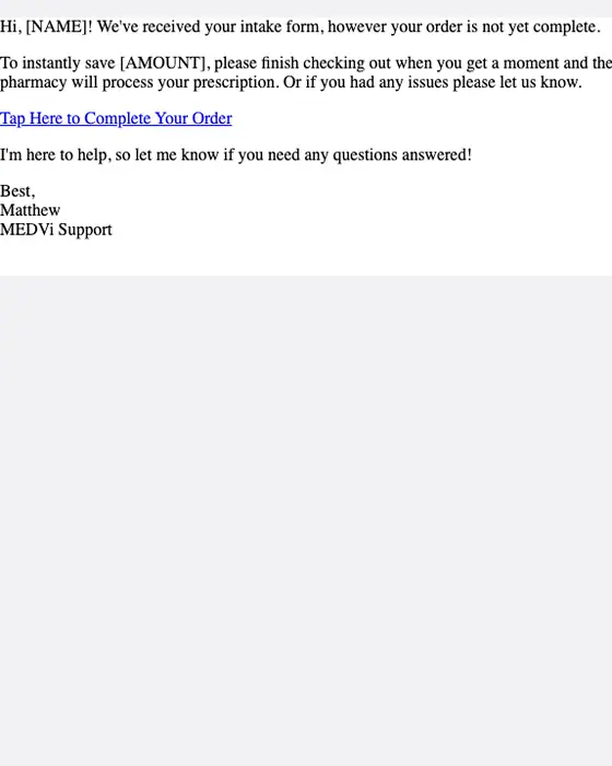
MEDVi
[NAME]'s Order
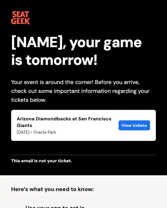
SeatGeek
Get into Arizona Diamondbacks at San Francisco Giants with your phone!
iHerb
Restock Your Essentials Now
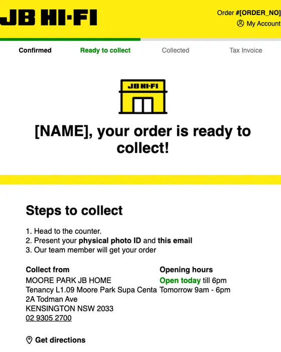
JB Hi-Fi
Your order #[ORDER_NO] is ready to collect
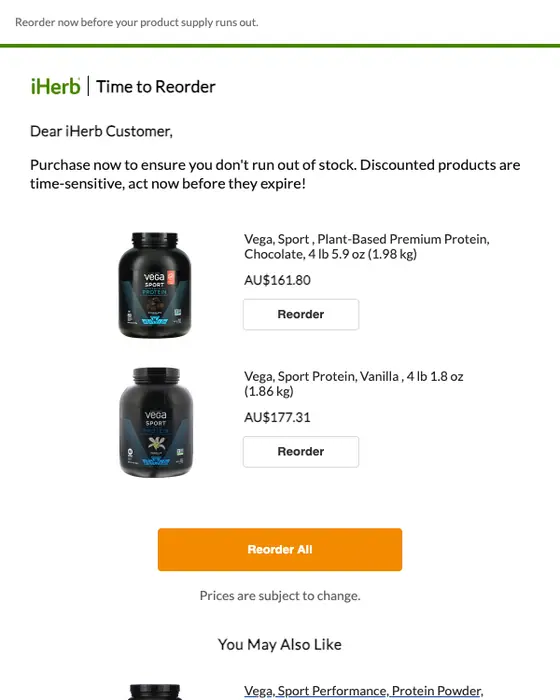
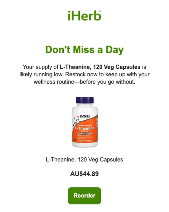
iHerb
Running Low?
How order reminders differ from everything else in the same inboxes
Order reminders against every other email
64 order reminders, the 23 from the 16 brands other than the co-op, and 12,647 other emails| What we measured | All 64 | Other 16 brands (23) | Everything else |
|---|---|---|---|
| Utilitarian design style | 84% | 70% | 33% |
| Instructional tone | 92% | 78% | 37% |
| Greets the reader by first name | 92% | 78% | 40% |
| Quotes the order: number, items or booking | 25% | 70% | 20% |
| Exactly one call to action | 9% | 26% | 30% |
| Median calls to action | 3 | 2 | 2 |
| Plain-text layout | 11% | 22% | 32% |
| Long | 70% | 17% | 16% |
Order reminders are more functional and more personal than the rest of the inbox. Of the 64, 84% use a utilitarian design, against 33%, and 92% greet the reader by first name, against 40%.
The co-op skews the full set. Its recurring send is long, with a recipe and ordering tips under the order button, which is why 70% of the 64 are long. The other 16 brands write short: 17% are long, about the rate for any email, and 70% quote the order itself, the order number, the items or the booking, against 20% of other email. The reminder works by showing the reader what they already have.
Transactional sends like these tend to go out on a plain default template, and this set bears that out: 70% of the 23 from the 16 other brands use a utilitarian design, against 33% of everything else. A reminder that pairs the order details with the brand's own design is the exception here, not the norm.
What is in the collected set
What the reminder asks for
all 64, read from each email| Ask | Emails |
|---|---|
| Place this week's recurring order (the co-op) | 41 emails |
| Collect an order | 3 emails |
| Get ready for a booking, trip or event | 11 emails |
| Finish a payment or a step | 5 emails |
| Restock something bought before | 2 emails |
| Check on an order's status | 1 email |
| Buy a deal for pickup (a promotion, no order yet) | 1 email |
By industry, the 64 are food and beverage 42, travel 7, ecommerce 5, retail and fashion 2, other 2, and one each from healthcare, education, professional services, a ticket marketplace, events and SaaS. The 6 in the grid were sent between 2022 and 2026, 4 of them in 2025 or later. iHerb's two restock reminders are the closest thing here to a replenishment email.
Next to this one
The emails either side of a reminder: abandoned cart emails before the order exists, order confirmations and booking confirmations when it is placed, and shipping emails once it moves. Recurring orders sit with subscription emails, and dated visits with appointment emails.
Questions about the collection
An email about an order or booking the customer already has, sent before the next step is due. Of the 23 we collected from 16 brands other than one food co-op, 11 prepare the reader for a booking, trip or event, 5 ask them to finish a payment or step, and 3 say an order is ready to collect.
3 of the 64 say an order is ready to collect. The one in the grid, from JB Hi-Fi, shows a progress bar from Confirmed to Collected, three steps to collect that ask for photo ID, the store's address and opening hours, and the item being collected.
No. An abandoned cart email chases a purchase that never happened, while an order reminder follows an order or booking that exists. That is why 70% of the order reminders from 16 brands other than one food co-op quote the order number, items or booking, against 20% of every other email in the same two inboxes.
Sometimes. A replenishment email asks the customer to buy a used-up product again. 2 of the 64 here do that, both from iHerb, one with the subject line "Running Low?" in 2022. Another 41 are one food co-op's recurring bread and veg order reminder. Most of the rest are about an order or booking already under way.
15 of the 64 had been rendered full length. 7 came off this page for personal details (names, what may be a real phone number, a booking reference, an order number or a private link), 1 is a promotion, not a reminder, and 1 has images that do not load. The other 58 still count in every percentage.