

![ING Australia referral email: [NAME], time's ticking to get $50 a pop](/email-examples/img/178f21bba0046922-t.webp)
What a referral email is
A referral email asks a customer to recommend a product to someone they know, or reaches the person they recommended with an invitation. Most of the ones shown here offer a reward to one or both sides: credit, a discount, a gift card, a prize draw or a commission.
We collected 44 from 38 brands in two ordinary inboxes, 23 of them sent in 2023 or later, and show 10 here from 9 brands. The percentages describe all 44, which include short invitations to join a team or an affiliate program as well as refer-a-friend offers. This page is one slice of the Nitrosend email library.
Browse all 10 referral emails
Search a brand or subject line. Open any email to see it full length, with its subject line, notes on what it is doing, and a prompt that rebuilds it as your own template.
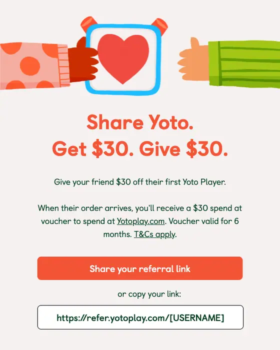
Yoto
You’re in! Start earning Yoto rewards today
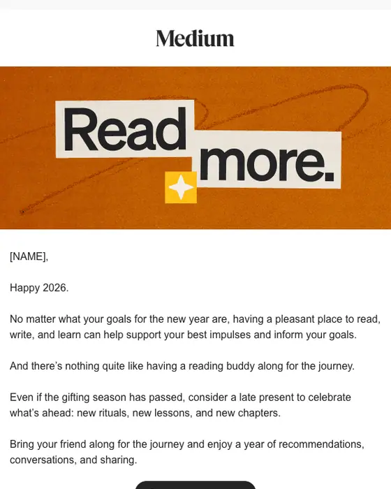
Medium
New year, new ritual. Bring a friend.
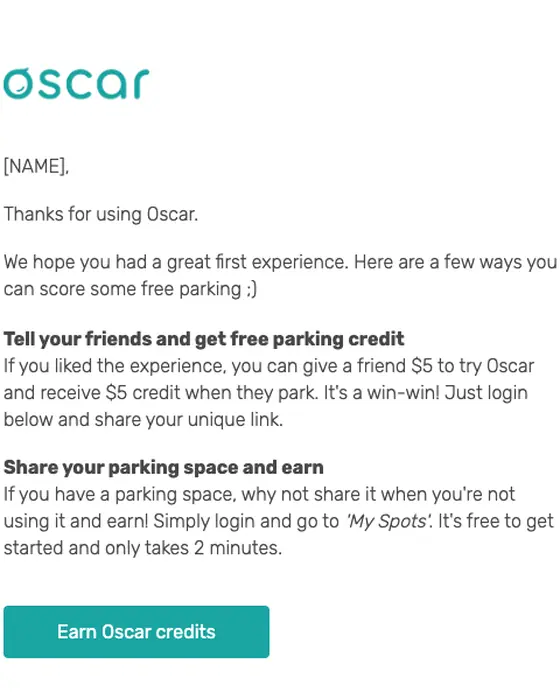
Share with Oscar
Earn Oscar coins today!
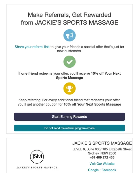
JACKIE'S SPORTS MASSAGE
Refer friends and get rewarded!
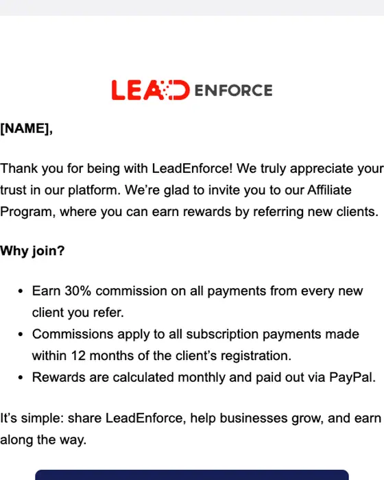
LeadEnforce
You’re Invited to the LeadEnforce Affiliate Program 💡
Wello Works
🌿 Refer a Friend To Wello Works & Win a Luxury Wellness Weekend!
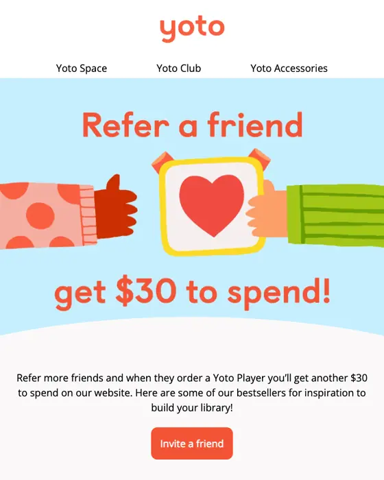
Yoto
Thanks for sharing your referral link
ING Australia
[NAME], time's ticking to get $50 a pop
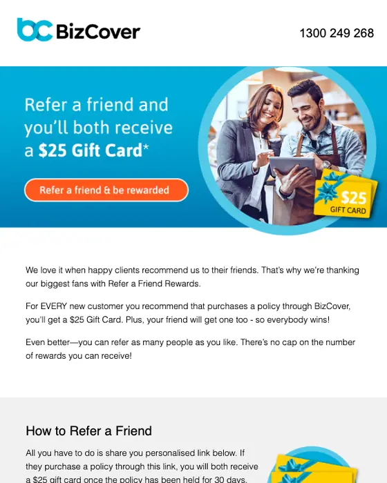
BizCover
Share the Love & Be Rewarded
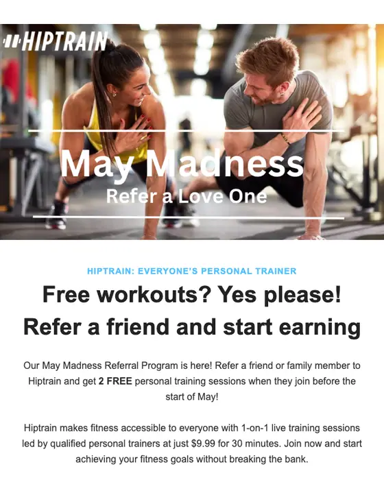
HipTrain
May Madness - Refer a friend
How referral emails differ from the rest of the inbox
Referral emails against welcome emails, promotions and everything else
44 referral, 468 welcome, 2,799 promotional and 12,667 other emails from the same two inboxes| What we measured | Referral | Welcome | Promotional | Every other email |
|---|---|---|---|---|
| Short or very short | 80% | 54% | 46% | 53% |
| Greets you by first name | 66% | 50% | 29% | 40% |
| Warm tone | 45% | 57% | 17% | 15% |
| Sent to a business | 30% | 13% | 22% | 19% |
Referral emails are the shortest of the four: 80% are short or very short, against 54% of welcome emails, 46% of promotions and 53% of everything else. They are also the most personal: 66% greet you by first name, against 50% of welcome emails and 29% of promotions. “Every other email” is all 12,667 non-referral emails from the same inboxes, welcome and promotional emails included. Every column is tagged by the same model, so the gaps between columns are the finding rather than any single figure.
Who sent the 44
The industries behind the 44 referral emails
all 44 collected, 38 brands| Industry | Emails | Share |
|---|---|---|
| SaaS and software | 13 | 30% |
| Marketplaces | 6 | 14% |
| Health and fitness | 6 | 14% |
| Online shops | 5 | 11% |
| Professional services | 4 | 9% |
| Banking, finance and insurance | 4 | 9% |
| Five other industries, one or two each | 6 | 14% |
SaaS and software sends the most, and a share of those are invitations to an affiliate or partner program rather than a friend offer: LeadEnforce, in the grid, offers 30% commission on a referred client’s payments for their first 12 months. 31 of the 44 went to consumers and 13 to businesses. 21 came from US senders, 11 from Australian ones and 6 from UK ones. In the grid, 6 were sent in 2026, 1 in 2025, 2 in 2023 and 1 in 2021.
What the shown emails have in common
The reward is a number. 8 of the 10 name it: $30 to spend at Yoto, $5 of parking credit at Share with Oscar, 10% off the next session at Jackie’s Sports Massage, a $50 reward from ING, a $25 gift card from BizCover, two free training sessions at HipTrain and 30% commission at LeadEnforce. In 5 of the 10, the friend gets something too, and the email says so in one line: BizCover’s “you’ll both receive a $25 Gift Card” is the plainest.
The other two take a different route. Wello Works enters you in a draw for a retreat weekend, with more entries for a bigger membership. Medium offers no reward at all and asks you to give the gift of Medium to a reading buddy. Jackie’s Sports Massage is the only one that puts a button to stop referral emails next to the button to start.
Next to this one
The same inboxes, cut by the email’s job: advocacy emails ask happy customers to review, share or refer, discount offer emails carry the same kind of incentive without the friend, and thank you emails are often where a referral ask sits.
Questions people ask
A referral email is a message that asks a customer to recommend a product to someone they know, or that reaches the person they recommended. In 9 of the 10 shown here, one or both sides get a reward. Of the 44 we collected from 38 brands, 19 (43%) mention a reward in the subject line, and 12 (27%) name it as an amount or “free”.
Keep it short and give it one job. Of the 44 we collected, 80% are short or very short, against 53% of every other email in the same inboxes, and 66% greet the reader by first name. Name the reward as a number: 8 of the 10 shown do.
Yoto leads with “Share Yoto. Get $30. Give $30.” BizCover says “Refer a friend and you’ll both receive a $25 Gift Card”. ING says the customer and the friend could each bank a $50 reward, then lists the four steps the friend has to finish. All three are in the grid above, with 7 more.
Use the link or code the brand sends you. Yoto prints a personal link you can copy, BizCover puts a personalized referral link in the body, and ING gives a promo code your friend types into the signup form. In 5 of the 10 shown, both you and your friend get something.
We show emails we have checked by eye. Of the 44, 6 came off this page: three named a real person, one repeated a template already shown and two rendered badly. 2 were removed from the library earlier, and 26 have not been rendered yet. The percentages on this page describe all 44.