
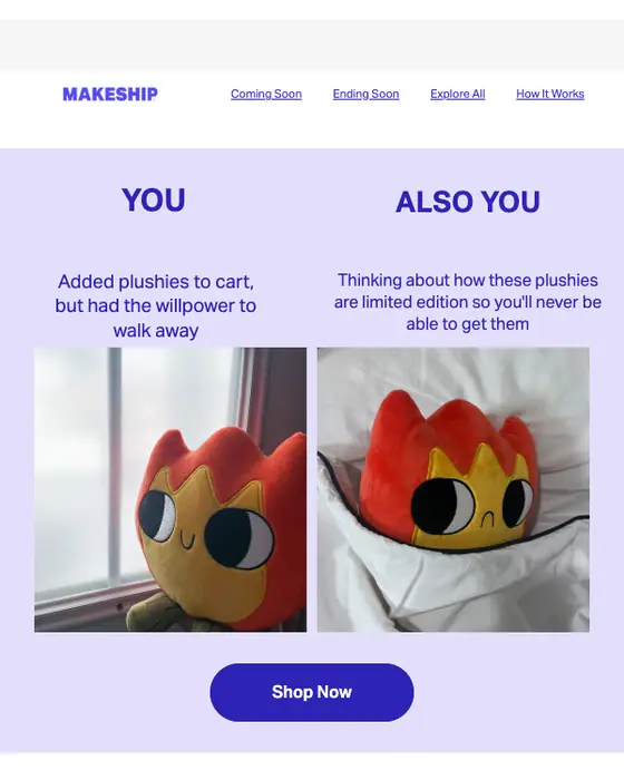
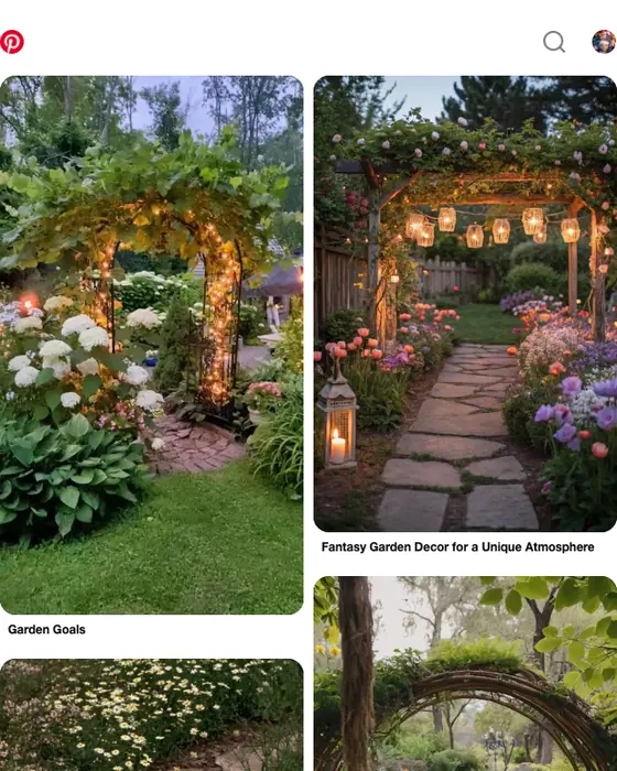


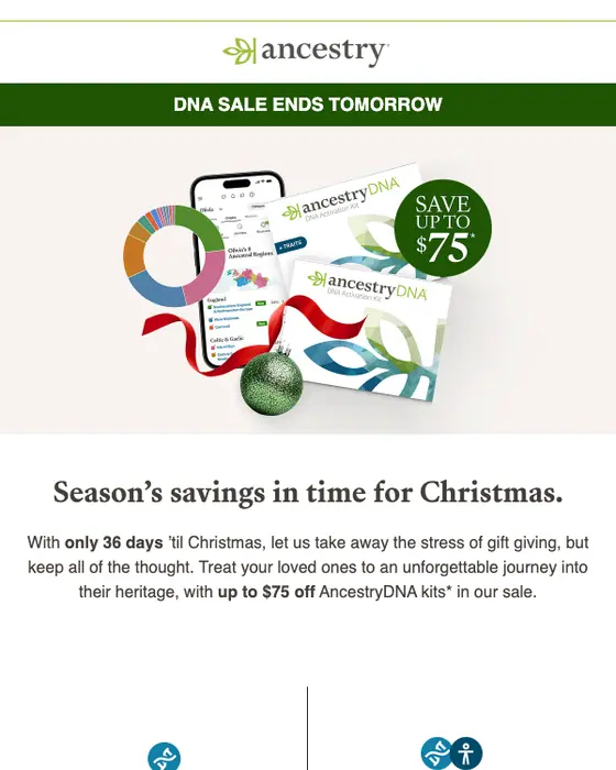
What a two column email is
A two column email splits the body into two blocks that sit side by side, so an image can sit next to its text or two products can share a row. In HTML it is usually one table row with two cells, and responsive versions stack the cells into one column on a phone.
We collected 236 two column emails from 202 brands out of two ordinary inboxes, among 12,711 emails in total. That makes the layout rare: 2% of everything collected, against 65% single column. This page shows 62 of the 236, from 62 brands, and 58 of them were sent in 2023 or later. Nothing here is a mockup, and the percentages on this page describe all 236.
Browse all 62 two column emails
Tap a type to narrow the grid, or search a brand or subject line. Open any email to see it full length, with its subject line, notes on what it is doing, and a prompt that rebuilds it.
Two column vs single column email, same two inboxes
Two column and single column email, same two inboxes
| What we measured | Two column | Single column |
|---|---|---|
| Promotional emails | 38% | 23% |
| Has a product grid | 22% | 5% |
| Opens with a hero image | 25% | 17% |
| Exactly one call to action | 9% | 27% |
| Median calls to action | 4 | 3 |
| Text heavy | 7% | 44% |
| Medium length | 67% | 35% |
| Corporate design style | 33% | 15% |
| Greets by first name | 33% | 37% |
Two columns are mostly a selling layout. 38% of two column emails are promotional and 22% carry a product grid, against 23% and 5% of single column emails from the same inboxes. They ask for more clicks too: 9% have exactly one call to action, against 27%, and the median is 4 against 3. And they carry far less text, with 7% text heavy against 44%. Greeting by first name is about the same, 33% against 37%.
The single column set is on our single column email examples page, with 8,259 emails behind it.
Before building one
A single column 472 to 600 pixels wide is the safer default, since anything wider reads as a desktop layout and breaks on a phone. Two columns earn their place where the content is already a pair, such as two products, or an image beside its text, which matches the selling tilt in the table above.
One rendering fault is worth checking before sending. An image given a fixed pixel height inside a fluid column stretches vertically once the columns stack on a phone. Leave the height to scale (height:auto) and keep only the width attribute that Outlook needs.
What is in the collected set
By industry
| Industry | Emails | Share of the set |
|---|---|---|
| SaaS | 43 emails | 18% of the set |
| Ecommerce | 37 emails | 16% of the set |
| Media and publishing | 20 emails | 8% of the set |
| Travel | 19 emails | 8% of the set |
| Retail and fashion | 17 emails | 7% of the set |
| Marketplace | 15 emails | 6% of the set |
By type, 38% of the 236 are promotional, followed by newsletters (8%), then re-engagement, welcome and order confirmation emails (6% each). In the grid of 62, the largest groups are promotional emails (23), then discount offers and product launches (5 each).
Next to this one
The same library, cut by layout: single column, multi column, modular grid and plain text. By type and industry, where most two column emails sit by count: promotional emails, ecommerce emails and SaaS emails.
Questions people ask
In email, a two column format puts two blocks of content side by side in the body, such as an image beside its text or two products in one row. It is uncommon: of 12,711 emails collected from two real inboxes, 236 use two columns, 2%, while 65% use a single column.
In HTML email, two columns are usually one table row holding two cells, each with its own content, and a media query that stacks the cells on narrow screens. Of the 236 two column emails we collected, 22% use the two cells for a product grid, against 5% of single column emails.
There is no single correct format, but most email uses one column. Of 12,711 emails collected from two real inboxes, 65% use a single column, 32% are plain text and 2% use two columns. By count, most two column emails are promotional (38% of the two column set). By rate, re-engagement email uses two columns most often: 15 of 396, or 3.8%.
Two ordinary inboxes that signed up to products and newsletters the way any customer would. Nothing is a mockup, and nothing is taken from another email gallery. This page shows 62 of the 236 two column emails collected, from 62 brands. The percentages on the page describe all 236.