

![YouTube TV welcome email: Welcome to YouTube TV, [NAME]](/email-examples/img/1991c820b4ba8160-t.webp)
![Yelp welcome email: Welcome to Yelp, [NAME] ✨](/email-examples/img/19958d2587e6f88f-t.webp)

What a single column email is
A single column email stacks everything in one vertical line, from the logo through the headline, images, text and buttons, so it reads the same top to bottom on a phone as on a desktop.
It is the most common layout we have. Of 12,711 emails collected from two ordinary inboxes, 8,259 from 2,423 brands use a single column: 65%. Plain text letters make up another 32%, and every layout with two or more columns side by side adds up to 3%.
This page shows 1,821 of the 8,259, from 1,175 brands, and 1,520 of them were sent in 2023 or later. How we picked them is below the grid.
Browse all 1,821 single column emails
Tap a type to narrow the grid, or search a brand or subject line. Open any email to see it full length, with its subject line, notes on what it is doing, and a prompt that rebuilds it.
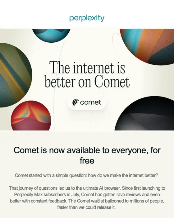
Perplexity
Comet is now available to everyone
Yelp
Welcome to Yelp, [NAME] ✨
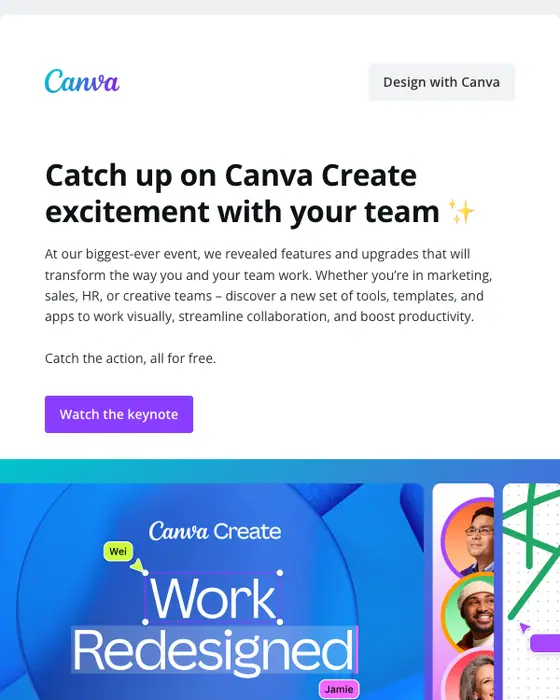
Canva
Come back to a fresh, new Canva 🤩
Lime
You're missing $2.75 AUD flat-rate rides with LimePrime
YouTube TV
Welcome to YouTube TV, [NAME]
WOW Presents Plus
Open For Your Weekend Watchlist! 🍿
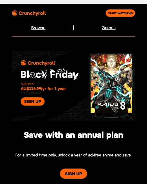
Crunchyroll
Ad-free anime for [AMOUNT] for 1 year
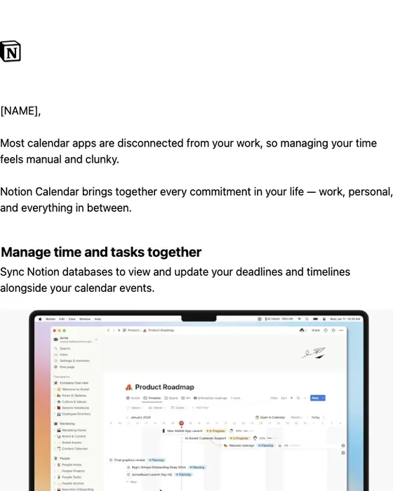
Notion Calendar
Manage time and work together with Notion Calendar
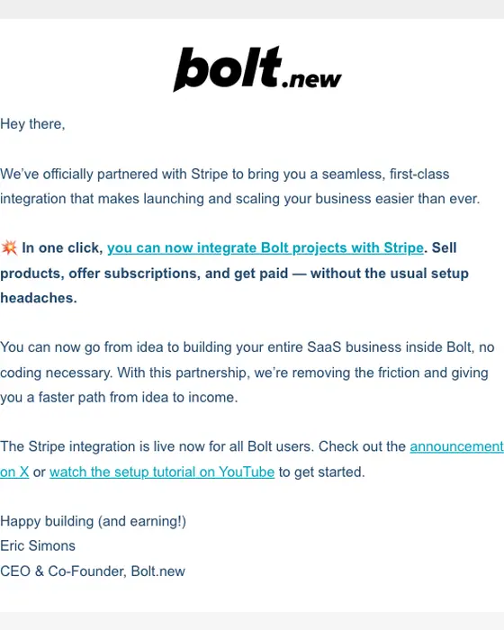
Bolt.new
Bolt + Stripe is live 💥
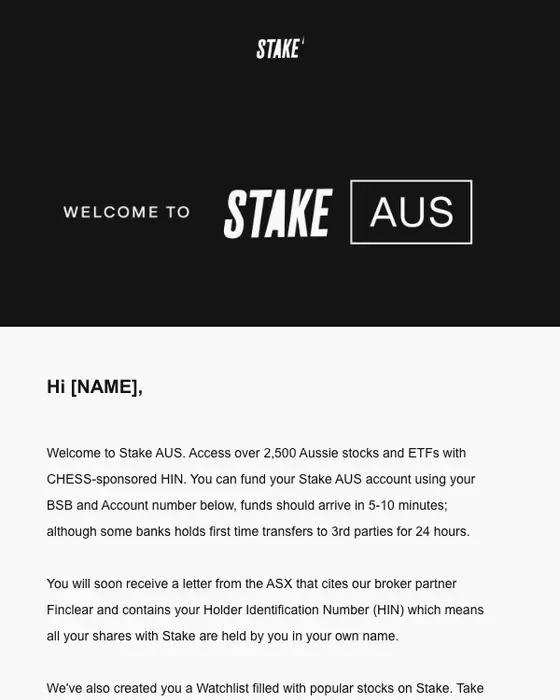
Stake
Welcome to Stake AUS
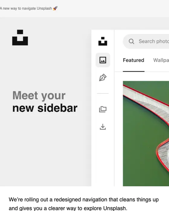
Unsplash
A new way to navigate Unsplash 👀

Captions
NEW AI avatars dropped 👀

CuriosityStream
Start watching the best in factual entertainment 📺
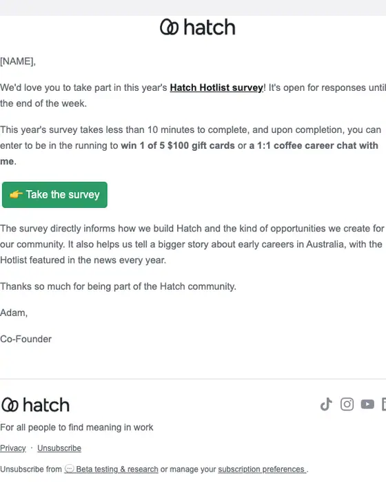
Hatch
Final call: How are you feeling about work?
New York Magazine
Read Our Most Scandalous Stories for Free
DiDi
Welcome to DiDi! Save $20 off on your first ride 🎉🚘
Lumosity
💡🧠 Take time for you
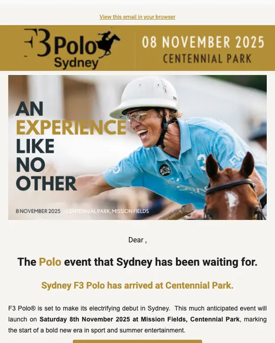
F3 Polo Sydney
The Polo Event Sydney's been waiting for...
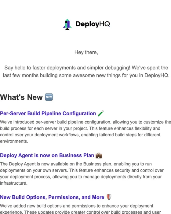
DeployHQ
DeployHQ Newsletter [June 2025]

Splice
Your Splice plan comes with these workflow power-ups

Kyte
All Your Rental Needs
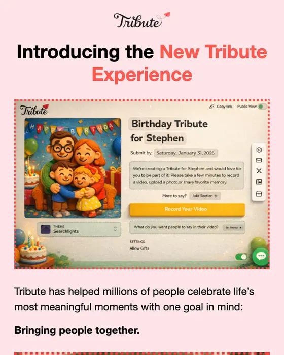
Tribute
🎉 A Fun New Way to Create a Tribute
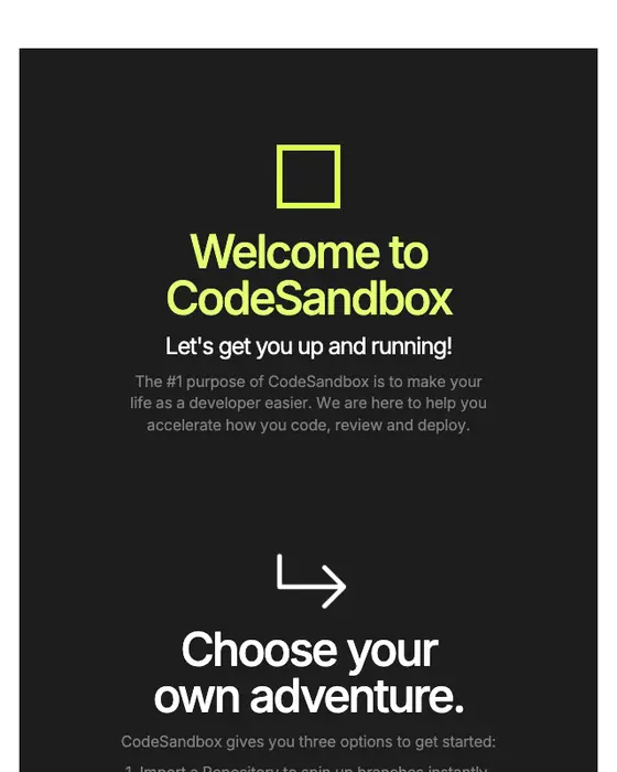
CodeSandbox
Get the most out of CodeSandbox
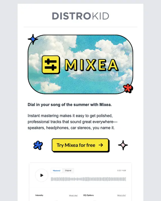
DistroKid
Get your summer track release-ready (for free)
How we picked these 1,821
The library publishes a selection rather than every screenshot, picked for quality and for a spread of brands. For this page we also took out repeats where one brand sent the same type of email more than once (the newest stays), sign-in and security alerts, which can carry IP addresses and locations, most one-time code and password emails, which look alike, subject lines that carry a street address, and receipts, bookings and appointment emails that still showed personal details after redaction. Nothing here is a mockup, and the percentages on this page describe all 8,259.
Single column vs other email layouts, same two inboxes
Single column, plain text and multi column email, same two inboxes
| What we measured | Single column | Plain text | Two or more columns |
|---|---|---|---|
| Share of all 12,711 emails | 65% | 32% | 3% |
| Promotional emails | 23% | 17% | 38% |
| Newsletters | 14% | 7% | 13% |
| Opens with a hero image | 17% | 0% | 23% |
| Has a product grid | 5% | 0% | 40% |
| Exactly one call to action | 27% | 39% | 8% |
| Median calls to action | 3 | 1 | 5 |
| Text heavy | 44% | over 99% | 6% |
| Short or very short | 45% | 72% | 18% |
| Greets by first name | 37% | 49% | 33% |
Single column sits between the other two layouts on most measures. Plain text emails are letters: 39% ask for exactly one click, and 4 of 4,027 open with a hero image. Emails with two or more columns lean toward selling: 38% are promotional and 40% carry a product grid, with a median of 5 calls to action. Single column does both jobs. 44% of single column emails are text heavy, yet 17% open with a hero image, and the median is 3 calls to action.
The two or more columns figure groups two column emails (236), modular grids (159) and multi column emails (30). The plain text set is on our plain text email layout page.
How wide a single column email should be
Nitrosend's email design guidance keeps a single column email between 472 and 600 pixels wide. Wider starts to read as a desktop layout and breaks on mobile. Buttons and links get a touch target of at least 44 by 44 pixels. Both rules are in the open-source email design skill. This library does not measure the width of the emails it shows, so the range is a design rule and not a finding from the 8,259.
What is in the collected set
By type
| Type | Emails | Share of the set |
|---|---|---|
| Promotional | 1,935 emails | 23% of the set |
| Newsletter | 1,191 emails | 14% of the set |
| Shipping | 547 emails | 7% of the set |
| Product launch | 385 emails | 5% of the set |
| Account notice | 384 emails | 5% of the set |
| Order confirmation | 340 emails | 4% of the set |
By industry, SaaS brands sent 18% of the 8,259 and ecommerce brands 12%. Most are not the first email a brand sends: 44% are retention-stage sends, and 23% follow up on an order, from confirmation to delivery. Welcome emails are 310 of the 8,259 (4%).
In the grid of 1,821, the largest groups are promotional emails (382), newsletters (233), welcome emails (140) and account notices (115). Shipping and order emails have their own pages: shipping emails and order confirmations.
Next to this one
The same library, cut by layout: plain text, two column, multi column and modular grid. By type, where single column emails show up most: promotional emails, newsletters and product launch emails.
Questions people ask
In email, a single column layout stacks every block, from logo and headline to images, text and buttons, in one vertical line with nothing side by side. It reads the same on a phone as on a desktop. Of 12,711 emails we collected from two real inboxes, 65% use it.
We sort email into five layouts. Of 12,711 emails collected from two real inboxes, single column is 65%, plain text 32%, two column 2%, modular grid 1%, and multi column under 1%, at 30 emails. Layouts with columns side by side lean promotional: 38% of them, against 23% of single column emails.
Our data shows what brands send, not which layout earns more clicks. The difference is in what they hold: 40% of emails with two or more columns carry a product grid, against 5% of single column emails. One column is still the default, at 65% of all 12,711 emails we collected.
Two ordinary inboxes that signed up to products and newsletters the way any customer would. Nothing is a mockup, and nothing is taken from another email gallery. This page shows 1,821 of the 8,259 single column emails collected, from 1,175 brands. The percentages on the page describe all 8,259.