

![AllEvents.in digest email: [NAME], popular events this weekend in Sydney](/email-examples/img/191e857fb5ec038e-t.webp)

What a modular grid email is
Modular email design is a way of building an email from reusable blocks, such as a header, a hero, a product row and a footer, that can be swapped or reordered. A modular grid email is what that looks like when some blocks split into tiles that sit side by side, such as a grid of products, articles or listings.
We collected 159 modular grid emails from 98 brands, out of 12,711 emails in two ordinary inboxes, so about 1 in 80 uses this layout. This page shows 33 of the 159, from 32 brands, and 29 of them were sent in 2023 or later.
Emails we left out include single column letters filed under this layout, broken renders, repeats of one brand's template, coupons that scan and emails that print private contact details. Nothing here is a mockup, and the percentages on this page describe all 159.
Browse all 33 modular grid emails
Tap a type to narrow the grid, or search a brand or subject line. Open any email to see it full length, with its subject line, notes on what it is doing, and a prompt that rebuilds it.
Redbubble
Up To 40% Off Valentine's Gifts For Him
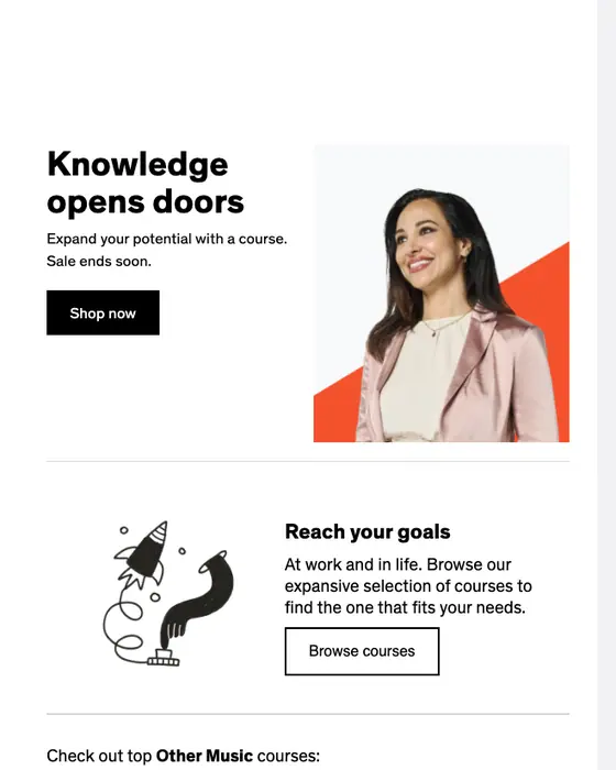
Udemy
Create new opportunities. Courses on sale now.
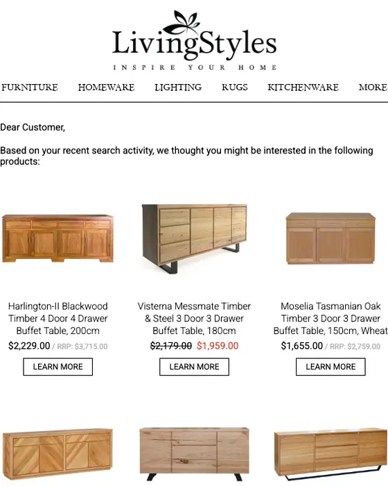
Livingstyles
LivingStyles recommends "Harlington-II Blackwood Timber..." and more
AllEvents.in
[NAME], popular events this weekend in Sydney
EB Games
🎁 Christmas Comes Early: Your EB Games & ZING Sale Starts NOW
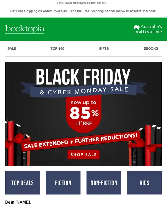
Booktopia Bookstore
Cyber Monday Sale Extended ⏳ Now up to 85% off RRP
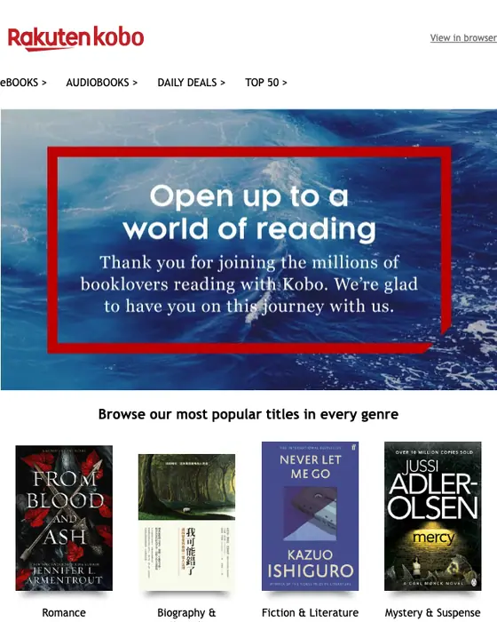
Kobo
Welcome to Kobo!
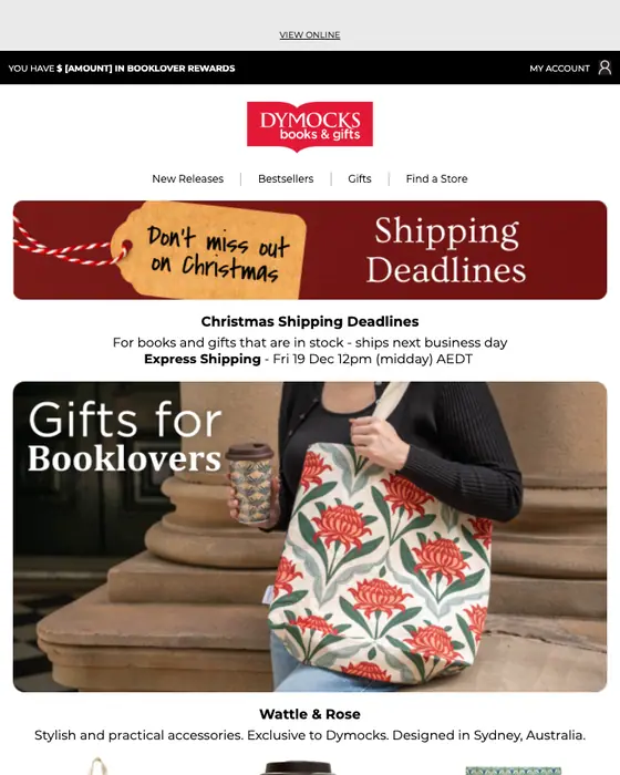
Dymocks Booklover
Discover More Than Books at Dymocks 🎉
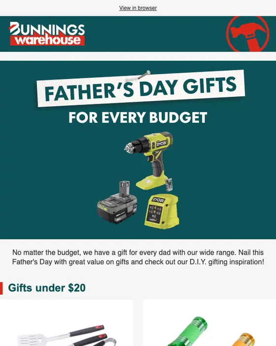
Bunnings
Father's Day gifts for every budget

99designs by Vistaprint
Launching a new biz? Here are 6 helpful tips for branding on a budget

HBO Max
🚨 LAST CHANCE: Save over 40% when you prepay.
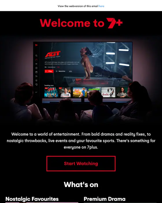
7plus
[NAME], Welcome to 7plus!
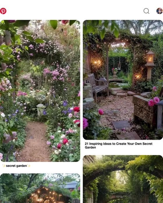
Secret Garden, Whimsical Backyard and more ideas to search for

YouTube Primetime
Watch The White Lotus on YouTube with a 7-day limited-time free trial of Max

MasterClass
Yes, you can learn that!
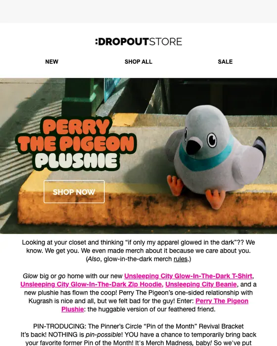
Dropout Merch
Glow-in-the-dark merch that’s absolutely LIT ⭐
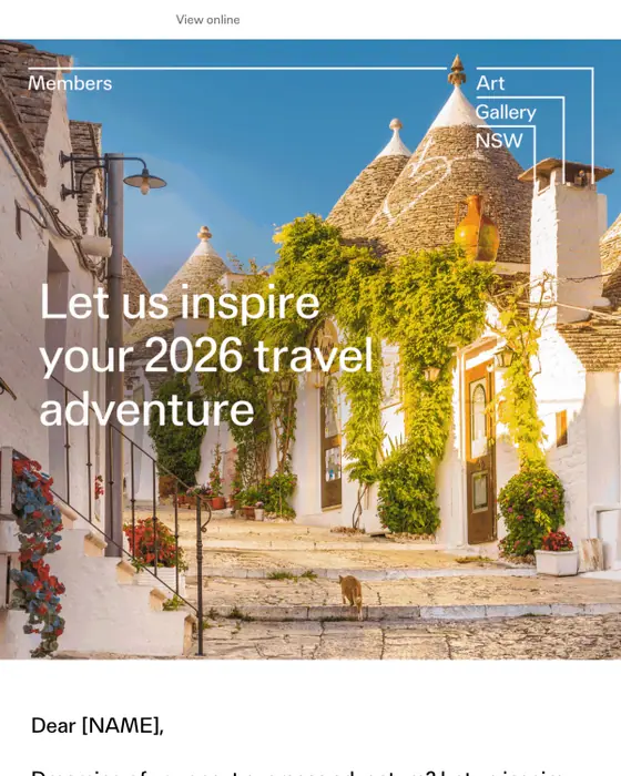
Art Gallery of NSW Members
Dreaming of your next international adventure?
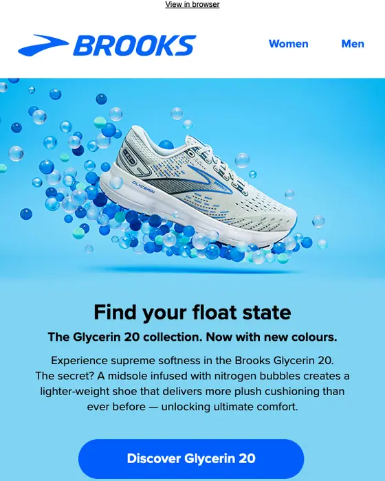
Brooks Running
Find your float state in the Glycerin 20

Crown Awards
🍂 Fall Clearance Is On – Save Up to 50% Now!
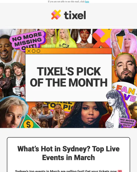
Tixel
🔥Trending in March on Tixel – Dua Lipa, New Order, Kneecap...
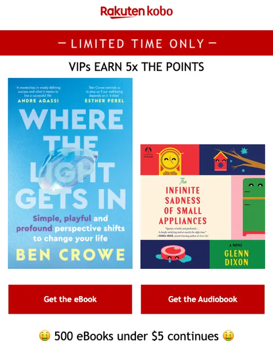
Kobo
Today, Where the Light Gets In can be yours for only $5.99
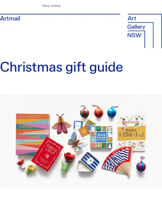
Art Gallery of NSW
🎁 Christmas gift guide

Musos Corner
🎁🎸 Wrap It Up! Final Weekend for Musical Gifts
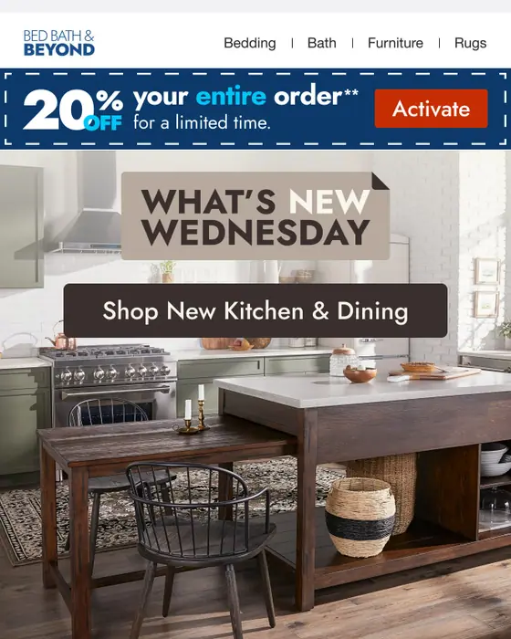
Bed Bath & Beyond
What’s New Wednesday: Kitchen 🧑🍳
Modular grid vs two column vs single column email
Three email layouts, same two inboxes
| What we measured | Modular grid | Two column | Single column |
|---|---|---|---|
| Has a product grid | 60% | 22% | 5% |
| Long email | 58% | 11% | 19% |
| Image heavy | 39% | 9% | 8% |
| Median calls to action | 10 | 4 | 3 |
| Exactly one call to action | 4% | 9% | 27% |
| Bold graphic design style | 30% | 14% | 8% |
| Promotional emails | 38% | 38% | 23% |
| Newsletters | 21% | 8% | 14% |
| Opens with a hero image | 19% | 25% | 17% |
| Greets by first name | 33% | 33% | 37% |
A modular grid is the layout for showing many things at once. 60% of these emails carry a product grid, against 22% of two column and 5% of single column emails from the same inboxes. They run long, with 58% long against 11% and 19%, and 39% are image heavy against 9% and 8%. They ask for the most clicks too: the median modular grid email has 10 calls to action, and only 4% have exactly one.
Newsletters lean this way too: 21% of the set, against 8% of two column and 14% of single column emails. 19% open with a hero image, between two column (25%) and single column (17%). The other layouts have their own pages, two column email examples with 236 emails behind it and single column email examples with 8,259.
What is in the collected set
By industry
| Industry | Emails | Share of the set |
|---|---|---|
| Ecommerce | 37 emails | 23% of the set |
| Media and publishing | 26 emails | 16% of the set |
| Retail and fashion | 19 emails | 12% of the set |
| Real estate | 17 emails | 11% of the set |
| Travel | 14 emails | 9% of the set |
| Marketplace | 13 emails | 8% of the set |
By type, 38% of the 159 are promotional, followed by newsletters (21%), sale emails (12%) and re-engagement emails (9%). In the grid of 33, the largest groups are promotional emails (10), sale emails (6), seasonal emails (6) and newsletters (3).
Next to this one
The same library, cut by layout: single column, two column, multi column and plain text. By type, where modular grids show up most: promotional emails, sale emails, seasonal emails and newsletters. By industry: ecommerce emails and retail and fashion emails.
Questions people ask
Modular email design builds each email from reusable content blocks, such as a header, a hero, a grid of products or articles and a footer, that can be swapped and reordered. A modular grid adds rows of side by side tiles. 60% of the 159 modular grid emails we collected carry a product grid.
Most email uses one column. Of 12,711 emails collected from two real inboxes, 65% are single column, 32% are plain text, 2% use two columns, 1% use a modular grid and under 1% a multi column layout. Modular grids show up mostly in promotional email and newsletters.
Usually more than one thing to click. The median modular grid email we collected has 10 calls to action, against 3 for a single column email, and 58% are long. Only 19% open with a hero image, while 60% carry a product grid.
An email grid layout arranges content in rows of side by side tiles, such as products, articles or listings, instead of one stacked column. In the 159 modular grid emails we collected, 60% carry a product grid, 58% are long and the median has 10 calls to action.
Two ordinary inboxes that signed up to products and newsletters the way any customer would. Nothing is a mockup, and nothing is taken from another email gallery. This page shows 33 of the 159 modular grid emails collected, from 32 brands. The percentages on the page describe all 159.