
![GymbaROO-KindyROO promotional email: Term 2 Adventures Start Now, [NAME]!](/email-examples/img/19dddf47d02640c6-t.webp)
What an education promotional email is
An education promotional email is one a school, university, course creator or training provider sends to sell a place: an enrollment, a course, a class, a camp or a certification.
We collected 192 of them from 106 education brands out of two ordinary inboxes, sent between 2016 and 2026. Nothing here is a mockup. This page shows 23, one from each of 23 brands. Only 37 of the 192 have been published as images so far, and we left off the rest of those for repeats, a fundraising appeal and personal details. 81 of the 192 were sent in 2023 or later, and the grid starts with the 16 of those shown here.
Browse all 23 education promotional emails
Tap what the email sells to narrow the grid: kids' classes and camps, online courses, career training, or schools and degrees. Between them they cover term enrollment (GymbaROO-KindyROO), applications closing soon (Victoria University Online), holiday and summer camps (Junior Engineers, ChessKid), a course launch with an offer ending (Shani Raja) and a waitlist for a new product (Khan Academy). Open any email to see it full length, with its subject line, notes on what it is doing, and a prompt that rebuilds it.
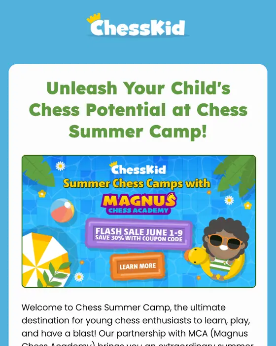
ChessKid
🌞LAST DAY to register and save 30% off Summer Chess Camps!🌞
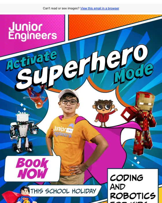
Junior Engineers
These holidays are long , but so is our list of coding and robotics classes!
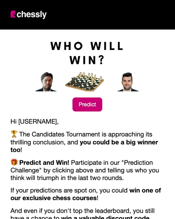
Chessly
Win a Free Course! Predict the winner of the Candidates
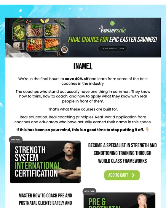
Clean Health
[NAME], your next move starts here!
GymbaROO-KindyROO
Term 2 Adventures Start Now, [NAME]! 🙌
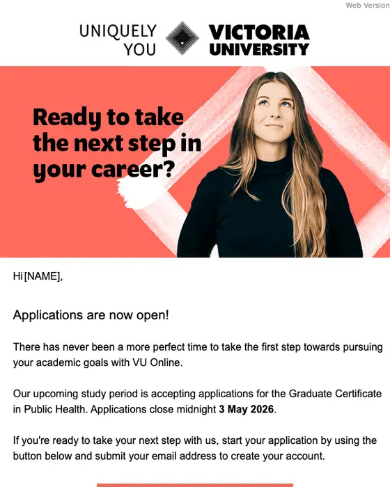
Victoria University Online
Applications are closing soon
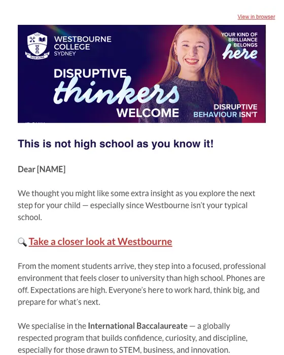
Westbourne College Sydney
See why ambitious teens choose Westbourne 🔎
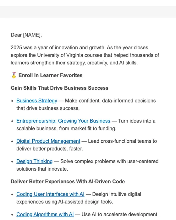
University of Virginia
University of Virginia: Top Business + AI Courses to Learn Before 2026
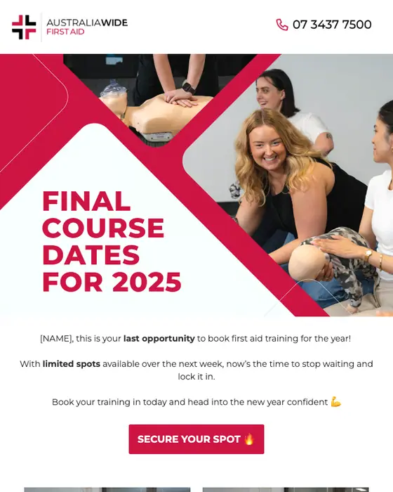
Australia Wide First Aid
Last chance to book First Aid before the year ends!
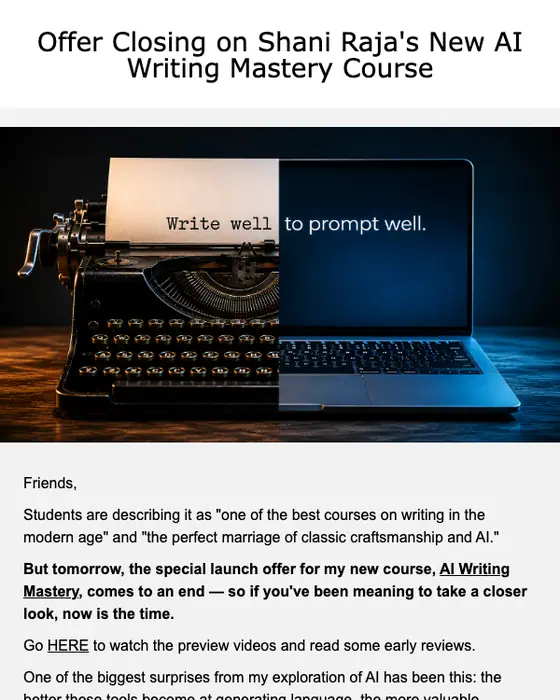
Shani Raja
Offer Ending on "AI Writing Mastery" Launch
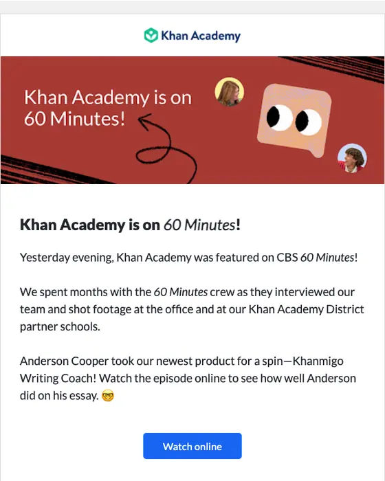
Khan Academy
60 Minutes Featured Khan Academy yesterday 🥺

Scholarly
[Y4-Y5] 5x FREE BOOKS + THINKING SKILLS KEY STRATEGIES
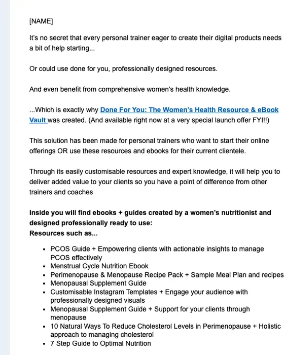
Fitness Education Online
2x free bonus ebooks 🎉
Accumentum
CareerSync® is your solution for Career Growth!
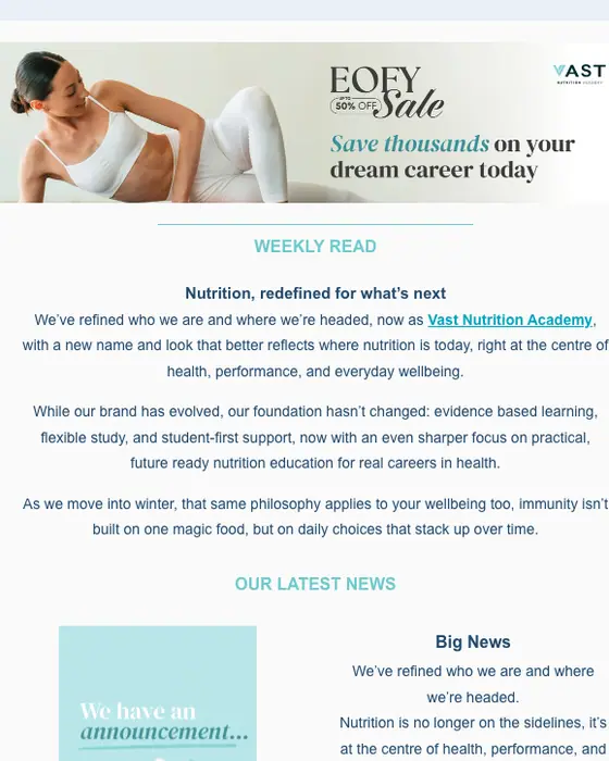
Vast Fitness Academy
We have some news...we've evolved!!
Social Skills Australia
Your teen is struggling socially. Here is how to make sense of it.
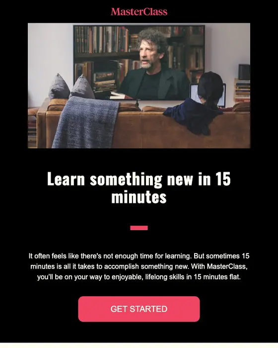
MasterClass
Enrich your life in 15 minutes
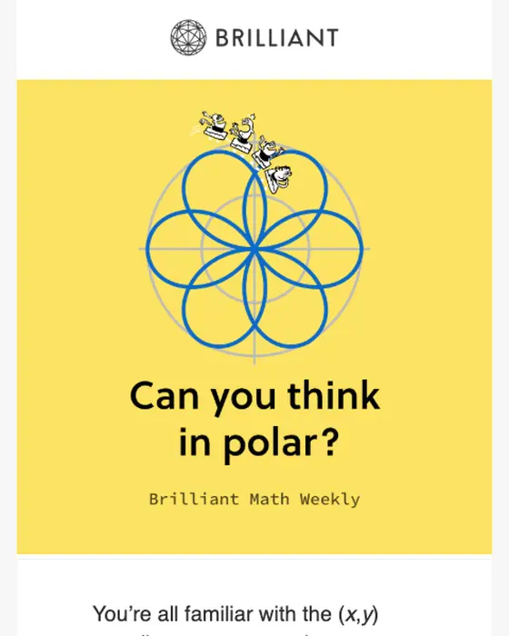
Brilliant
[NAME], can you think in polar?
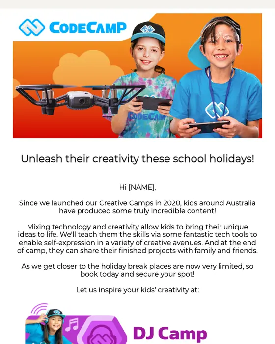
Code Camp
Do you have a creative kid in the house?
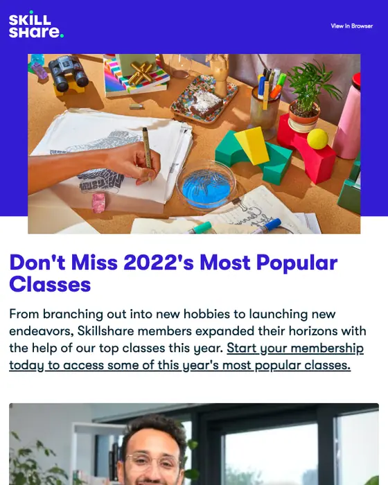
Skillshare
Don't Miss 2022's Most Popular Classes
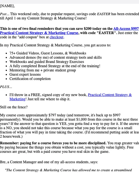
Express Writers
Need guided content strategy training? Easter Savings ends tomorrow 🐰Save $200
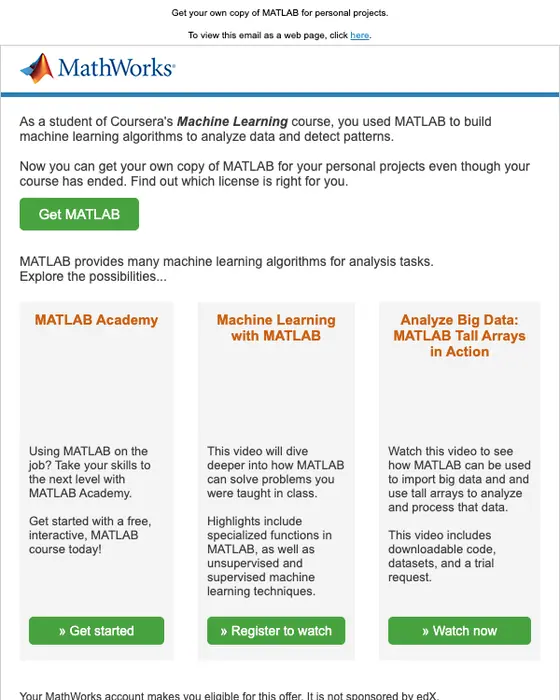
MathWorks MOOC Team
Build Machine Learning Algorithms with MATLAB
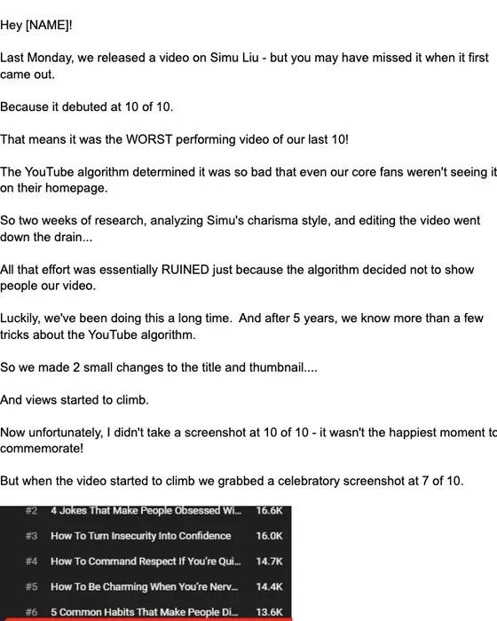
Charisma On Command
Would you like a successful YouTube channel?
How education promotions differ from other promotional email, same two inboxes
Education promotional email, all promotional email and all email, same two inboxes
192 education promotions, 2,799 promotions, 12,711 emails| What we measured | Education promotions | All promotions | All email |
|---|---|---|---|
| Instructional in tone | 54% | 36% | 37% |
| Greets the reader by first name | 43% | 29% | 40% |
| Has a hero image | 8% | 24% | 12% |
| Text heavy | 65% | 48% | 60% |
| Long | 28% | 19% | 16% |
| Median calls to action | 2.5 | 2 | 2 |
| Asks for one thing only | 25% | 30% | 30% |
| Urgency in the subject line | 9% | 4% | 4% |
| Discount in the subject line | 16% | 22% | 11% |
An education promotion reads more like a lesson than a sale. 54% are instructional in tone, against 36% of all promotional email, and 28% run long, against 19%. They show less: 8% open on a hero image, against 24% of promotions. They are more personal, with 43% greeting the reader by first name against 29%. In the subject line they reach for urgency about twice as often as other promotions (9% against 4%) and for a discount less often (16% against 22%).
Every kind of promotional email, every industry, is in promotional email examples.
What is in the set
By what the email sells
the 23 shown on this page, sorted by hand| What it sells | Emails | Share |
|---|---|---|
| Career training and certification | 7 emails | 30% of those shown |
| Online courses | 7 emails | 30% of those shown |
| Kids' classes and camps | 6 emails | 26% of those shown |
| Schools and degrees | 3 emails | 13% of those shown |
We read each of the 23 and sorted it by what it is selling. Career training is the largest group: Vast Fitness Academy's end of financial year sale offers up to 50% off selected courses, and Australia Wide First Aid, Clean Health, Fitness Education Online, Accumentum, Express Writers and MathWorks make up the rest of the group. Online courses come from MasterClass, Brilliant, Skillshare, Chessly, Shani Raja, Charisma On Command and Khan Academy, whose email asks readers to join the waitlist for a free writing coach. Six sell classes and camps for children: ChessKid, Junior Engineers, Code Camp, GymbaROO-KindyROO, Social Skills Australia and Scholarly, which offers a free Zoom session with five free books. Victoria University Online, Westbourne College Sydney and the University of Virginia sell places and courses.
By tone
all 192 education promotions collected| Tone | Emails | Share of the set |
|---|---|---|
| Instructional | 104 emails | 54% of the set |
| Warm | 38 emails | 20% of the set |
| Urgent | 36 emails | 19% of the set |
| Celebratory | 6 emails | 3% of the set |
| Playful | 5 emails | 3% of the set |
| Other | 3 emails | 2% of the set |
Instructional is the most common tone by a wide margin. Urgent ones on this page include ChessKid's summer camp "LAST DAY to register" and Australia Wide First Aid's "Last chance to book First Aid before the year ends!". Free sessions and taster classes like Scholarly's overlap with webinar invitations, and the sales with discount offer emails.
Next to this one
The same library, cut a different way: every education email, including receipts and reminders, education newsletters, and promotions from SaaS, health and fitness and media and publishing brands.
Questions about education promotional emails
This page shows 23 real promotional emails from 23 education brands, out of 192 we collected from 106. They sell four things: kids' classes and camps (ChessKid, Junior Engineers), online courses (MasterClass, Skillshare), career training (Australia Wide First Aid, Vast Fitness Academy) and places at schools and universities (Victoria University Online). Open any one to read it full length.
They teach more and show less. 54% of the 192 we collected are instructional in tone, against 36% of all 2,799 promotional emails. Only 8% open on a hero image, against 24% of promotions. 28% run long, against 19% of promotional email.
More often than other promotions. 43% of the 192 education promotional emails we collected greet the reader by first name, against 29% of all promotional email and 40% of every email in the library. On this page, GymbaROO-KindyROO puts the reader's name into its subject line: "Term 2 Adventures Start Now, [NAME]!"
Only 37 of the 192 have been published as images in this library so far. We took 14 of those off this page: 9 repeats from a brand already shown, so each brand appears once, 1 school fundraising appeal that sells no course, and 4 that carried someone's personal details. The percentages on this page still describe all 192.
Send one like it
Simple pricing. Unlimited contacts.
Every plan includes full stack emailing: Flows, Newsletter Campaigns and Transactional Email, plus our NitroWheel LLM and all agent integrations (Claude, ChatGPT, Codex, Cursor and others). Pay for what you send, not who you store.
- Emails 8,000then 500/mo
- Email types Transactional & Marketing
- AI actions 20/mo
- Contacts Free & Unlimited
- Brands 3 · Custom domain 1
- Seats 1
- Recipients / rolling 24h 100–5,000
- Email validation Prepaid only
- Emails 20,000/month
- NitroWheel LLM Included
- Brands 5 · Domains 3
- AI actions 1,000/mo
- Contacts Free & Unlimited
- BYO sending and AI keys Yes
- Seats 3
- Recipients / rolling 24h 1,000–100,000
- Email validation Prepaid only
- Emails 125,000/month
- AI actions 5,000/mo
- Brands 10 · Domains 10
- Seats 10
- Frontier AI Included
- Dedicated IP Available
- Recipients / rolling 24h 1,000–625,000
- Email validation Prepaid only
- AI actions Unlimited
- Unlimited brands & domains Included
- SSO / SAML Included
- 99.9% SLA Included
- Recipients / rolling 24h Contracted
- Email validation Prepaid only
Daily allowances depend on your plan and sender standing. Strong list, domain and delivery evidence can raise standing, including on day one. Trusted receives the full plan allowance; available email credits, safety checks and delivery pacing still apply.
Free forever. No credit card required. See full comparison →