Compare the Market
Subject line
⚡️ We’re zapping your energy bills
What it is doing
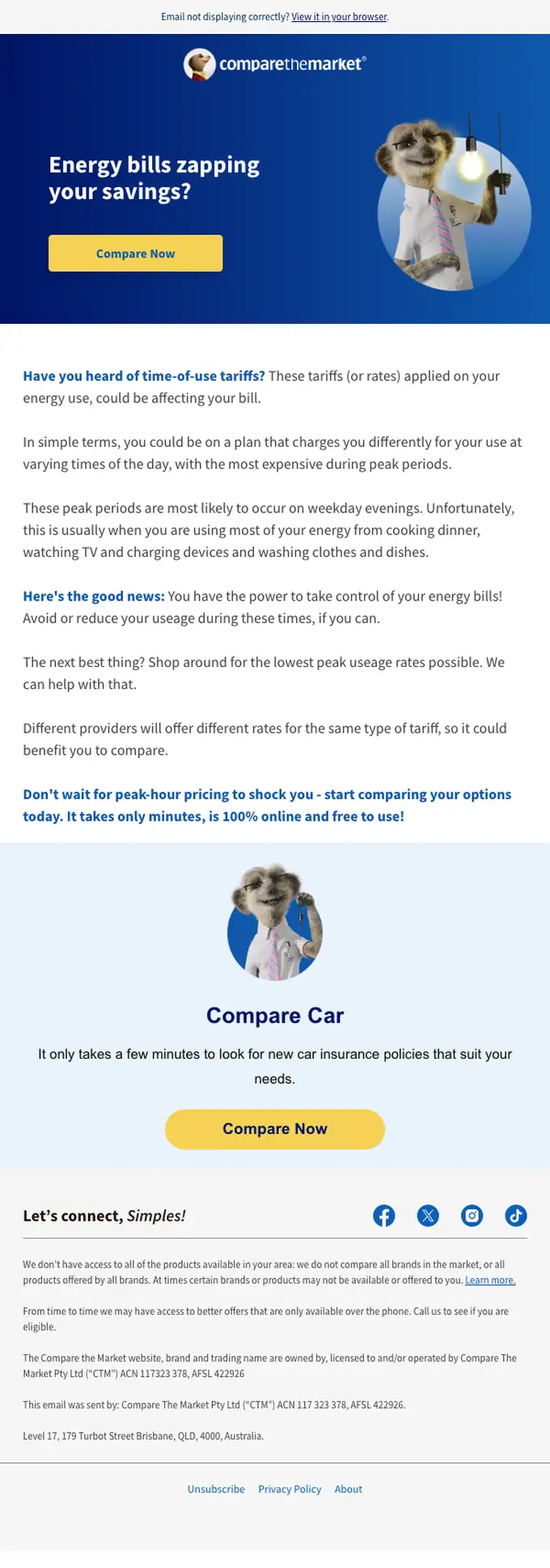
This email uses a single-column layout with a clear hierarchy, guiding the user from an energy bill problem to a solution. It effectively uses a two-stage CTA, first for energy comparison, then a secondary one for car insurance, both using the same button style. The design is clean and uses a limited color palette to highlight key information.
Worth stealing
The email effectively cross-promotes a secondary service (car insurance) after the primary call to action for energy comparison.
Attributes
promotionalfinanceutilitariansingle columnacquisitioninstructionalmediumAU
In the library