
![Tally Forms welcome email: Welcome to Tally, [NAME]!](/email-examples/img/195f91f2d53c10c5-t.webp)
What a SaaS welcome email is
A SaaS welcome email is the first message a software product sends after someone signs up: it confirms the account and points the new user at the first thing to do.
We collected 131 of them from 109 SaaS brands out of two ordinary inboxes, sent between 2016 and 2026. Nothing here is a mockup. This page shows 23 from 23 brands. 35 of the 131 have been published as images so far, and we left off 12 of those: four second sends from a brand already shown here, two senders that are not SaaS products (a dating app and an accelerator), two signed with a staff member's full name, one showing a person's phone number, one broken render, one private program email and one whose subject line we could not show as written. 97 of the 131 were sent in 2023 or later, and the grid starts with the 21 of those shown here.
Browse all 23 SaaS welcome emails
Tap a layout to narrow the grid: 6 are plain-text notes, 17 are designed single-column emails. Open any email to see it full length, with its subject line, notes on what it is doing, and a prompt that rebuilds it.
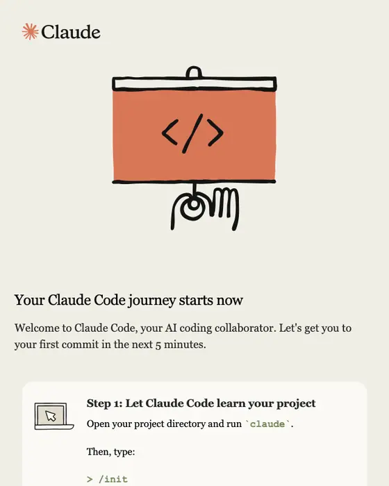
Claude Code
Welcome to Claude Code
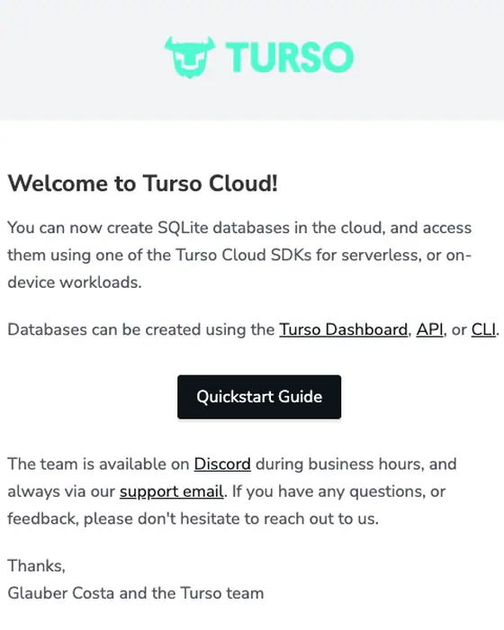
Turso
Welcome to Turso Cloud!
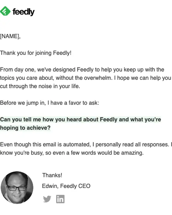
Feedly
A quick hello
Tally Forms
Welcome to Tally, [NAME]!
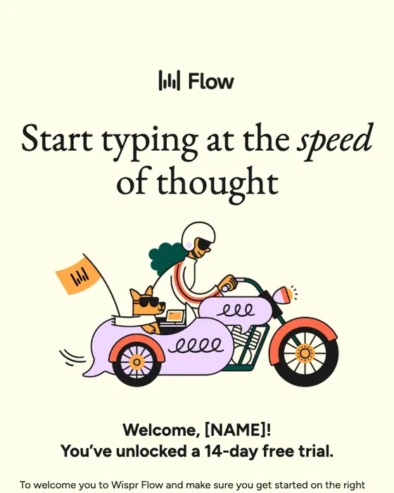
Wispr Flow
Welcome to Wispr Flow 💜
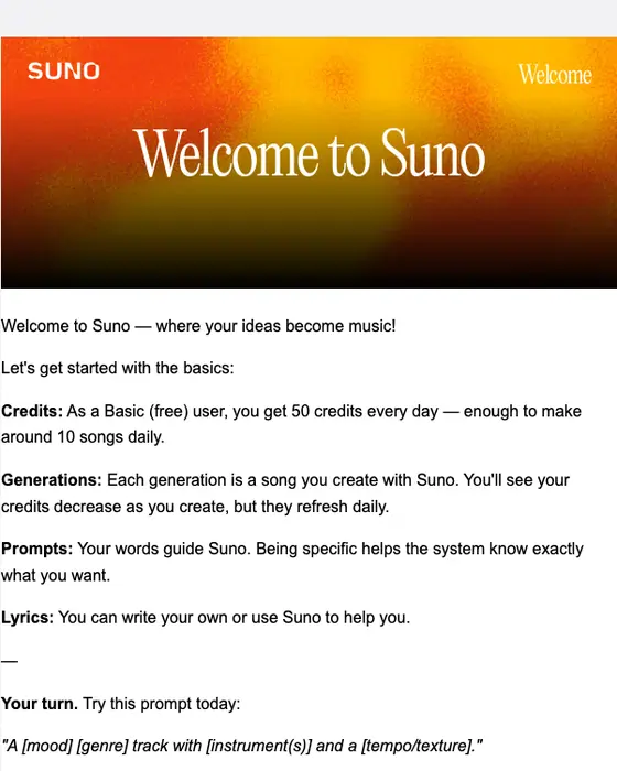
Suno
Welcome to Suno! Your first song is waiting
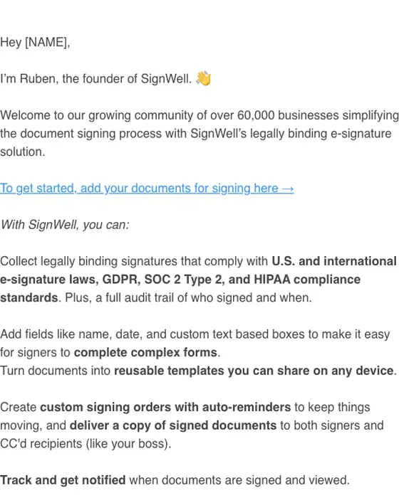
SignWell
Welcome to SignWell!
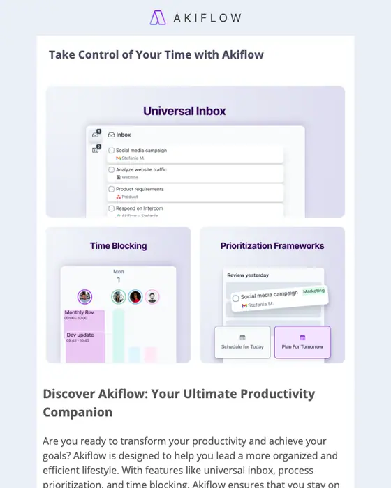
Akiflow
You're 2 minutes away from full productivity 🚀
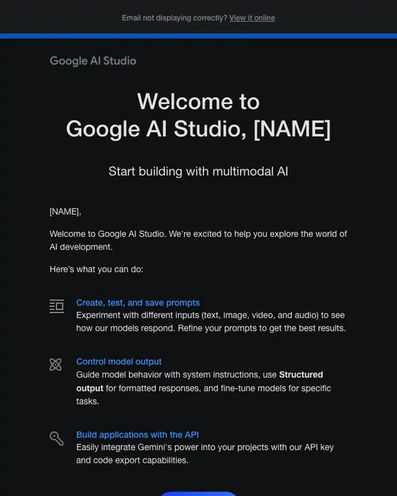
Google AI Studio
[NAME]: Welcome to Google AI Studio
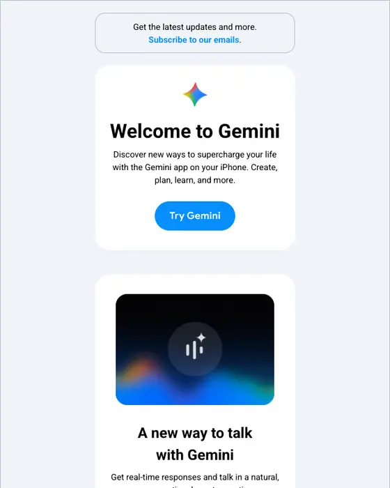
Google Gemini
Hey [NAME], welcome to Gemini
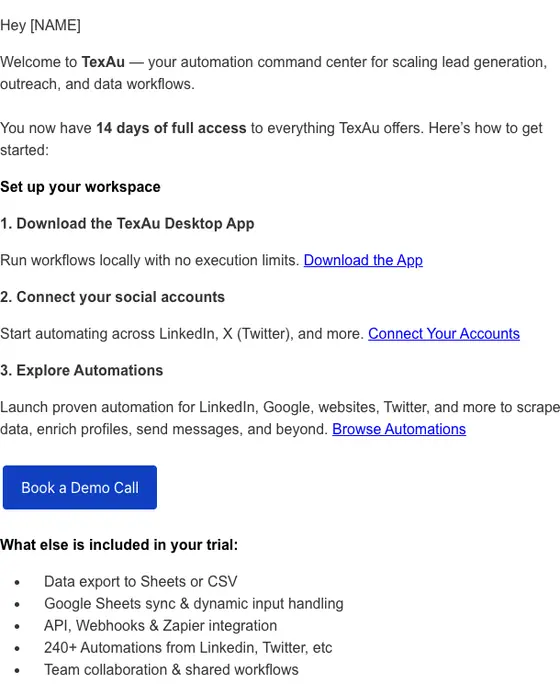
TexAu
Welcome to TexAu - Your 14-Day Trial Is Live
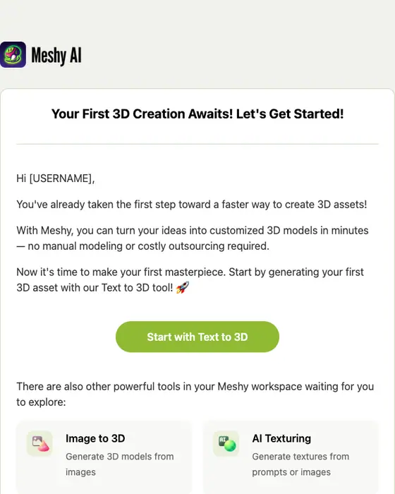
Meshy
Your First 3D Creation Awaits! Let's Get Started!
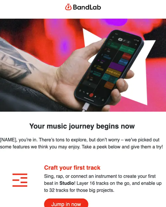
BandLab
[NAME], welcome to BandLab! 👋
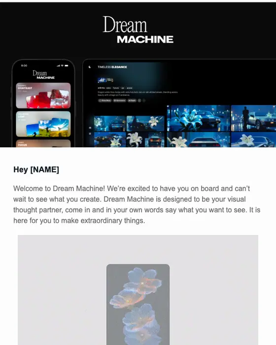
Luma AI
🤗 Welcome to Dream Machine
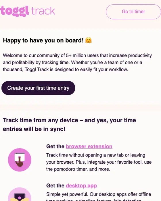
Toggl Track
Welcome to Toggl Track!
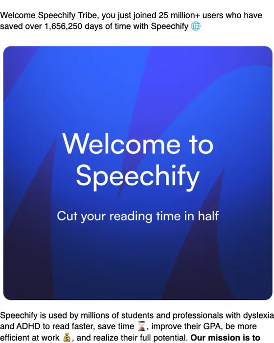
Speechify
Welcome to Speechify 💙
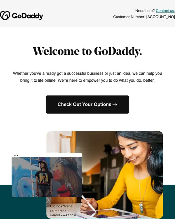
GoDaddy
Thanks for creating your account and welcome to GoDaddy.
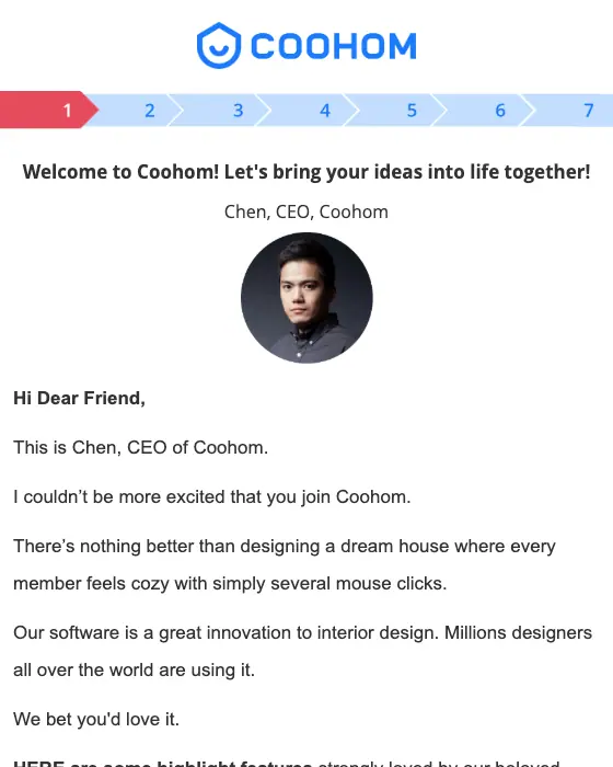
Coohom
Welcome to Coohom! I'd really like your eyes on this.
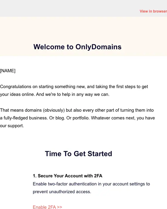
OnlyDomains
Welcome to OnlyDomains 👋

Serato
Welcome to Serato DJ Lite 👋
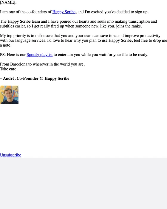
Happy Scribe
a personal hello
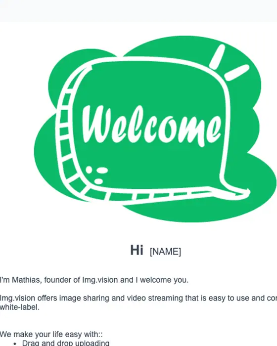
Img.vision
Welcome to Img.vision!
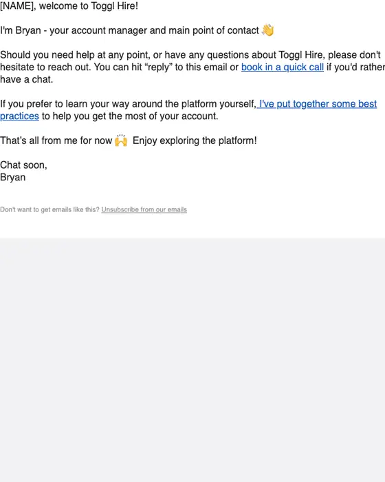
Toggl Hire
[NAME], nice to meet you!
How SaaS welcome emails differ from other welcome emails
SaaS welcome emails, all welcome emails and all email, same two inboxes
131 SaaS welcome emails, 468 welcome emails, 12,711 emails| What we measured | SaaS welcome | All welcome | All email |
|---|---|---|---|
| Instructional in tone | 51% | 32% | 37% |
| Warm in tone | 44% | 57% | 15% |
| Sent to a business audience | 39% | 13% | 19% |
| Short or very short | 68% | 54% | 53% |
| Plain-text layout | 38% | 30% | 32% |
| Has a hero image | 5% | 15% | 12% |
| Median calls to action | 3 | 2 | 2 |
| Carries one call to action | 31% | 32% | 30% |
| Greets the reader by first name | 46% | 50% | 40% |
A SaaS welcome email teaches more than it greets. 51% are instructional, against 32% of welcome emails from every industry, where a warm hello is the norm (57%). They are shorter, too: 68% are short or very short, against 54%. And they show fewer pictures, with a hero image in 5% against 15%, while 38% use a plain-text layout.
The usual advice for a welcome email is one clear next step. Only 31% of the SaaS ones we collected carry one call to action, the same share as welcome emails overall, and the median carries 3 calls to action. Every industry's welcome emails are in welcome email examples.
What the set looks like
Three shapes repeat across the ones shown. The plain-text note from a person asks for a reply: Toggl Hire's account manager asks you to hit reply, Feedly's CEO asks how you heard about Feedly and what you hope to achieve, and Happy Scribe's co-founder asks you to drop a note. The one-button email is built around a single button: Tally's creates a form, Meshy's makes a first 3D model, Akiflow's finishes setup. The tour lists what the product does, and Google Gemini and Luma AI each carry 10 calls to action by our count.
By layout
all 131 SaaS welcome emails collected| Layout | Emails | Share of the set |
|---|---|---|
| Single column | 75 emails | 57% of the set |
| Plain text | 50 emails | 38% of the set |
| Two column | 6 emails | 5% of the set |
By length
all 131 SaaS welcome emails collected| Length | Emails | Share of the set |
|---|---|---|
| Short | 69 emails | 53% of the set |
| Medium | 34 emails | 26% of the set |
| Very short | 20 emails | 15% of the set |
| Long | 8 emails | 6% of the set |
Long is rare. More plain-text emails from every kind of sender are collected in plain-text email examples.
Next to this one
The same library, cut a different way: every SaaS email, onboarding emails and activation emails from any industry, emails asking a new user to confirm their address, which often arrive first, SaaS newsletters and SaaS product launch emails that come later, and B2B emails.
Questions about SaaS welcome emails
The 23 on this page are real ones, from Claude Code, Feedly, Tally, Suno, Wispr Flow, Google AI Studio and 17 other brands. Feedly's CEO asks how you heard about the product, Tally builds its email around one button to create your first form, and Google Gemini walks through its features. 21 of the 23 were sent in 2023 or later.
Look at what the 131 we collected have in common: 68% are short or very short, 51% are instructional rather than warm, and 46% greet the reader by first name. Most explain how to start using the product. Only 5% open on a hero image, against 15% of welcome emails from every industry.
Advice usually says one. In practice the median SaaS welcome email we collected carries 3, and only 31% carry one call to action, about the same as welcome emails overall (32%). 22% carry five or more. The ones built around a single button include Tally, Meshy and Akiflow.
More of them are than in most email. 38% of the 131 SaaS welcome emails we collected use a plain-text layout, against 30% of all welcome emails and 32% of all email. The plain-text ones shown here are mostly a short note from a founder or a named person asking for a reply, like SignWell's and Feedly's.
35 of the 131 have been published as images in this library so far. We took 12 of those off this page: four second sends from a brand already shown here, two senders that are not SaaS products (a dating app and an accelerator), two signed with a staff member's full name, one showing a person's phone number, one broken render, one private program email and one whose subject line we could not show as written. The percentages on this page still describe all 131.
Send one like it
Simple pricing. Unlimited contacts.
Every plan includes full stack emailing: Flows, Newsletter Campaigns and Transactional Email, plus our NitroWheel LLM and all agent integrations (Claude, ChatGPT, Codex, Cursor and others). Pay for what you send, not who you store.
- Emails 8,000then 500/mo
- Email types Transactional & Marketing
- AI actions 20/mo
- Contacts Free & Unlimited
- Brands 3 · Custom domain 1
- Seats 1
- Recipients / rolling 24h 100–5,000
- Email validation Prepaid only
- Emails 20,000/month
- NitroWheel LLM Included
- Brands 5 · Domains 3
- AI actions 1,000/mo
- Contacts Free & Unlimited
- BYO sending and AI keys Yes
- Seats 3
- Recipients / rolling 24h 1,000–100,000
- Email validation Prepaid only
- Emails 125,000/month
- AI actions 5,000/mo
- Brands 10 · Domains 10
- Seats 10
- Frontier AI Included
- Dedicated IP Available
- Recipients / rolling 24h 1,000–625,000
- Email validation Prepaid only
- AI actions Unlimited
- Unlimited brands & domains Included
- SSO / SAML Included
- 99.9% SLA Included
- Recipients / rolling 24h Contracted
- Email validation Prepaid only
Daily allowances depend on your plan and sender standing. Strong list, domain and delivery evidence can raise standing, including on day one. Trusted receives the full plan allowance; available email credits, safety checks and delivery pacing still apply.
Free forever. No credit card required. See full comparison →