
![Slack activation email: [NAME] has started a free trial of Slack Pro](/email-examples/img/18f4b68430da1057-t.webp)
What an activation email is
An activation email is sent after someone signs up, starts a trial or accepts an invite, to get them to the first real use of the product: finish setting up, try the main feature, take the first test or trade, or use a trial before it runs out. The confirm-your-email message that switches an account on comes first, and has its own page: email verification examples. Reactivation is a different job, winning back someone who used the product and lapsed: see re-engagement email examples.
We sorted 785 emails from 517 brands, collected from two ordinary inboxes, into the activation stage. Most were promotions, launches and invitations, so the numbers here count the 156 from 123 brands whose type is account notice, re-engagement, deadline, survey, onboarding, subscription, verification or welcome. That set is looser than the definition above: it also holds course and crowdfunding deadlines, research surveys and general account notices. 42 of the 156 have been published as images so far, and this page shows 18 of them, from 18 brands, the nudges, notices and deadlines tied to something the reader just signed up for (the questions below itemize the 24 left off). 56 of the 156 were sent in 2023 or later, and so were 14 of the 18 shown, which open the grid. Nothing here is a mockup.
Browse all 18 activation emails
Tap a type to narrow the grid: 8 re-engagement nudges and 6 account notices. The other 4 are two invite and booking deadlines, one set of setup steps and one trial that has started, under All. Open any email to see it full length, with its subject line, notes on what it is doing, and a prompt that rebuilds it.
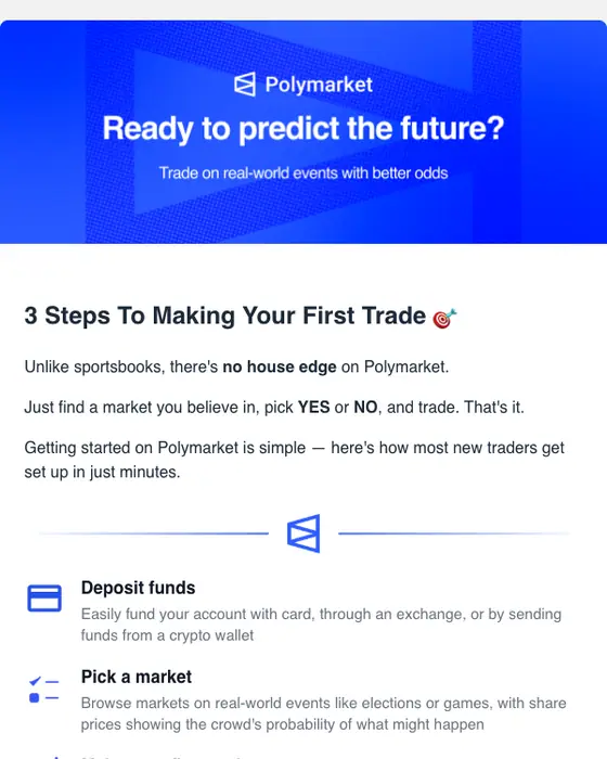
Polymarket
Your first Polymarket trade in 3 steps 🎯
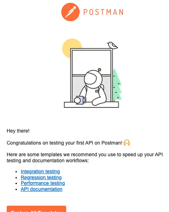
Postman
Get started faster with Postman templates
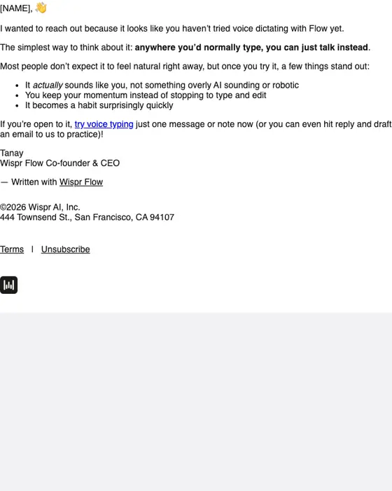
Wispr
Give this a quick try
Slack
[NAME] has started a free trial of Slack Pro
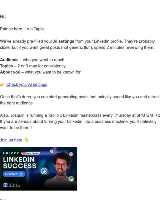
Taplio
Your AI settings are ready - check them now
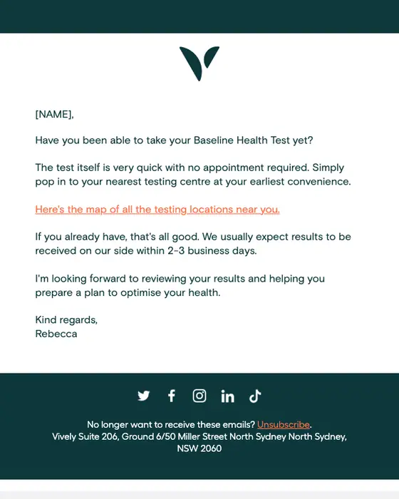
Vively
Have you taken the test yet?
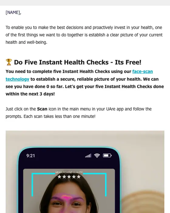
UAre
🚩 [NAME] - Instant Health Checks Update: You've Done 0 So Far, Aim for 5.
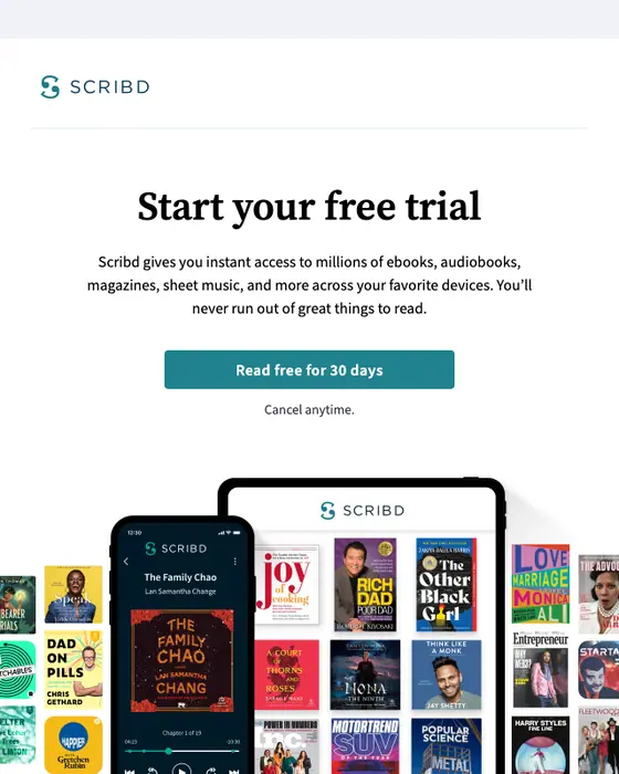
Scribd
Your free trial is waiting
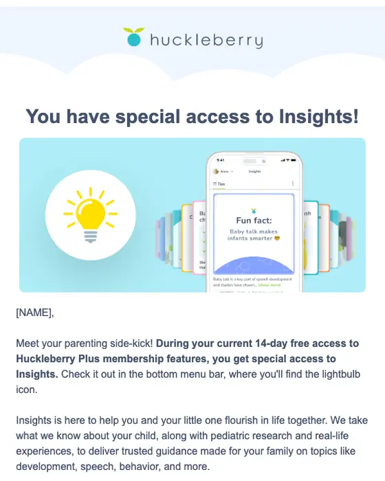
Huckleberry
Check out Insights during your free access! 💡
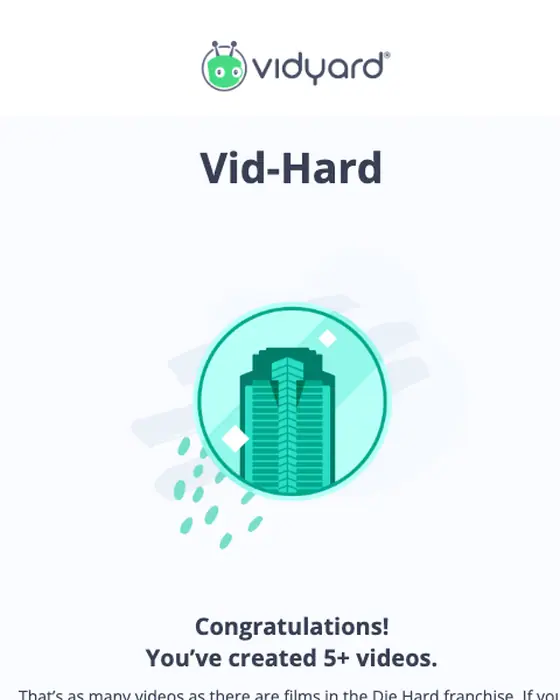
Vidyard
Congrats on hitting the Vid-Hard milestone!
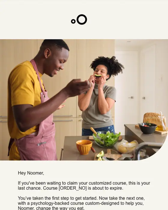
Noom
Your customized course [ORDER_NO] is ready
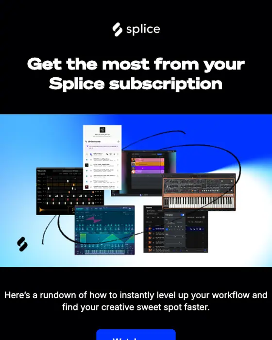
Splice
Your Splice plan comes with these workflow power-ups
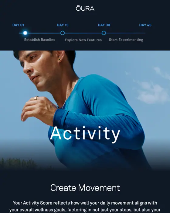
Oura
Align your wellness goals with Activity Tracking
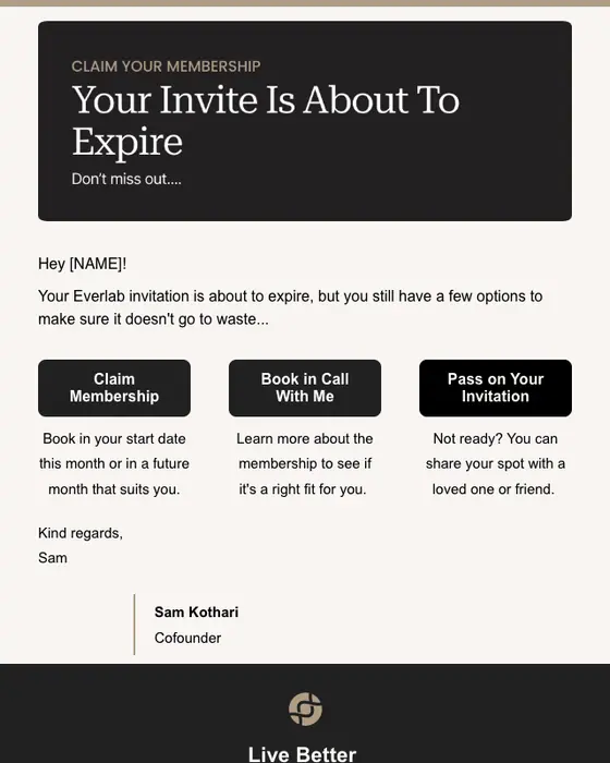
Everlab
Your Invitation Is About To Expire.
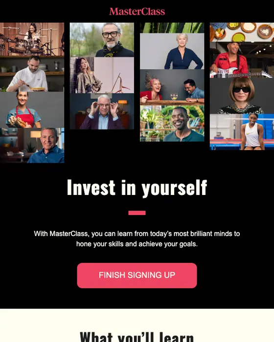
MasterClass
Yes, you can learn that!
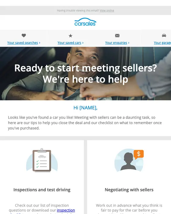
carsales
Ready to start meeting sellers? We're here to help
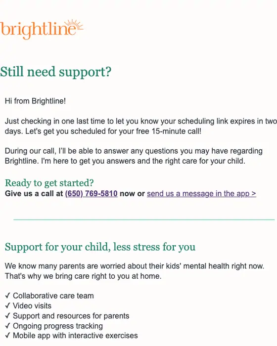
Brightline
Your scheduling link is about to expire!
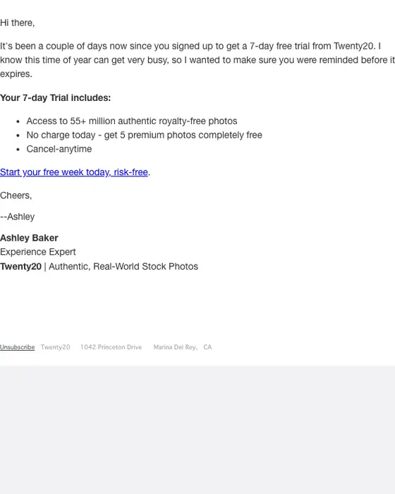
Twenty20
Last chance for 7 days of premium photos on us
How activation-stage email differs from other email
Activation-stage emails and all email, same two inboxes
156 activation-stage emails, 12,711 emails| What we measured | Activation stage | All email |
|---|---|---|
| Instructional in tone | 53% | 37% |
| Plain-text layout | 49% | 32% |
| Greets the reader by first name | 51% | 40% |
| Personalized subject line | 17% | 7% |
| Short or very short | 63% | 53% |
| Subject line leads with a discount | 2% | 11% |
| Has a hero image | 5% | 12% |
| Sent to a business audience | 28% | 19% |
| Asks for one thing only | 42% | 30% |
| Median calls to action | 2 | 2 |
Email in the activation stage teaches more than it sells. 53% are instructional in tone against 37% of all email, and 2% lead with a discount in the subject line against 11%. Nearly half are plain text, 49% against 32%, and only 5% open on a hero image, under half the rate of email overall. They are more personal too: 51% greet the reader by first name and 17% personalize the subject line, against 40% and 7%.
Voice does more of the work than layout. Wispr's nudge, from its co-founder and CEO, and Taplio's, from its general manager, are plain-text notes signed by a named person, each built around one main link.
The usual advice is one clear next step. 42% of the emails we collected in the activation stage ask for one thing, against 30% of all email, though the median still carries 2 calls to action.
What the set looks like
By type of email
all 156 emails collected in the activation stage| Type | Emails | Share of the set | Ask for one thing | Instructional in tone |
|---|---|---|---|---|
| Account notice | 67 | 43% | 42% | 67% |
| Re-engagement nudge | 56 | 36% | 50% | 48% |
| Deadline (trial, invite, course or campaign) | 13 | 8% | 23% | 0% |
| Other (surveys, setup steps, trial started, verification, welcome) | 20 | 13% | 30% | 55% |
Account notices and re-engagement nudges make up 79% of the set. The nudges hold to one ask most often, half of them, and the deadlines least: 12 of the 13 deadlines are urgent in tone and none is instructional. These are the types assigned to each email, and they are looser than the definition at the top: the deadlines include course and crowdfunding ones as well as trial and invite ones, most of the surveys are research surveys, and the account notices include announcements and team notices.
Some brands send these on a timer. Wispr's welcome arrived on April 4, 2026, and two days later, to the minute, its co-founder wrote "Give this a quick try": plain text, the reader has not tried voice dictating yet, one link to try it. Two more Wispr emails followed on April 8 and 12 at the same time of day. Polymarket sent "Your first Polymarket trade in 3 steps" on June 23, 2026 and a promotional email at the same minute on each of the next three days. Postman congratulates the reader on testing a first API, then lists four templates to try next. Taplio pre-filled its AI settings from the reader's LinkedIn profile and asks for two minutes reviewing them, and Slack's trial email says when the trial ends and that no credit card is needed before it asks for anything.
The other emails sorted into the activation stage
629 of the 785, not counted on this page| Type | Emails |
|---|---|
| Promotional | 206 |
| Product launch | 166 |
| Event invite | 109 |
| Webinar | 54 |
| Abandoned cart | 29 |
| Other (job alerts, thank-you notes, discount offers, referrals and more) | 65 |
These were sent after a sign-up or subscription, so they sit at the same stage, but they sell or announce rather than get someone started. They have their own pages: promotional emails, product launch emails, event invitations, webinar invitations and abandoned cart emails.
Next to this one
The same library, cut a different way: onboarding emails and SaaS welcome emails sent right after a sign-up, emails asking a new user to confirm their address, re-engagement emails for people who have gone quiet, expiration notices, retention emails that come later, and every SaaS email in the library.
Questions about activation emails
An activation email is sent after someone signs up, starts a trial or accepts an invite, to get them to the first real use of the product. Of the 156 emails we collected in the activation stage, 43% are typed as account notices and 36% as re-engagement nudges; the rest are deadlines, surveys, setup steps and similar.
Polymarket's "Your first Polymarket trade in 3 steps" is one: it names the first action and lays out deposit, pick a market and trade. Wispr's co-founder wrote two days after its welcome to say the reader had not tried voice dictating yet, with one link to try it. All 18 on this page open full length.
Activation gets a new user to a first real use. Reactivation comes later, for someone who used the product and went quiet. In an inbox the line blurs: 56 of the 156 emails we collected in the activation stage are typed re-engagement, and this page shows 8 of them.
Open the message the service sent you and click its confirm or activate link; check spam if it has not arrived, and ask the service to resend it. That confirm-your-email message is a different email from the ones here, and 3 of the 156 we collected are one. More of them are in our email verification examples.
42% of the 156 emails we collected in the activation stage ask for one thing, against 30% of all email, and the median carries 2. Re-engagement nudges hold to one most often: 50% of them ask for one thing, against 42% of account notices and 23% of deadlines.
42 of the 156 have been published as images in this library so far. We took 24 of those off this page: 6 showing personal details, 1 broken render, 3 repeats of a brand's template, 13 that turned out to be course or crowdfunding deadlines, newsletters, announcements or notices rather than a prompt to use the product, and 1 whose subject line we could not reproduce. The percentages on this page still describe all 156.
Send one like it
Simple pricing. Unlimited contacts.
Every plan includes full stack emailing: Flows, Newsletter Campaigns and Transactional Email, plus our NitroWheel LLM and all agent integrations (Claude, ChatGPT, Codex, Cursor and others). Pay for what you send, not who you store.
- Emails 8,000then 500/mo
- Email types Transactional & Marketing
- AI actions 20/mo
- Contacts Free & Unlimited
- Brands 3 · Custom domain 1
- Seats 1
- Recipients / rolling 24h 100–5,000
- Email validation Prepaid only
- Emails 20,000/month
- NitroWheel LLM Included
- Brands 5 · Domains 3
- AI actions 1,000/mo
- Contacts Free & Unlimited
- BYO sending and AI keys Yes
- Seats 3
- Recipients / rolling 24h 1,000–100,000
- Email validation Prepaid only
- Emails 125,000/month
- AI actions 5,000/mo
- Brands 10 · Domains 10
- Seats 10
- Frontier AI Included
- Dedicated IP Available
- Recipients / rolling 24h 1,000–625,000
- Email validation Prepaid only
- AI actions Unlimited
- Unlimited brands & domains Included
- SSO / SAML Included
- 99.9% SLA Included
- Recipients / rolling 24h Contracted
- Email validation Prepaid only
Daily allowances depend on your plan and sender standing. Strong list, domain and delivery evidence can raise standing, including on day one. Trusted receives the full plan allowance; available email credits, safety checks and delivery pacing still apply.
Free forever. No credit card required. See full comparison →