
![Anthropic, PBC receipt email: Your receipt from Anthropic, PBC #[ORDER_NO]](/email-examples/img/19f3a6d280657da3-t.webp)
![Google Play receipt email: Your Google Play Order Receipt from [DATE]](/email-examples/img/19b7c300ac4a1544-t.webp)
![Amazon.com account notice email: Action Required: Problem with Your Kindle Order #[ORDER_NO]](/email-examples/img/19f1128dd03fdb77-t.webp)
![NSW TrainLink booking confirmation email: NSW TrainLink - Purchase Confirmed for Booking [ORDER_NO]](/email-examples/img/19b5969d732bd2f8-t.webp)
What a utilitarian email is
A utilitarian email is a simple email built to get a job done: it states the fact or the next step in plain words, usually in one column, with little decoration between the reader and the information.
Descriptions of the style often add brutalist traits: high contrast, monospace type, heavy rules. The 4,240 emails we collected agree on three things and not the rest. They are more often monochrome (72% against 57%), more often text-link led (63% against 51%) and more often single column (75% against 60%). They are not more often high contrast (13% against 16%), not shorter and not lighter on actions.
We collected 4,240 emails our tagging marked utilitarian, from 1,671 brands, sent between 2016 and 2026, out of two real inboxes that are part of the Nitrosend email library. This page shows 217 of them from 192 brands, 180 sent in 2023 or later. We left off repeats of one brand's template, emails tagged utilitarian that are visibly designed (photo-led, poster type, product grids), sign-in alerts and codes, emails that showed someone's personal details, broken renders and a few others. The tables below still count all of them.
Utilitarian is not the same as plain text. 23% of these emails use a plain-text layout, against 36% of everything else; most are simple HTML. For emails that read like a typed note, see the plain text email examples, and for designed emails that hold back, the minimal email examples.
217 utilitarian emails you can open
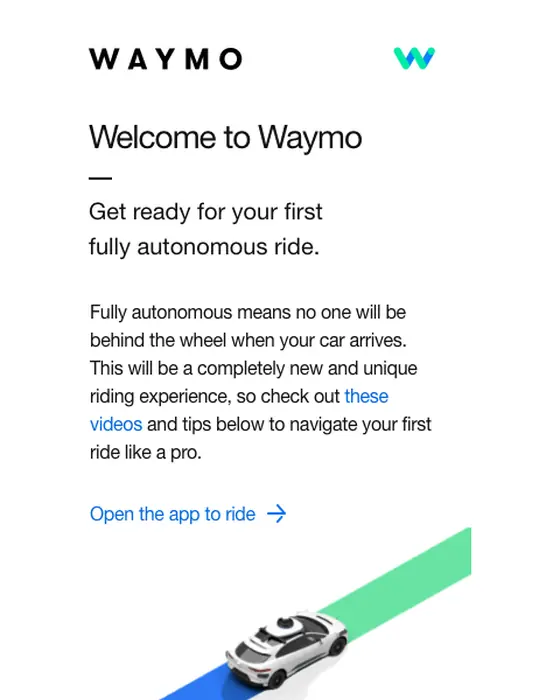
The first screen is recent receipts, account notices, bookings and welcomes, starting with Anthropic, Google Play, Amazon, NSW TrainLink and Waymo. Of the 217 shown, 110 are transactional or account mail (receipts, invoices, confirmations, appointments, subscriptions, delivery updates, cancellations, account notices and reminders), 19 are newsletters and 14 surveys, and 187 use a single-column layout. Open any email for its subject line, what it does and the prompt that rebuilds it.
Anthropic, PBC
Your receipt from Anthropic, PBC #[ORDER_NO]
Google Play
Your Google Play Order Receipt from [DATE]
Amazon.com
Action Required: Problem with Your Kindle Order #[ORDER_NO]
NSW TrainLink
NSW TrainLink - Purchase Confirmed for Booking [ORDER_NO]
Waymo
Welcome to Waymo
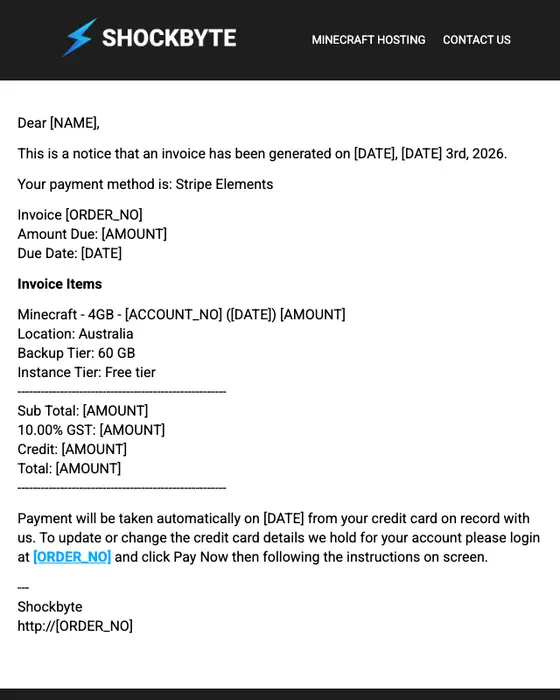
Shockbyte
Customer Invoice
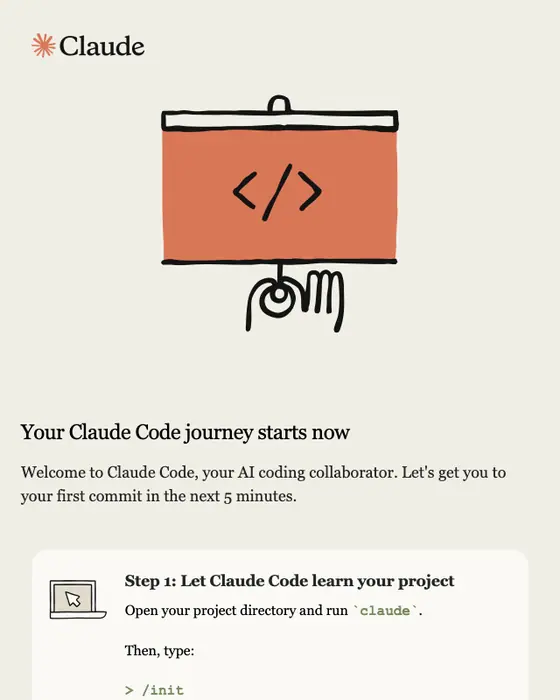
Claude Code
Welcome to Claude Code
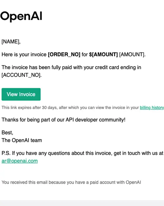
OpenAI
OpenAI API Invoice [ORDER_NO]
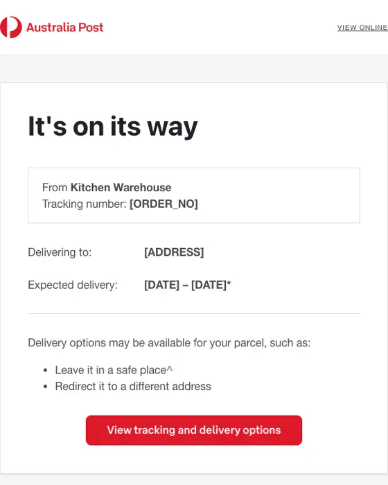
Australia Post
Your parcel from Kitchen Warehouse is on its way
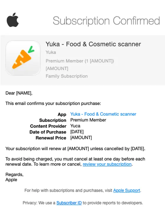
Apple
Your Subscription is Confirmed
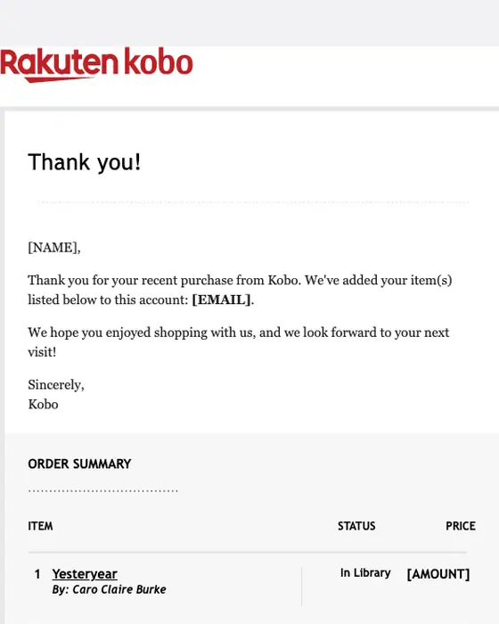
Kobo
Your Kobo Order Receipt for 1 item
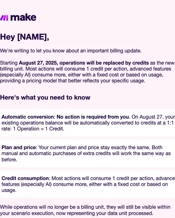
Make
Important update: Introducing Credits as our new billing unit
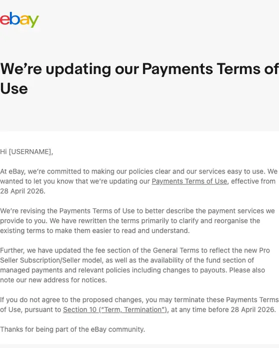
eBay
We’re updating our Payments Terms of Use
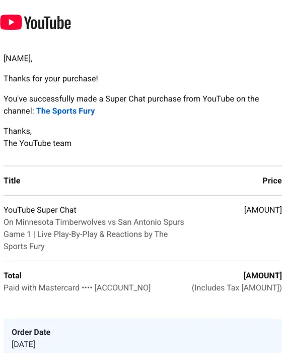
YouTube
Your YouTube Super Chat receipt from [DATE]
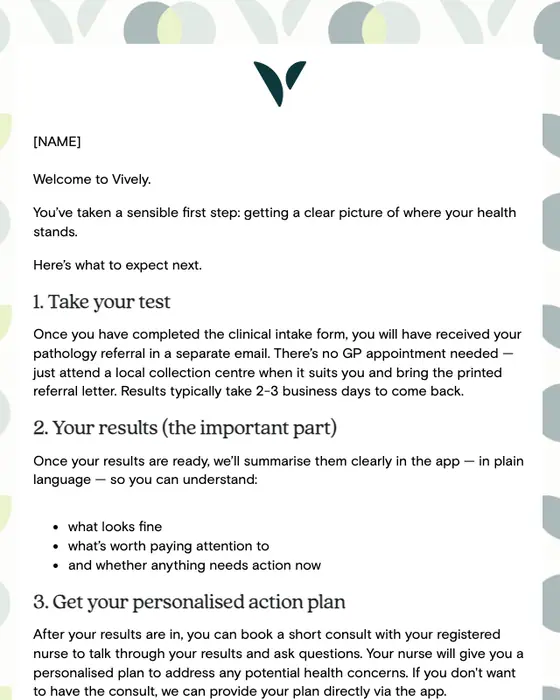
Vively
Welcome to Vively - here's what happens next
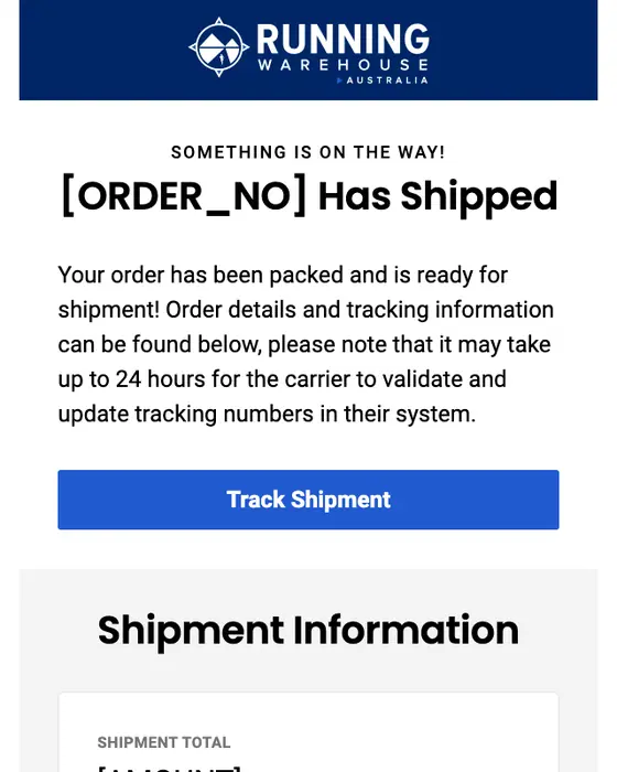
Running Warehouse Australia
Your Running Warehouse Australia order has shipped.
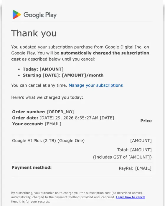
Google Play
You updated your subscription to Google LLC
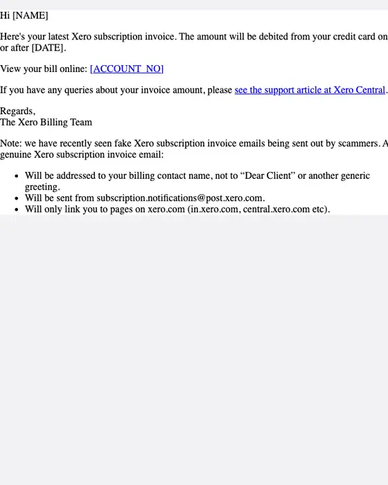
Xero
Your Xero Invoice for [NAME]
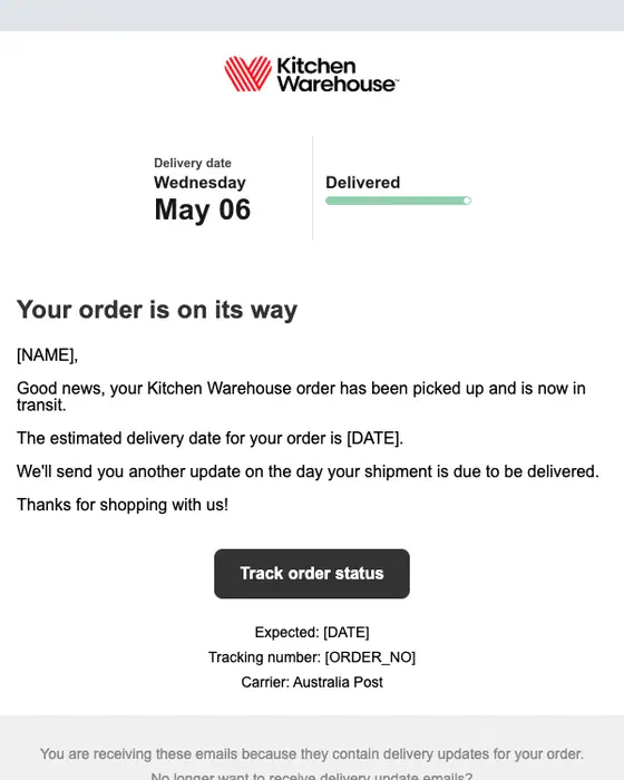
Kitchen Warehouse
Your Kitchen Warehouse order [REF] is on its way
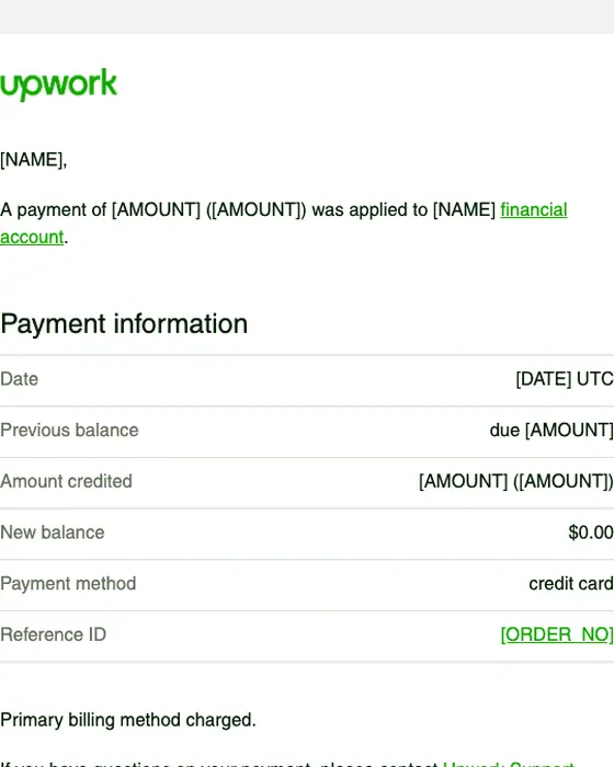
Upwork
Payment Received - Thank You!
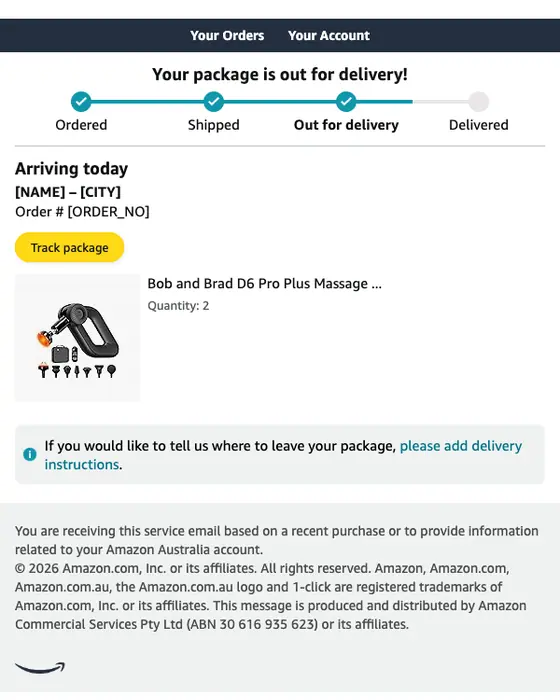
Amazon.com.au
Out for delivery: 2 "Bob and Brad D6 Pro Plus..."
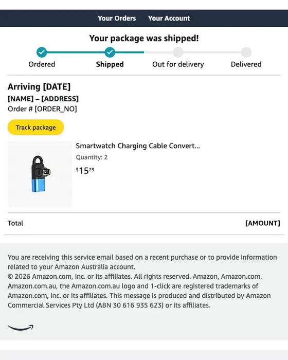
Amazon.com.au
Shipped: 2 "Smartwatch Charging Cable..."
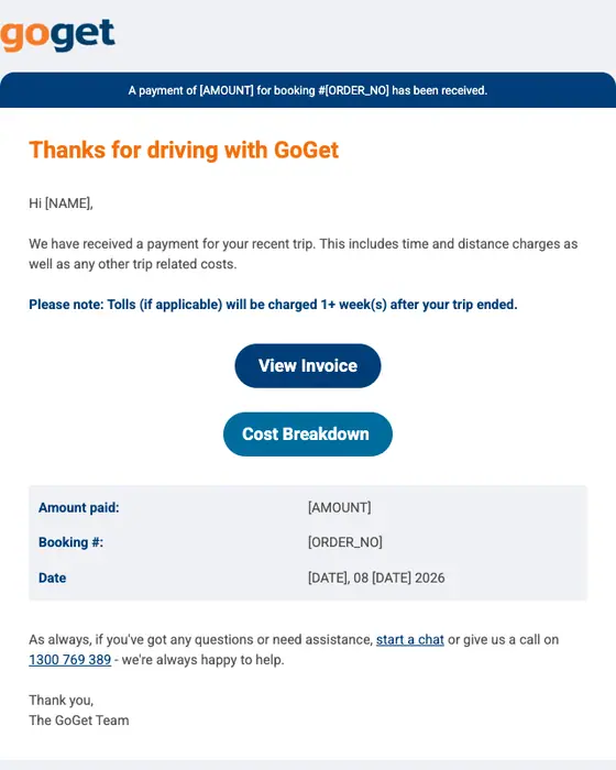
GoGet
Payment for booking #[ORDER_NO] was received
How utilitarian emails differ from the rest
Utilitarian emails against every other email in the library
4,240 tagged utilitarian and 8,471 others, same two inboxes| What we counted | Utilitarian | Every other email |
|---|---|---|
| Single-column layout | 75% | 60% |
| Plain-text layout | 23% | 36% |
| Micro or short | 44% | 58% |
| Long | 20% | 15% |
| Mostly text (tagged text heavy) | 67% | 57% |
| Mostly images (tagged image heavy) | 1% | 8% |
| Monochrome color | 72% | 57% |
| High-contrast color | 13% | 16% |
| Actions as text links only | 63% | 51% |
| Actions as buttons only | 15% | 26% |
| Exactly one call to action | 26% | 32% |
| Five or more calls to action | 29% | 20% |
| Median calls to action | 3 | 2 |
| Instructional tone | 45% | 33% |
| Arrives after a purchase or booking | 38% | 19% |
| Promotions, sales and discount offers | 20% | 33% |
| Uses the reader's first name | 45% | 38% |
| Sent to a business audience | 15% | 21% |
They carry almost no imagery: our tagging marks 1% as mostly images, against 8% of everything else, and 67% as mostly text. They are more often black, white and gray (72% monochrome against 57%), but not more often high contrast (13% against 16%). They lean on text links over buttons: 63% use only text links (against 51%) and 15% only buttons (against 26%).
They are not shorter or simpler to act on. Only 44% are micro or short, against 58% of the rest, and 20% run long. The median utilitarian email has three calls to action against two, and 29% have five or more (against 20%). Much of the set is post-purchase mail: 38% arrive after a purchase or booking, against 19% of other emails. The tone is instructional in 45% (against 33%).
Nitrosend's own build notes show where the style helps an AI agent. While building its digest emails, its engineers recorded that five stacked text sections with the renderer's default padding left about 200px of empty space before any content, a pattern AI-composed emails produce routinely. Its email validator now strips empty text, missing-image, blank-button and empty-column sections from AI-generated emails before they go out. One column with one run of paragraphs sidesteps the stacking.
For the transactional side of this style, see our transactional email templates and transactional email best practices.
What is in the utilitarian collection
What the utilitarian emails are
4,240 emails, top 8 types| Type | Emails | Share |
|---|---|---|
| Promotional | 650 | 15% |
| Newsletter | 509 | 12% |
| Shipping | 404 | 10% |
| Receipt | 265 | 6% |
| Account notice | 264 | 6% |
| Order confirmation | 246 | 6% |
| Delivery | 204 | 5% |
| Booking confirmation | 156 | 4% |
When in the customer's life they arrive
4,240 emails, top 5 stages| Stage | Emails | Share |
|---|---|---|
| After a purchase or booking | 1,616 | 38% |
| Keeping an existing customer | 1,415 | 33% |
| Winning a new one | 403 | 10% |
| Account admin | 202 | 5% |
| Security | 188 | 4% |
Three senders move the type table. Australia Post, PayPal and Amazon.com.au sent 488 of the 4,240 emails (12%) between them: 120 of the 265 receipts are PayPal's and 102 of the 204 delivery emails are Australia Post's. Promotions still top the list at 15%, but that is lower than for the rest of the library (20% of utilitarian emails are promotions, sales or discount offers, against 33%).
Next to this one
The same library by structure: single column email layouts. By style: plain text, minimal, corporate, editorial, playful and bold graphic. By the types that most often go out utilitarian: receipt emails, shipping emails, order confirmation emails and account notice emails.
Questions people ask
Utilitarian email design puts the information first: plain words, usually one column and little decoration. In our library 75% of the 4,240 emails tagged utilitarian use a single column, against 60% of other emails, only 1% are mostly images, against 8%, and 38% arrive after a purchase or booking.
No. Plain text is a layout; utilitarian is a design approach. Only 23% of the 4,240 utilitarian emails we collected use a plain-text layout, against 36% of other emails. Most are simple HTML in a single column (75%), and 72% use a monochrome palette, against 57%.
Mostly text links. Of the 4,240 utilitarian emails we collected, 63% use only text links for their calls to action, against 51% of other emails, and 15% use only buttons, against 26%. They also carry more actions: a median of three against two, and 29% have five or more.
Lead with the fact or the next step, keep everything in one column and use plain links. The utilitarian emails here are 75% single column and 67% mostly text. Simple does not always mean short, though: only 44% are micro or short, against 58% of other emails, and 20% run long.
775 were rendered for this page and we cut 558: 251 tagged utilitarian that are visibly designed, 125 repeats of one brand's template, 97 sign-in alerts and codes, 60 that showed or risked personal details, 11 broken renders and 14 others. The tables count all 4,240.