
What a bold graphic email is
In email graphic design, a bold graphic email leads with the picture: saturated or high-contrast color, big display type or a full-width image, and a short line with a button under it.
We collected 768 of them from 401 brands, sent between 2016 and 2026, out of two real inboxes that are part of the Nitrosend email library. This page shows 232 of them from 186 brands, 211 sent in 2023 or later. We left off 40 that our tagging called bold graphic but read as quiet or text-led, 48 repeats of one brand's template, 27 broken renders where the images did not load, 11 that carried personal details or per-recipient codes and 2 others. The tables below still count all 768. Bold does not mean sparse: the median bold graphic email has 3 calls to action, against 2 for the rest.
232 bold graphic emails you can open
The first screen is mostly recent promotions, product launches, sales and discount offers, with a few welcomes and event invitations, starting with EB Games, Redbubble, Ubisoft, KISS ACTIVE and Dark Mofo. Of the 232 shown, 82 are promotions, 30 sales, 22 discount offers and 22 product launches, and 214 use a single-column layout. Open any email for its subject line, what it does and the prompt that rebuilds it.
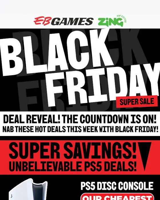
EB Games
🔒 Our black Friday prices are unlocked! Deals go live from 19 Nov 12.01AM AEST
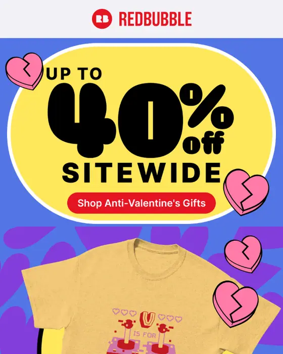
Redbubble
Up To 40% Off Valentine's Gifts For Him
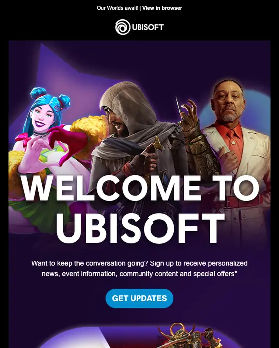
Ubisoft
Welcome to Ubisoft
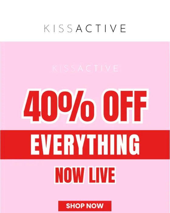
KISS ACTIVE
🚨 40% OFF FOR 4 HOURS: NOW LIVE
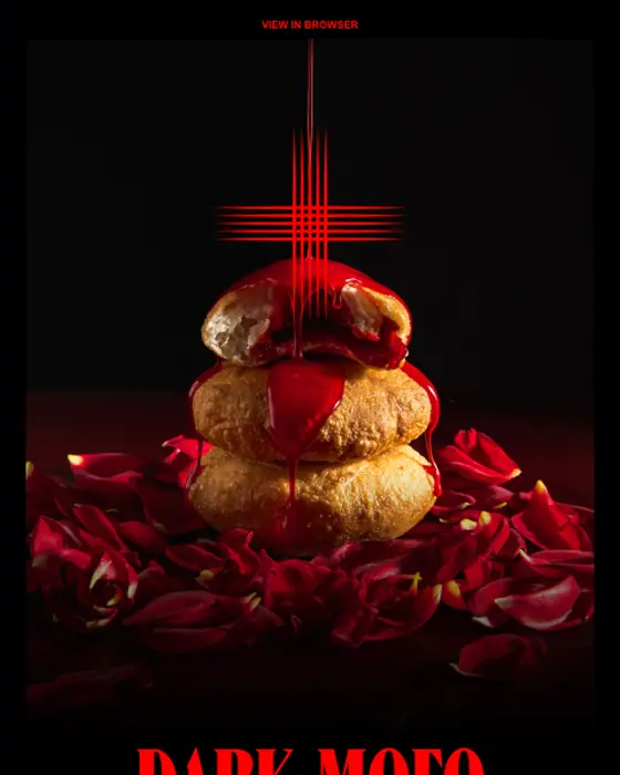
Dark Mofo
Blessed are those who hunger and thirst
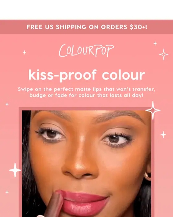
ColourPop Cosmetics
We made the perfect 8HR lipstick 💄
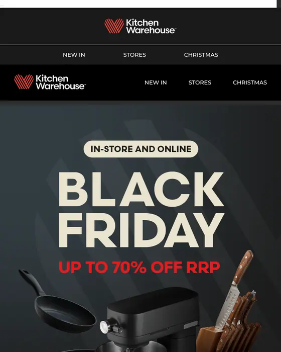
Kitchen Warehouse
IT'S HERE: BLACK FRIDAY STARTS NOW!
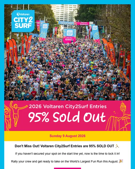
City2Surf
2026 Voltaren City2Surf Entries 95% SOLD OUT 🚨
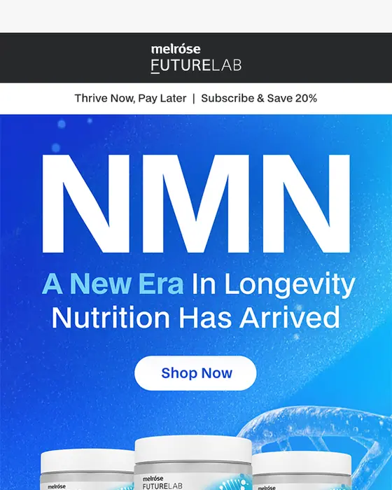
Melrose Health
NMN Has Officially Landed 🚀
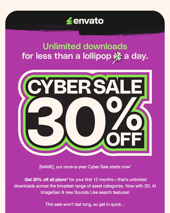
Envato
Ready, set... SAVE 30% on all plans 🥳
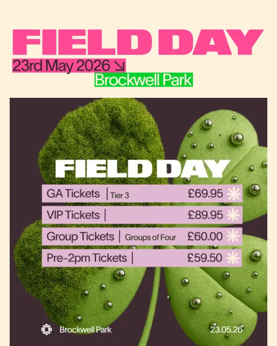
Field Day Festival
Tier 2 tickets sold out. Tier 3 tickets moving fast.
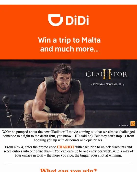
DiDi Australia
Ready to ride like a Gladiator? 🚗⚔️
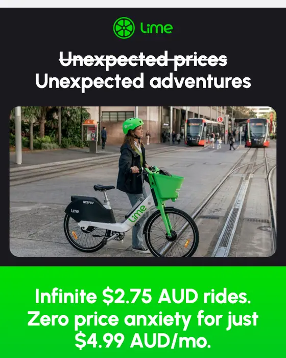
Lime
You're missing $2.75 AUD flat-rate rides with LimePrime
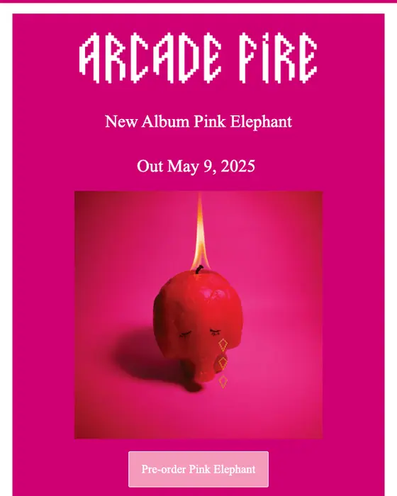
Arcade Fire
New Album Just Announced
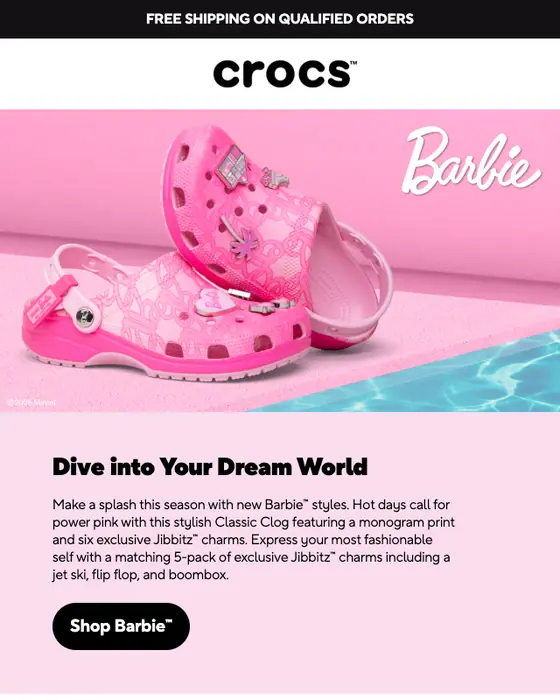
Crocs Australia
New Barbie styles just dropped 💖🎀🛍
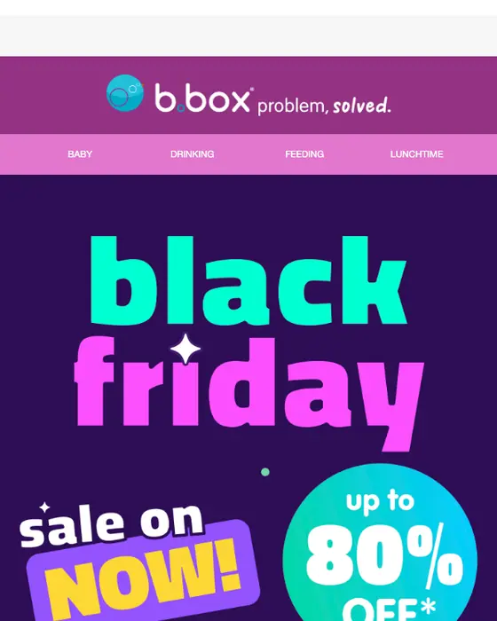
b.box for kids
Black Friday is LIVE! Up to 80% off* starts now 🖤
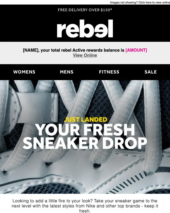
rebel active
NEW! Your fresh drop inside 👟
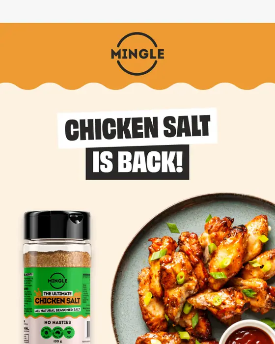
Mingle Seasoning
🐔 IT'S BACK! Chicken Salt (sold out in 3 days last time)
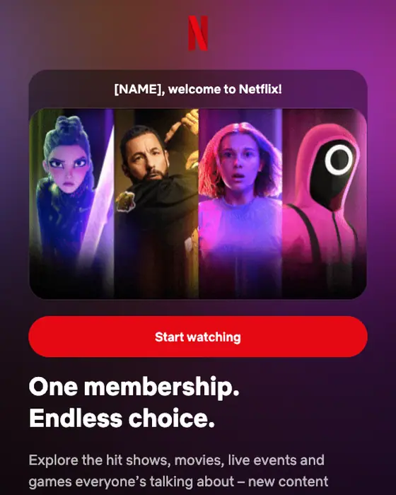
Netflix
Welcome to Netflix! Ready to dive in?
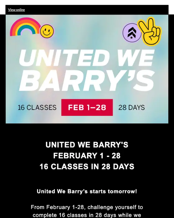
Barry's Bootcamp
The Countdown to United We Barry’s is ON! 🌈🌟
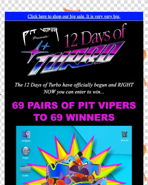
Pit Viper Australia
12 DAYS OF TURBO IS BACK
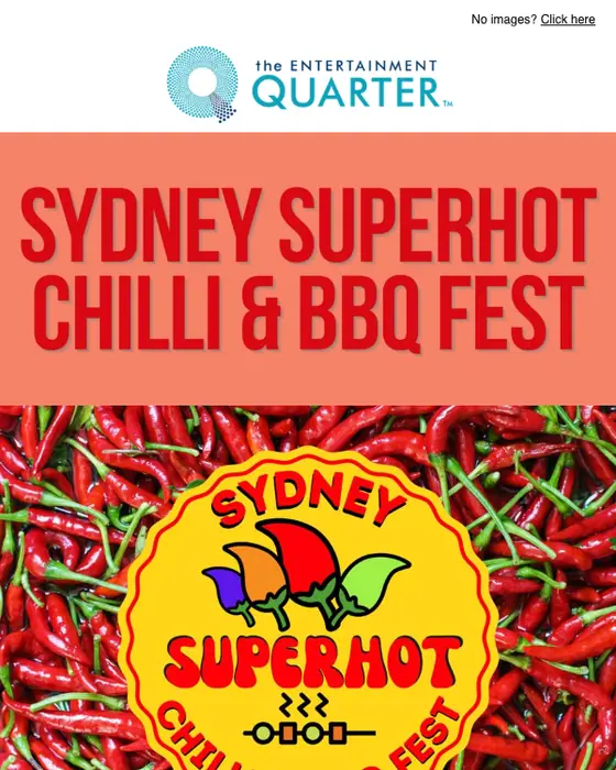
The Entertainment Quarter
Something SPICY is coming to the EQ... 🌶️
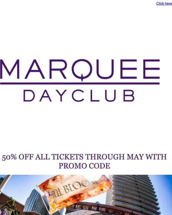
Marquee Dayclub
Tickets on Sale Now! 50% Off All Tickets Through MDW
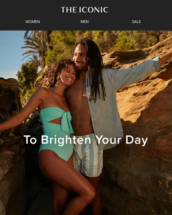
THE ICONIC
Here's $25 OFF your order! 🌟
How bold graphic emails differ from the rest
Bold graphic emails against every other email in the library
768 bold graphic emails and 11,943 others, same two inboxes| What we counted | Bold graphic | Every other email |
|---|---|---|
| Color tagged high contrast, vivid or dark | 94% | 15% |
| Color tagged high contrast | 67% | 12% |
| Mostly images (tagged image heavy) | 39% | 4% |
| Mostly text (tagged text heavy) | 3% | 64% |
| Single-column layout | 89% | 63% |
| Plain-text layout | 1 of 768 | 34% |
| Calls to action are buttons only | 63% | 20% |
| Median calls to action | 3 | 2 |
| Exactly one call to action | 29% | 30% |
| Five or more calls to action | 31% | 23% |
| Urgent tone | 40% | 10% |
| Greets the reader by first name | 14% | 42% |
| Promotions, sales and discount offers | 71% | 26% |
| Sent to a business audience | 5% | 20% |
The difference is color and pictures, not structure. 94% of bold graphic emails are tagged high-contrast, vivid or dark, against 15% of everything else, and 39% are mostly images, against 4%. Only 3% are mostly text. The layout stays simple: 89% use one column, against 63% of the rest, and just 1 of 768 uses a plain-text layout.
They push harder. The median bold graphic email has 3 calls to action against 2, 31% have five or more (against 23%), and 63% use buttons only, against 20%. The share with exactly one call to action is about the same (29% against 30%). 40% are tagged urgent in tone, against 10%, and 71% are promotions, sales or discount offers, against 26%. They greet the reader by first name far less often (14% against 42%) and are rarely aimed at a business audience (5% against 20%).
For how designers put these choices together, see our best email designs of 2026.
What is in the bold graphic collection
What the bold graphic emails are
768 emails, top 8 types| Type | Emails | Share | Share of other emails |
|---|---|---|---|
| Promotional | 388 | 51% | 20% |
| Sale | 105 | 14% | 2% |
| Product launch | 64 | 8% | 4% |
| Discount offer | 53 | 7% | 3% |
| Event invite | 45 | 6% | 4% |
| Newsletter | 28 | 4% | 13% |
| Re-engagement | 24 | 3% | 3% |
| Welcome | 21 | 3% | 4% |
Who sends them
768 emails, top 8 industries| Industry | Emails | Share | Share of other emails |
|---|---|---|---|
| Ecommerce | 127 | 17% | 11% |
| Entertainment | 118 | 15% | 3% |
| Retail and fashion | 95 | 12% | 5% |
| Media and publishing | 90 | 12% | 6% |
| Health and fitness | 58 | 8% | 6% |
| SaaS | 47 | 6% | 21% |
| Food and drink | 38 | 5% | 3% |
| Travel | 32 | 4% | 4% |
Half of the collection is promotions (51%, against 20% of other emails). Sales are 14% against 2%, and product launches and discount offers each run at more than twice their share of other emails. Entertainment is the clearest sender: 15% of bold graphic emails against 3% of the rest. SaaS goes the other way, at 6% against 21%. No one brand dominates: the biggest single sender has 12 of the 768.
Next to this one
The same library by structure: modular grid email layouts and single column email layouts. By style: minimal, playful, editorial, corporate, utilitarian and plain text. By the types that most often go out bold: promotional emails, sale emails, product launch emails and event invitations. By sender: entertainment and retail and fashion.
Questions people ask
Bold email design leads with strong color and big visuals: saturated or high-contrast color, large display type or a full-width image, and a short message with a clear button. In our library 94% of the 768 bold graphic emails are tagged high-contrast, vivid or dark, against 15% of other emails.
Mostly, yes. Our tagging marks 39% of bold graphic emails as mostly images, against 4% of other emails, and only 3% as mostly text, against 64%. Many in the grid put the offer or headline inside the image, so test how they read with images switched off.
More than most. The median bold graphic email has 3 calls to action against 2 for other emails, and 31% have five or more, against 23%. 63% use buttons only, against 20%, while the share with exactly one call to action is about the same, 29% against 30%.
Most do. 89% of the 768 bold graphic emails we collected use a single-column layout, against 63% of other emails, so the boldness comes from color, type and imagery rather than a complex grid. A single column also scales cleanly to a phone screen.
360 were rendered for this page and we cut 128: 40 tagged bold graphic that read as quiet or text-led, 48 repeats of one brand's template, 27 broken renders, 11 that carried personal details or per-recipient codes and 2 others. The tables count all 768 collected from the two inboxes.